Modern cave drawings and story-telling using PowerPoint
Bill Dennison ·I made a presentation in the CERF 2015 session entitled "Successful Science Story-Telling for Coastal Resilience". My presentation was titled "Telling new stories about resiliences of Chesapeake Bay, Mississippi River and the Great Barrier Reef". My initial slide contrasted story-telling vs. logical-scientific, and referenced the research studies that have shown that story-telling increases comprehension, interest and engagement, summarized by Michael Dahlstron in a 2014 paper (Using narratives and storytelling to communicate science with nonexpert audiences. Proceedings of the National Academy of Science 111: 13614-13620; pdf).

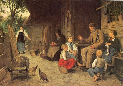
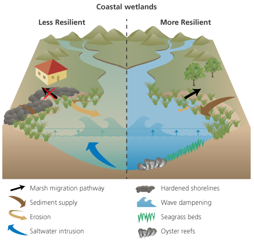
I emphasized the ancient practice of story-telling, illustrated with the 19th century Swiss artist Albert Anker painting of children listening to an older man telling a story. The contrast was with a photograph of an audience listening to a PowerPoint presentation (debuting in 1987). I then went on to show how the symbol libraries to create conceptual diagrams to illustrate resilience stories in Chesapeake Bay, Mississippi River and the Great Barrier Reef.

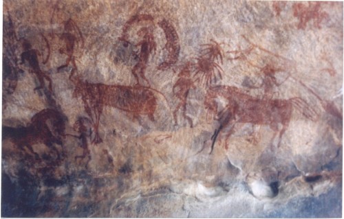
John Farrington from Woods Hole Oceanographic Institution came up to me following my presentation and made an astute point. His point was that the earliest visualizations of stories were cave drawings, and the modern technology of PowerPoint just provides a new medium to illustrate stories. The act of using PowerPoint does not mean that this technology can't be used to support a good story. Good use of visuals can enhance a story, but we scientists often use PowerPoint to inundate our audiences with data and information without an underlying story. Even when we distill data and information into knowledge and wisdom, if we don't weave this scientific knowledge and wisdom into stories, we are not likely to be effective in communication.

I should point out that John visited the University of Maryland Center for Environmental Science when we were doing a self-study years ago and he recommended the book, "Pasteur's Quadrant--Basic Science and Technological Innovation" by Daniel Stokes (1997). This book promoted use-inspired basic research, exemplified by the career of Louis Pasteur, the father of microbiology who also invented the pasteurization process and a rabies vaccine. This concept of blending basic and applied research now serves as an explanation of what we are trying to do in the Integration and Application Network, so this is not the first time that John Farrington has stimulated me to rethink what I am doing with an insightful observation.
About the author
Bill Dennison

Dr. Bill Dennison is a Professor of Marine Science and Interim President at the University of Maryland Center for Environmental Science (UMCES).
Next Post > Developing a report card for the Florida Reef Tract
Comments
-
Atika 7 months ago
Thank you for sharing this great information with us, i really appreciate your post!