Just Right: Goldilocks and conceptual diagrams
Marybeth Shea ·Marybeth Shea
During our class I kept thinking about revision and the Goldilocks problem: Getting things “just right” is a challenge for conceptual diagram design. I could see in the analysis of what worked in our diagrams -- and what did not work -- applications of “just right.” How do we get there?
IAN offers principles that guide this getting-to-just-right revision of conceptual diagrams:
- Consistent Symbols
- Comprehensive Legend
These two principles lay bare what must be balanced: the visual, (symbols and backgrounds) and supportive text (legend and labels). Part of getting-to-right is understanding that we are engaged not only in cognitive communication tasks but also in aesthetic tasks. We, then, need ways to judge “getting-to-just-right”: conceptual diagrams must both work and please the eye.
I was also reminded of the guiding principles for written communication. We write to accommodate a specific audience, with a clear purpose, all the while mindful of the context. Often, our audiences are not scientists. Keeping this in mind is both essential and difficult. Much of our disciplinary training concerns an audience of relative peers -- who share our disciplinary formation. Yet, in designing conceptual diagrams, we need to distill down essentials for communicating complexity to lay readers, often in mixed audiences.
I learned so much from reading and discussing our conceptual diagrams. In the rest of this blog entry, I want to present a success and a failure. In between, I want to share a visual exercise I tried, to learn more about symbols that work.

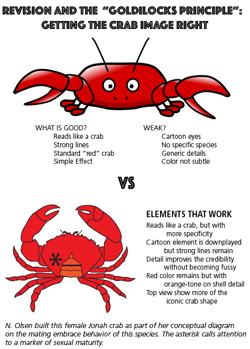
First, the success: Noelle Olsen presented a conceptual diagram about mating embraces in Jonah crabs. Her crab symbols were simple and clear, with strong color and lines. Her simplicity hit the Goldilocks spot. Achieving this is harder than it looks. The cartoon effect looms, even as you try to build a clear, clean symbol with slim and essential lines. Generally, these values will yield a good aesthetic and strong communication choice. Yet, anthropomorphism is a real risk. Back to Noelle, her Jonah crab is really strong. To see this subtlety, I built an image with a comic crab juxtaposed to Noelle’s “just right” image.
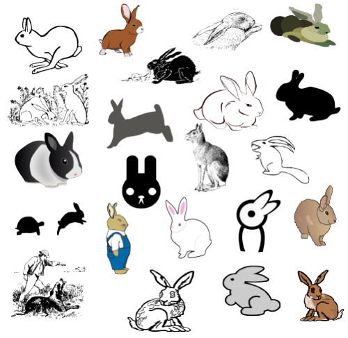
Noelle's success with symbols -- and that of other colleagues in the class -- sent me on a brief study of images that work and images that do not work. I looked at rabbit images.

I tried to think about the art-values in images so I will become more image-literate. I asked myself many questions including: Which images would I eliminate immediately? What are my elimination criteria? Cartoon-like? Anthropomorphic? Too much detail? Too simplistic? Open drawing? Silhouette?
Next, I thought about what graphical elements might be useful even in the symbols I tended to reject. What about meaning? Some of the graphics in this gathering of rabbits offer ways that you might show rabbit-in-motion or rabbit-in-context? Would you ever need an icon-rabbit? What about the tortoise-bunny pair to show slow-fast strategy?
As our skills in Adobe Illustrator improve, we might begin with such rejected images and revise them. Note: All the images in this graphic are from Open Clip Art, save one from the IAN Symbol Library. Can you guess which one is from IAN?
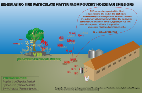
Now, my really big “fail”: I used a “blow up” -- meant for visual detail -- to place a huge wall of text pretty much in the center of my conceptual diagram. I worked on this technique earnestly, thinking I had really hit a sweet spot with this description of how Nitrogen becomes incorporated into dust, making one kind of fine particulate matter. If you look in my current version of my conceptual diagram, you can see this wall of text. Further, I inadvertently built my blow up” in the shape of a cartoon speech bubble. The little tip makes it look as if this “speech” is coming from the molecules in the fan exhaust plume. I missed so many Goldilocks spots here! Back to the drawing board, thanks to our class discussion and guidance. You can become invested in your documents and somewhat oblivious to them. And, yes, lots of other elements to be improved on in this version.

Conceptual diagrams are the poems of science communication, compared to textbooks, white papers, literature reviews, and research articles. And, like poems, conceptual diagrams need to be lyrical and beautiful, while they deliver meaning.
Goldilocks summary; getting closer to “just right”
- Develop symbol literacy
- Collect conceptual diagrams that work for analysis
- Plan to draft, draft, revise, revise
- Anticipate the time required to build conceptual diagrams
- Join or make a science communication peer group
- Your eyes alone cannot catch all communication fumbles or see opportunities
- Use the IAN symbols and swatches as Goldilocks examples; develop eyes for “gold” in part by seeing what is already present here as a resource for us
Next Post > Developing a strategy for Long Island Sound embayment report cards
Comments
-
Christina Goethel 8 years ago
I really enjoyed your Goldilocks analogy! It is an excellent way of describing what we are trying to do, find that balance. I liked that you brought up that many of us are used to communicating to a group of scientific peers so we have to stop and evaluate how we are displaying the images/symbols or writing the text. I agree, and am hopeful as I believe communicating in a way the particular audience can understand is becoming a more mainstream part of our education. In a seminar last week here at CBL, we had a discussion surrounding scientific communication and I asked if people had noticed a rise in the conversation about communication or if younger employees were coming in with a better understanding of communicating outside of the scientific world and even within the scientific world. I asked this question because I feel as if I have been part of this scientific communication conversation in many parts of my life. My undergraduate degree had a required core class in communication that brought all of the Environmental Science major students together, and we went through exercises in practicing all forms of communication from oral presentations, to posters, to writing an article for our local newspaper. We were all studying such diverse topics, that even within the same major we had to learn how to present our research in such a way that someone studying sustainable farming techniques could understand another student's work on the effect of decreased pH on a phytoplankton species. That was extremely challenging, we all had different problems we were approaching and different ways to approach those problems. It made us stop and think about how we were presenting and if we could use other student’s techniques to bolster our own. I see so much of what I was exposed to in that class, presented here, but I feel I have a better understanding and appreciation for it now. Because, even though I didn’t know it at the time, the goal of that undergraduate class was to find and produce the “goldilocks” outcome.
I also really like the exercise you went through with the rabbits. I think it is very important to stop and think about what you really want to convey with the symbol that you pick. I think the most important thing you mention here, however is stopping to think about why you discarded a particular symbol. Just because you discard the symbol in this circumstance, doesn’t mean you may not want to use it in the future, depending on again as you mentioned what you want to convey and who is listening and seeing the information you are presenting. I think this was an excellent exercise and that we should all follow your example in practicing it when choosing symbols for our next diagram. Conceptual diagrams where a rabbit is no longer simply just a rabbit. -
Dylan Taillie 8 years ago
Marybeth - I really liked your use of the clip art images to juxtapose between IAN's more accurate and colorful symbol usage and that of the average depiction of a rabbit which is usually just a shadow of it's body and large ears. IAN has such a large symbol library that one would be hard pressed to do this same comparison for more specific and science-oriented organisms such as SAV or a specific species of butterfly. Your comparison shows clear uses and benefits to the style of symbols that IAN uses but also asks broader questions about the use of silhouettes and in-motion symbols - could one possibly manipulate an IAN symbol into one of these different styles on illustrator if that was how they were looking to depict their rabbit?
Also in terms of your wall of text -i wouldn't call it as much of a fail as a trial. That exact situation is why getting input on your diagrams is so useful! Everyone will see the diagram differently and often times what starts off as an idea in my head turns out to be something very different when I create a diagram and can sometimes misconstrue the original purpose that I had for my diagram. This is why input is a part of the process (and a very important one).
Thanks for your blog!
Dylan -
Noelle O. 8 years ago
Thanks for the feedback Marybeth! Interestingly, I struggled a bit when choosing which colors to use to represent Jonah crabs. In real life, there really isn't much of a color difference among the sexes-and they're not 100% red-so I definitely felt like I had to compromise between accuracy and simplicity for the diagram. On the same note, because shell color isn't necessarily an important biological factor for Jonah crabs, I felt like I could let this slight misrepresentation slide.
-
Kathleen Gillespie 8 years ago
I really agree with the author on how much consideration should be taken when deciding on the best image representative. Too much detail and it detracts, too little and it does not support the intended message.The critique of a diagram from an diverse classroom setting has a real benefit, and the feedback will allow for better enhancement of a revision.
-
Atika 7 months ago
I really enjoyed your Goldilocks analogy! It is an excellent way of describing what we are trying to do, find that balance. I liked that you brought up that many of us are used to communicating to a group of scientific peers so we have to stop and evaluate how we are displaying the images/symbols or writing the text. Thanks for sharing!
-
Atika 4 months ago
Thank you for sharing this great information with us, i really appreciate your post!