A picture is worth a 1,000 words
Amanda Mueller ·Amanda Mueller

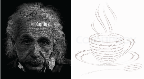
Each image elicits a specific thought or response in each of us, and that response may depend on the day of the week, our knowledge base, or experiences we have had in the past. However, we have to make sure that the images we are creating are exhibiting the message we are trying to share. For this reason, we need to make sure that our visualizations are realistic and that we pay attention to details, without getting lost in them.
Before we begin: slow down, take a deep breath, and stop and think!
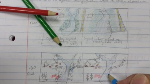
This is good advice before starting any project, and it is especially helpful when starting to work on a conceptual diagram. While the old, pen to paper (or colored pencils in this case) method can seem tedious, it provides you the time and opportunity to conceptualize and visualize the message you want to share.

You want to make sure that you know the story you are trying to tell, and that you find the best way to illustrate that story in a diagram, or series of diagrams if necessary. As Katie Goerger noted in last week’s blog, one of the most important steps, Step 4, in creating your conceptual diagram and making sure it is telling your story, is to “solicit feedback and review your work.” As members of the 2016 IAN Science Visualization Course quickly discovered, feedback on your conceptual diagrams is important, and there are a lot of common errors that we need to keep in mind when we are creating our conceptual diagrams.
1. Reality check!
Henri Bergson a French Philosopher (1859-1941) noted that, “The eye sees only what the mind is prepared to comprehend.” To this end, it is important that our images are as realistic as possible.
- Are your sizes, proportions and spacing correct? At least to a rough scale?
- Are your plant and animal symbols representative of species that would live in that habitat/ecoregion?
- Are your physical and chemical processes correct for this area? In the correct location? Flowing in the correct direction?
- Are your colors accurate? Do they depict the true colors of the environment you are trying to portray?
As Frasier Crane asked Cliff Clavin in Season 7 of Cheers, “What color is the sky in your world?” As many of us discovered, it probably shouldn’t be white. A nice shade of Carolina Blue might be in order, or a nice Hawaiian sunset, but a sky color is important for creating a realistic image.

Capturing reality in a diagram is inherently difficult, but keep trying, you’ll get there.
2. “The Devil is in the details” (variant by Ludwig Miles van der Rohe).
Conveying your message accurately can be thwarted by errors in the smallest details. It can definitely take extra time and effort to get it right, but it is worth it in the end. Some of the details you want to focus on include:
- using an active title to help your viewer find the message quickly
- having an accurate legend. This can be an embedded legend (Slides 26 and 27) where symbols are included in the text for reference, or a more traditional legend in list format.
- making sure your diagram is clean and consistent.
This is one time when you want to make sure that, “the grass is [not] always greener on the other side” unless that is a detail you are trying to show. Some of the design elements you can concentrate on to ensure that it is clean are:
- correctly selecting a 2D or 3D image. Do you need the extra perspective?
- providing a mirror image or comparison image where appropriate.
- utilizing blow-outs (Slide 28) to draw attention to and explain areas needing further details.
- using arrows appropriately to depict movement within the system.
- making sure all parts of the diagram are aligned correctly.
- pulling image layers to the front or sending them to the back at appropriate times.
- balancing the amount of “white space.”
- creating overall balance in the diagram.
- be consistent.
3. “You can’t see the forest for the trees” (John Heywood, 1546).
While details are important, sometimes we pay too much attention to the details and forget the bigger message we are trying to convey. Sometimes we can spend too much time, and memory, on the details of an item, such that the message is not able to be shared. While it is very important to get the details correct, sometimes they can be distracting and take away from the overall message. Work hard to find that balance.

As with most things, I find creating a good conceptual diagram takes longer than you think, and creating a great one, takes even longer. The more time you spend on your diagram and the more feedback you receive, the better it will be. Don’t be afraid to create two or more hand-drawn versions before you even approach the computer. Use Adobe Illustrator, Inkscape, or other similar program, as the final, finishing step of your design process.
In the words of fashion consultant Tim Gunn, “Make it work!”
*Note: Jeff Clark, creator of Neoformix, has a web-site with a blog as well as more active Twitter and Pinterest accounts. Neoformix has a lot of neat items related to data visualization and creative coding.
Next Post > Combating climate change in the floating city
Comments
-
Jen Shanahan 8 years ago
I really enjoy reading these blogs! I like the images you found and created to add to this blog and the bullet points towards the bottom will be a useful reference.
One element that you could have also included (that I find to be the biggest challenge) is the art of oversimplifying ecosystems that we (as scientists) inherently perceive as very complicated. Similarly it is a challenge to properly represent a region or topic in simplistic view without losing the local/topic specificity. Nice read, it engages the reader right from the start and flows well. Good job!
-
Caroline Donovan 8 years ago
I liked the breakdown of common errors or troubleshooting that occurs throughout the process - it can be frustrating to get so into the details that when you step back to look at your diagram overall you realize it's too busy, the symbols are too small, or your key message is lost. It's in the process of making the diagram and getting so deep into it you might get a little lost that it becomes a great diagram in the end.
-
Melissa Merritt 8 years ago
Great blog! Loved that you referenced another's blog in here as well. Really nice way to build on others work. Also, really appreciate the organization with the numbered list and then the bullets underneath. Really good organization!
-
Holly Padgett 8 years ago
Nice! I really like the comparison examples of the sky color and the tree. I'm a very visual person and I have to see something to understand it and comparisons like this are a huge help! It maybe could have also been neat if you had included your "after" conceptual diagram next to your sketched diagram so we could see that comparison. Also, I love all the quotes!
-
Michelle Canick 8 years ago
"Each image elicits a specific thought or response in each of us" - this was a great hook line, since I had just chuckled at the Einstein image. And "we have to make sure that the images we are creating are exhibiting the message we are trying to share" - that's really the key, so it was great to state it up front and repeat at the end, with the deviling details in the middle!
-
Katie Goerger 8 years ago
Awesome post! If my post last week was '101: The Basics', this really seems like a '102: Let's Take It Up a Notch'. I can definitely see myself using this to check over my work and really bring out the details in my future diagrams. It's sometimes easy to forget the details - or even add too many - but you've done a great job at making those points and emphasizing the idea of art with balance. (PS - Love the pop culture quotes!!)
-
Atika 7 months ago
Great blog! Loved that you referenced another's blog in here as well. Really nice way to build on others work. Also, really appreciate the organization with the numbered list and then the bullets underneath. Thanks for sharing!