Goldilocks: The Unheralded Mapping Guru
Michelle Canick ·Michelle Canick
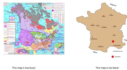
OK, not really. But like Goldilocks selecting the bed just right for her nap, we should try to avoid the extremes when designing a map. Don’t make the map too simple or too complex, but provide just the right amount of detail to tell the story.

What’s the story? Well, that’s really the first step. As we learned in the Science Visualization unit about conceptual diagrams, it is important to slow down and think about what story you’re trying to tell, and who you’re trying to communicate with, before you dive into any software.
Some of the design advice for maps is the same as for graphs and conceptual diagrams. For text, use fonts that are large enough and easy to read; generally, sans serif fonts are more readable from a distance. On a map, text may be found in the title, captions, legend and as labels on the map itself. Label the map features that are important to orient people or to communicate your data, but don’t clutter the map with unnecessary or irrelevant labels. Balance content and white space so the map is neither too crowded nor too bare. Use an active title to help the reader interpret the graphic, or in this case cartographic, information you present. You may want to include captions to explain scientific or technical terms used in the map legend. Write out acronyms and provide measurement units with the data in your legend.
Color is another important design element in graphs, conceptual diagrams and maps. The stoplight colors of green, yellow, and red are often used to represent good, moderate, and bad environmental conditions. Some colors have implicit land cover connotations, such as blue for water, green for forest and gray for urban or developed land. Coloring the land blue and the water green will make your map less intuitive and harder to interpret. Yes, the reader should be able to figure it out based on shapes and labels, but we don’t want our reader to have to work that hard. Some colors stand out more than others, so make sure you use colors that emphasize the features you want the reader to focus on. Use subtler color, or partial transparency, to fade other elements into the background, where they can provide context but not distract from the main point. Remember that colors can look very different on screen and printed, and keep colorblind readers in mind. Sounds like a lot to consider, right? Luckily, there are web sites like Colorbrewer that provide color advice for cartography.
![The web site Colorbrewer provides color advice for cartography, credit: colorbrewer2.org he web site Colorbrewer provides color advice for cartography, http://colorbrewer2.org]]](/site/assets/files/2579/image-2-colorbrewer-e1477401193678-500x298.jpg)
The geographic nature of maps means we have some additional considerations above and beyond those discussed for graphs and conceptual diagrams. Like those “you are here” maps at the mall, your map needs some elements to orient the reader in space. Roads are often used for this purpose, but be careful not to clutter the map with unnecessary roads. You may want to select only major roads, such as interstates and U.S. routes, to display on your map, or consider using a subset of town names to orient people instead. To put your study area in a larger geographic context, you may want to include an inset or locator map, for instance showing where your study area falls within the state. A north arrow and scale bar also provide important geographic information, although there was some discussion in class as to whether these elements are necessary on every map. When in doubt, include them, and display both metric & English units on the scale bar.
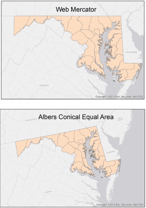
One design consideration unique to maps is deciding which projection to use. Since the Earth is a sphere, displaying a portion of the earth in 2-D results in some distortion of area, shape and/or distance. Different map projections cause different types and degrees of distortion, which may be most obvious on small scale (large area) maps. USGS provides an informative discussion of map projections on their web site.

In a nutshell, each map element – title, legend, captions, scale bar, north arrow, map layer – conveys information. And each design consideration – font size and style, color choices, amount of detail, map projection – influences how effectively your map conveys the information you want to communicate. So your job as a cartographer is to stop, think, and then “choose wisely” those elements and designs that will best tell your story.

Next Post > UMCES active in the 2016 River Symposium in Delhi, India
Comments
-
Melissa Merritt 7 years ago
This is SUCH a thorough blog- you could almost print this out and use it as the class lesson! I also really appreciate how you showed an example of the different mapping projections. That really helps explain it way better than just verbalizing the differences. You chose your supporting graphics really well. I also appreciate that you listed sources for help, like the colorbrewer website. Really nice blog post!
-
Katie Goerger 7 years ago
I think I personally struggle with the too much information and clutter aspect of this. It harks back to our previous lesson, having peers review our work as well to help us find the correct balance. "Stop, think, and then 'choose wisely'" is a great way to put it.
Great blog post!! Love the Indiana Jones reference =)
-
Jen Shanahan 7 years ago
Nice blog Michelle, love the title!I think you covered all the key concepts.
I really agree that there are themes on simplifying graphs that carry over into the mapping efforts.
-
Atika 6 months ago
Thank you for sharing this great information with us, i really appreciate your post!