Let's get in line, with InDesign!
Kathleen Gillespie · | Science Communication | Applying Science | 4 commentsKathleen Gillespie
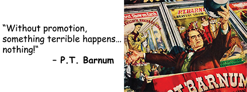
A conference is your time to shine and to get the word out about your scientific project. You have a finite amount of time to interact, and many people are just strolling through a venue. In order to make an impression, reach out to them! The presenter themselves must make sure to play an active role by being able to promote themselves effectively.
Some ways to consider capturing attention:
- You Gotta have a Gimmick: this could could be a prop (i.e. a tool / model), or a computer visual/ audio display, or a 3-D element to the poster
- “Step right up!” Be extroverted and speak out, tell the passer-by something fascinating about your work
- “Sell” your science: give a 3 minute overview narrative, reveal details upon request
- Seal the deal: provide contact information: cards and/or color sheets of your poster
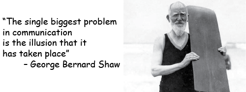
Once you have drawn in the audience, your poster is key in keeping their attention. In order to make a powerful impact, your poster has to best communicate your science.
Important elements to consider that make a poster worth a second look:
- Engaging Titles: must be active and get to the point
- Arresting Visuals: a picture or diagram that tells a compelling story
- Layout: have a design that will draw the eye in to the important points
Pick the best tool for the job
The impression garnered by your scientific poster is predicated on the strength of the software platform you are using. The table below compares tools used for poster design based on aspects including costs, ease of use, graphics, and text interplay with graphics. Most researchers default to PowerPoint, which is best known and utilized for online and seminar presentations. It can be manipulated to create posters, but there are limitations when it comes to printing quality and graphics.
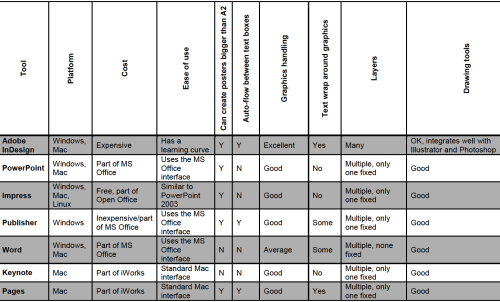
If the intent is to “wow!” (without limitations in budget or design capabilities), then Adobe InDesign is the way to go for posters. It is renowned for managing high quality images and graphics, text layout, and gives a polished professional output for print. As a preferred program used for print media, InDesign is versatile in publishing polished looking newsletters, books, and reports.
InDesign Tutorial Highlights
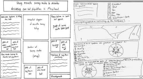
Before getting started, it is best to first draw your storyboard and convert to a picture file. Below are examples of a poster and a newsletter’s page that has well defined descriptions for both the images and text. These layouts are concise and will make good placeholders. This provides a template for your images and text, which you can then place into InDesign.
These screenshots emphasizes advantageous features found in InDesign, as discussed in the IAN course tutorial.
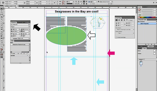
- Guidelines are a feature which deliminates where the columns guides (blue arrows) can be set and the margins (pink arrow) are located for text and images. Both can be customized.
- Palettes (black arrow) are pop-out menus for modifying the textboxes in columns and image links, used to control and edit the paragraphs, characters, and glyphs.
- Text wrap function is a unique feature found in InDesign that gives the user the ability to truly “wrap” text around a shape or image. The text can then be balanced by offsets, the white space that appears around the shape (white boxed arrow).
- The place function is used to import an image from a file into a designated placeholder shape (square, elliptical, hexagon). Then it can be moved, the perspective changed, or resized.
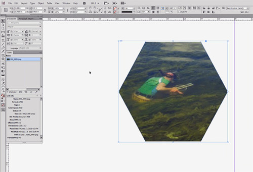
It is true that the learning curve for the InDesign program may be steep initially, but there are a multitude of tips and tutorials available online to help get you started.
The real purpose of any poster is to get your point across. If this can be accomplished by a dazzling image or design, then use the tool to get that lead!
==========================================================
Tips for Posters:
http://gradschool.unc.edu/academics/resources/postertips.html
http://www.creativebloq.com/graphic-design-tips/indesign-tutorials-1232639
https://www.smashingmagazine.com/2011/03/indesign-tips-i-wish-i-d-known-when-starting-out/
Below are some additional video tutorials online that can go through step-by-step with the process:
YouTube science tutorials “luckylion”
InDesign basics: “sterlingteaches”
Major resources:
ADOBE TV
https://www.youtube.com/watch?v=GY16m7QcFj4&list=PL5A9107F471513D4E
InDesign secrets
Science Visualization - InDesign Tutorial by IAN-UMCES
==========================================================
Next Post > How to organize and run short, productive and fun scientific workshops
Comments
-
Christina Goethel 10 years ago
Thank you for an excellent blog and recap of the class (especially for those of us that missed it). I really liked the chart for picking the best too. It is a nice, quick, easy way to compare programs that anyone could use when making their product. Not only did you describe tips for making a better product, but you focused in on tools we can use when actually presenting the information. I think the overall package is very important to think about in addition to the individual parts. Each individual part has to be a quality product to create an excellent overall picture/story, but I think sometimes we forget to then look at how the overall product comes out. Its kind of like in the photography lesson when we talked about remembering to look at the background and to take notice of what was in the entire frame and not just the subject we were focusing in on.
-
MbS 10 years ago
K,
Really nice use of visual in the blog. All of the images communicate what we need to remember from that class. I really like the Oxford table on the options for poster development. I would add one item to this: collaborator preferences and even limitations. Some of my colleagues would not have access to InDesign or a computer with heft to work this program. I took this off mine due to lots of crashing problems....and then a gingerly repair with a colleague to the "wounded" laptop. For the moment, I will think on how to make PP behave for a poster, for the collaboration factor. Summer project: cozy up to InDesign. Start to convert some colleagues. World domination....One take-away from the class is deep respect for power users of these programs. And, that graphic design and visuals expertise is really worth the money. Sometimes, at the backend of projects, we do not want to pay for editing, document re-organization, audience analysis, and the graphics know-how that give us all these great elements but are also really part of the over-all design of information.
I have been re-watching Downton Abbey, so here goes a bit of stretch of a metaphor: science can be the jewels set nicely into a tiara. The tiara metalwork and framing and shape is the document design. And, yes, some of the jewels are really the shiny, sparkly graphics (especially the conceptual diagrams, and data displays)....I think this is true because I am starting to see the graphics as "science" too. Real science. How to make this case to others? The center portion of most research results articles in IMRAD -- introduction, methods, RESULTS, analysis, discussion is largely visual communication of results. So, this primacy of visuals is already in science.
Thank you. See you later.
-
W. Cruz 10 years ago
Great job Kathleen! I appreciate the comment of being extroverted! In my opinion that is the clue to expose your posters to others. Another good technique is to ask anybody that walks in front of your poster if the want to hear about it in 1 minute! (I do that!) They usually have questions and chat a little with you afterwards. Also, when you are in the 3rd year masters or PhD, my presentations get repetitive,and I kind of lose interest in presenting my work, so I have to constantly remind myself they don't know my research...So be enthusiastic about it!
-
Noelle O. 10 years ago
Great post!! You really hooked me with your communication quotes, and I appreciated the numerous tips and resources sprinkled throughout your post!