Data visualization: Feng shui for your charts, graphs, and plots
Noelle Olsen ·Noelle Olsen
The past two weeks of class have been dedicated to fine tuning our data visualization techniques. The first part consisted of bringing in a chart or graph from our research and presenting our data in a whole new way. Wilmelie Cruz Marrero reported on what we learned during that week in a previous blog post, and I will reference some of her examples used later in this post. Rather than focusing on the analytical tools used, we discussed the aesthetic elements. Jane Thomas from great tutorial on YouTube which I would recommend for anyone looking for an introduction to data visualization.
A quick review of data visualization tips:
- Remove chart junk/clutter/excessive words
- Use active titles with the most important words first
- Be color-wise and colorful, certain colors like red can be used to emphasize a main point
- Use mixed media (e.g. adding a picture of a species instead of using its scientific name)
- Utilize multiple softwares/programs (e.g. both R or Excel and Adobe Illustrator)
- Eliminate unnecessary data—not all data is needed to show main point!

The recommendation that came up time and time again when we went over my classmates’ graphs was to reduce clutter. Streamline. Take away x, y, and z. Remove these words. Eliminate redundancy. This reminded me of the application of feng shui principles when organizing and decorating rooms. In order to enhance the flow of energy in your room, you should be mindful of colors, beware of too many sharp corners, remove clutter, etc. On the same note, too many elements or lines in your graph often turns your graph chaotic, confusing your audience, muddling your main point, and decreasing the overall flow of your diagram. Colors can either work for or against you: we talked a lot about how red can be used to emphasize a point (whether you intend it to or not) or represent something bad (e.g. anoxic conditions), so use cautiously.
My “before” and “after” graphs and challenges with coding:
I completed my statistical analysis and graph using R programming and eventually found myself being limited by the language of R itself. Luckily, there are plenty of online resources for editing graphs in R. Because R requires running code before the graph changes will appear—as opposed to manually fixing the lines or colors in Adobe Illustrator—I seriously made 50+ versions of the graph (and still wasn’t 100% satisfied). Initially, I was being stubborn and wanted to create my graph solely in R. Once I was on the verge of giving up, I decided to edit my latest R version using Adobe Illustration. Eureka! Adobe Illustrator allowed to make the finishing touches I was looking for in R (particularly, re-writing the y-axis labels).
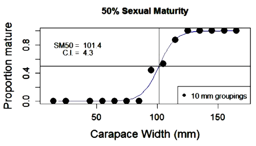
My critiques:
- Change vertical units to %
- Include 50% line/dashed line @ 50% line
- Make dots smaller
- Move legend outside of box
- Use arrow lines to point to where 50% maturity occurs on x-axis
- More informative title
- Remove outline of chart frame
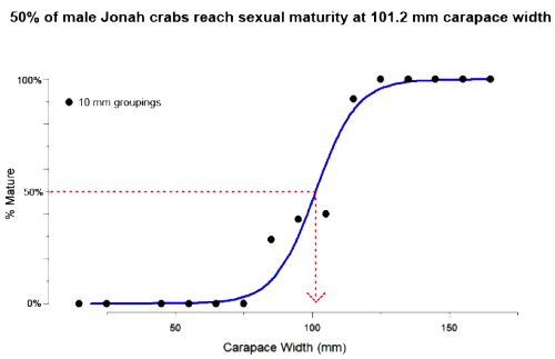
What I changed:
- Made my title active and more informative
- Changed my y-axis to read % maturity instead of proportion mature
- Reformatted the line at 50% maturity and added arrow line point at width at 50% maturity
- Edited my legend to be less distracting
- Removed outer box on graph to open up and spread out data points
And the awards for most improved go to….*drumroll*
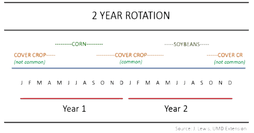
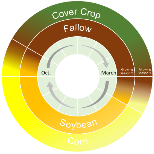
1. Keota Silaphone: Keota did a great job incorporating her critiques and advice from our first class and created something really special! Her use of color to coordinate with the different plants mixed with the perfectly circular, chronological diagram create a harmonious and inviting diagram. Where there was once a lot of confusing clutter and plain text, there is now a great flow of information that is not only visually appealing, but also dynamic!
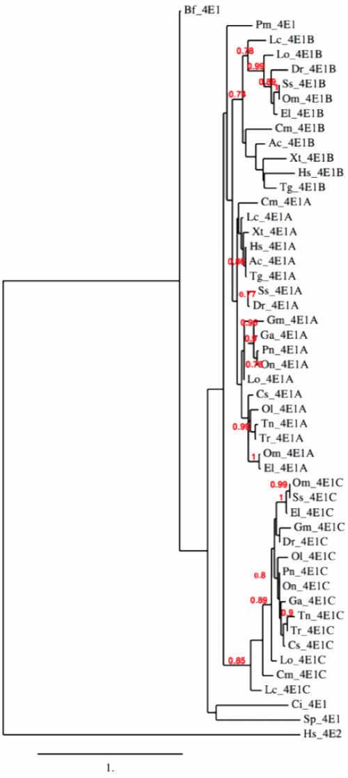
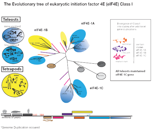
2. Kate Gillespie: I had to do a double take when I first saw Kate’s latest version of her phylogenetic tree! Kate had one of the biggest data challenges, because genomics, well, are so complicated! Another great example of utilizing color to reduce clutter, increase readability, and make the diagram more inviting. Kate’s latest version is a truly admirable piece of data visualization art full of flow and finesse.
Some final thoughts…
If I’m being completely honest, I never thought twice about putting the “before” figure in a PowerPoint presentation. After going through this graph with my class, however, I never want to go back to the original! I would absolutely recommend asking people who aren’t directly involved in your research to look over your graphs for recommendations. There is almost always room for improvement, so make sure you are open to suggestions and critiques (and don’t take it personally)! Remember to remove as much “chart junk” as possible to streamline your message and let your data speak for itself. You want your audience to be able to grasp the main point of your data as easily and comfortably as possible. Harmonize the elements in your graph to achieve great results!
Next Post > Developing a report card for the Integration and Application Network
Comments
-
MbS 9 years ago
I love how the idea of feng shui is another way of getting to right. The process of try, revise, workshop, revise, re-workship (be humble and even have a few aHA moments) is the only way to get there.
Where is there? Simple and effective communication of the complexity of science for stakeholders. We do also have the burden of "getting to right" quickly to help heal, protect, or understand the environment so we can live. Simply, to live and live well and to share better, with the others who live with us.
I agree with these "IanVizzies": Keota's story is a cycle. Kate's is a tree. Notice that those stories have a pattern that we can visualize. Other story patterns we might look for could be:
*a process forward, that is like an arrow or a timeline
*a chronology backward to look at history, so a reverse arrow or reverse timeline
*a network or relationships
*a web of relatedness, like energy
*steps for a hierarchy
*a cascade or falls of causality chains
*circle of stakeholders
*handshakes of partnershipsThank you, Noelle. Because of earlier work with you, I now think of you as symbolized by a nicely sketched Jonah Crab. :)
-
Jane Thomas 9 years ago
Hi all,
Thanks for the great feedback! Marybeth, your list of possible story patterns reminded me of some data visualization options that David McCandless presented during the Information is Beautiful workshop that Brianne and I attended.
I have taken photos of the handout that he gave us and uploaded them here, so that you can see the various visual stories and vocabularies that he mentioned:
http://imgur.com/a/lROlucheers
Jane -
Keota 9 years ago
I really appreciate the feng shui comparison since I actual do try to practice feng shui in my own home...what's great about this class is the feedback. I can work on something for hours and even days but need a break from it. I'll often ask my husband for his thoughts which helps me reset my thoughts. By reset I mean listening to what someone else thinks of my work simply lets me break away from my straight and sometimes narrow way of thinking. Through this class, we get feedback from professionals and I definitely think Bill and Jane had tremendous influence over how my "after" crop rotation diagram turned out. Thank you Bill and Jane!
-
Wilmelie Cruz 9 years ago
Noelle that is such a great way to put it! Improving our graph not only helps our presentations it also helps us better communicators.
-
Kara Hawkins 9 years ago
Looking at creating graphs and charts like feng shui is a great idea! Following easy design tips really can change how your data is viewed. Just looking at the before and after of everyone in the class, it is amazing how a few small changes make such an amazing difference. How often do we look at graphs or charts in science and are left scratching our heads? Hopefully after this class no one is left feeling that way after looking at our visualizations!
-
Kate Gillespie 9 years ago
The process of creating and analyzing data takes up some much mental energy that it often prevents one from remembering that universal interpretation is also essential.
This past week's visualization task to perform an" extreme data makeover" reminded me that the fruits of our scientific labors should not only "be" good, but must look good too.
I am personally thankful for all the feedback and inspiration this class provided to help make what was a standard phylogenetic tree pop out the page!

