Nobody gets it right the first time
Wilmelie Cruz Marrero ·Wilmelie Cruz Marrero
*A Spanish version (Nadie lo hace correcto la primera vez) is also available*
As scientists, we conduct research and spend a lot of time analyzing our data to validate our work, but do we do a good job at showing our findings to other people than ourselves? What about using visual representation of our findings - we know the saying that pictures are worth a thousand words… I am pretty sure they are probably taking about graphs. How can we improve our GRAPHS? How can we make non-scientists understand our data? Brianne Walsh from IAN mentioned that 90% of information transmitted to the brain is visual, as opposed to the 20% retention for written information. A graph can provide us more information than a whole paragraph!! There are the multiple type of graphs: pie, bar, dot, histogram, scatter plots that can be adapted to multiple data sets.
Before creating a graph we need to consider the following criteria:
- Know your audience
- Be enthusiastic about your data
- Include color (consider colorblind people)
- Readable font (NO COMIC SANS!!)
Follow the steps and then you create a graph you feel is perfect UNTIL you give it to someone else to review it… Believe me, having someone reviewing my images has helped me identify mistakes that I did not see. I am so used to my research that I forget that other people don’t know anything about it. I should make it more approachable for both scientists and non-scientists!
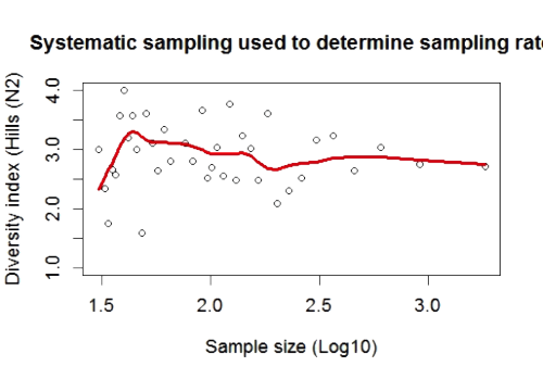
Some of the mistakes that I made in my “before graph”:
- I have an extra parenthesis
- My title is “Systematic sampling used to determine sampling rat” instead of "rate"
- Borderline is not necessary
- Log10 should be Log10
- Adding a legend for the red line which is a locally weighted regression
- I should have add a more descriptive title
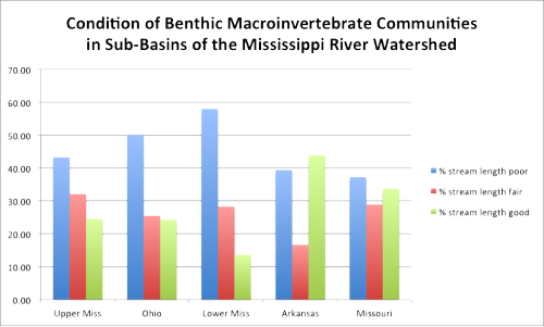
Image 2 shows another example from class where have a good start for the before class, but like we learned in class, there is room for improvement like removing the grid lines.
After reviewing all of the class graphs we have concluded the following tips for a good graph.
Tips for a good graph:
- Have a descriptive title
- Be creative (use IAN Symbols Library to describe your data)
- Avoid using acronyms
- Include tick marks in both axis
- Colors should be different for a better comparison
- Remove border lines
- Include a readable font size
- Remove vertical lines
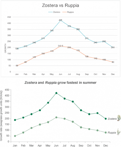
If you follow all these steps you can have a before and after design in your graph like in image 3. The after picture is not only more readable, but also gives a preview to your audience of what a seagrass look like for any audience whether or not they understand the science behind it.
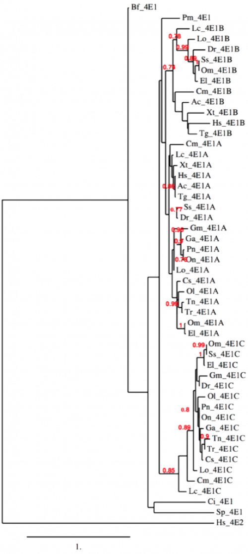
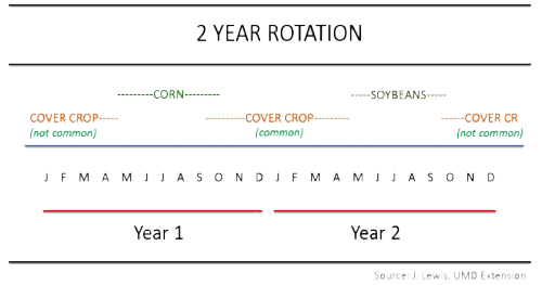
Another thing to consider is not all data can be treated equally. Some data can be visually challenging like in image 4 & 5. Where image 4 shows a phylogenetic tree eIF4E class I. Other procedures can be made to graph to make it more understandable for scientist and non-scientist. For example: making the title more approachable for audience and only focusing in one branch at the time. In image 5, comments in class showed Keota a new way to visualize her data which includes doing cycles where it can represent the two crops with IAN animations. Comments in class were really useful and help us view things in our data that we did not see.
Overall, make your graph stand alone. Don’t get frustrated in the process of making your graph. Information is valuable and graphs help us represent our data in a meaningful way, so have fun with it! REMEMBER: there are really good tools to make your graph stand out. Also, the IAN symbol library is available or be bold create your own symbols. This tool can make your data understandable without any language barrier and could attract somebody into science. If we do a good representation of our data this can open doors to new information about phylogenetic trees of eIF4E class I, new approaches to work with image data sets, understand the sexual maturity of Jonah crabs, and more. Information is limitless and if we do a good job representing it, it can travel really far…
*Spanish version of this blog (Nadie lo hace correcto la primera vez) available here
Next Post > 4 ways sea level rise and climate change are reshaping the coast
Comments
-
Caron 8 years ago
Hi, all. I like the continuation on the idea of information literacy. To be a scientist, you need to understand how systems work, why they work the way they work, and how to communicate with other scientists about your findings in meaningful ways that forward the science.
However, to make meaningful changes to policy, people have to know and understand the 'so what' in a way that is meaningful and relevant to them. In science we are sparse with our graphs, our abbreviations, our communications because time is always too little. However, learning how to shape the information that you present in ways that are more meaningful to more novice audiences will make it more impactful. However, this is like learning a new language, which takes patience.
I appreciate Wilmelie's advice to chip away at these ideas consistently over time, not just to think that you will master it right away.
-
MbS 8 years ago
I appreciate the discussion and selected images that W. presents for us. I am most struck, however, about the two design constraints that are really part of our ethical duties in communication:
First, thinking about colorblind readers, where red/green choices would really interfere with seeing and understanding.
Second, that we have (happy) duties to consider global communication and regional communication contexts. Here, W. posts simultaneously in English and Spanish. :)
The challenges of simultaneous technical publication are an ongoing problem in international environmental work, as well in development work (linked!). For example, the historical custom of the United Nations has been to publish international negotiation documents in English and in French. Working toward dual, triple, and more languages in simultaneous publication has been a rocky road. I am glad, though, to see this ethical duty arising here at the environmental science level.
-
Ben Wahle 8 years ago
Wilmelie made a really good point about how, as scientists, we often get so familiar with our research that we forget just how esoteric it can be. It is important to remember that people, even those who may use our research to make policy or regulatory decisions, may have little or no scientific background with which to understand it.
Of course that makes it even more crucial that we communicate complex information understandably. I think her bulleted list of "Tips for a good graph" gives us a great set of guidelines for what to remove (lines, words, numbers that simply clutter our figures), what to include (images, etc. that provide necessary background to understand the data being presented), and what to accentuate (colors, images, shapes that help the main points of the figure shine through).
-
Kara Hawkins 8 years ago
It's amazing how little changes with font, color, symbols and titles can make a graph into so much more than just a graph! It has become very clear, in my mind, that creating a good graph takes a lot of thought. Before this class I didn't think much of making graphs, but knowing that there are better ways to display data makes me wish I had more data to display!
-
Kate Gillespie 8 years ago
Wilmelie makes some excellent points and shines a light on why data presentations may not easily get their point across. I felt that of this blog could also have been entitled " Always room for improvement"
My take-away from this lecture of the science visualization course is a reminder that that even "simple" graphs and figures ( from a scientists viewpoint) must be relevant when the intent is to share it with a broader, possibly non-scientific audience.
-
Juliet Nagel 8 years ago
As Wilmelie says, showing your graph to others not familiar with your research can be such an eye-opening experience. As I discovered during our class discussion, titles and labels that seem obvious to you as the researcher may be unclear or even confusing to the audience.
Perhaps one reason "a picture is worth a thousand words" is that everyone views it from a slightly different perspective. When creating these visual data displays, getting input and suggestions from others is extremely helpful.
Wilmelie, I love that your blog is also available in Spanish, opening it up to an even larger audience!