How to help your audience feel comfortable: Four steps in creating clean, colorful and welcoming graphs
Jennifer Shanahan ·Jennifer Shanahan
As I listened to valuable lessons on how to improve visualization of our data during the latest unit in the IAN Science Communication course it struck me that there is a great parallel with the process of preparing to host a great party! Yes as much as we want to make a great impression the moment our guests walk in the door, similarly, we want our audience to quickly and easily understand relevant points from a data set.
But regardless of whether you are hosting a party or preparing for a really important presentation there are so many details to consider and remember. Therefore I propose you try to remember the following four simple steps to aid you in producing the best graph or party for any occasion.
- First ask yourself: why do I want to have a party? What is the purpose and who do we want to connect to? Similarly, why do you need a graph? What key message do you see in the data and who do you want to connect to? This is a crucial launch point for the process of data visualization. All too often as scientists we simply think that because we have data our audience wants to see it all. Yet picking the most important message from your data could save your audience 20 minutes of boring irrelevant facts and instead assure they walk away with just a few memorable take home points. This step includes drafting an active title which is a good test to check that you know exactly why you are building any particular graph.

Liz Meyers has done an excellent job of communicating a single message in this series of graphs despite the complicated nature of data involved. Data sets can be grouped in many ways and here Liz has decided on an approach that best conveys the key message. Credit: Liz Meyers.
- Declutter and clean! We all know this is an obvious step in hosting a great party, but oddly we are not as great at decluttering and cleaning up our graphs. I think of all the following as graph basics. Have you labelled your axes properly? Do the labels communicate the parameter accurately, clearly and succinctly? Are the units provided in parenthesis? Did you choose a simple sans-serif font and are you fonts large enough for the person in the back of the room to read? Have you capitalized only the first word and kept the other letters small case? Using all caps is like screaming to your audience. Think if this: you would never want to scream at your guest as they walk in the door!
Next how can we get rid of chart junk? Consider your axes. Do your tick marks sync up with the data or do you have extra minor tick marks? Are your data labels too frequent requiring tiny illegible font or too infrequent such that thresholds are not labelled? Also, remember programs like Excel might place your labels on an angle which is hard to read. How about the plotted area? Consider if lines crossing the plotted area are really critical. These lines are distracting to the eye and can often be eliminated altogether or perhaps you might choose to keep in just a single line to show a pertinent threshold.

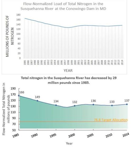
This series of graphs demonstrates the value of decluttering and cleaning up your graph. Melissa Merritt has reduced the labelling of years on the y-axis, placed a minimum value for labeling the x-axis, eliminated the lines in the plot area, and she switched to sentence case for the fonts rather than using all CAPS for the axes labels. Best of all she provided a “target allocation” line which sends a clear meaningful message to the viewer. Credit: Melissa Merritt
- Now that your house is clean you can think about the mood you want to set, the colors you want to decorate with and the smells throughout your house. Similarly with data visualization you have the opportunity to make your graph welcoming, warm, colorful and picturesque. This step can really speed up the time it takes for a reader to get the jist of your data. Colors are powerful when used sparingly however they can be terribly distracting if overused. For example your legend could use the same color scheme as your data lines or point. Better yet you can eliminate the traditional legend and place your labels immediately next to your data lines and use the same color scheme. Stoplight colors (red, yellow and green) are universal language to indicate good, fair and poor condition of an ecosystem. Somewhat like buying flowers or balloons for your party, the most fun part of producing an amazing graph is exploring and using the IAN symbols library. This incredible free resource offers almost 3,000 vector based symbols. These symbols are very user-friendly and can be edited using Adobe Illustrator to match your local species, ecosystem or storyline. You may choose to include a symbol for all your data elements or perhaps just one single image to draw in the crowds mulling through the poster session.

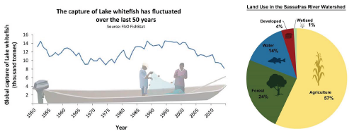
These two images use symbols to draw in the audience. In the pie chart the outline of each symbol is used with a solid fill to simplify the color scheme. Credit: Laura Wood and Holly Padget
- Before the doorbell rings with your first guest, you always want to stop, reflect, and always get an outside perspective? Ask for feedback on both details and big picture concepts. For example you might ask a friend if brussel sprouts are a good appetizer and they might also remind you that you are out of gas for the grill!
In the world of data visualization, getting an outside perspective on your graphs can be extremely insightful. Your colleague might notice a detail you missed such as data points that do not overlap with the data lines. You may not have noticed this small kink that can occur when you transfer your graph from Excel into Illustrator. Conversely your colleague might simply comment that it just doesn’t make sense.
There are so many factors contributing to research design and cofounding ecosystem factors that communicating science is not an easy task. Do not be dismayed if the feedback indicates you have more work to do. You may simply need to tweak your active title or change your entire approach. This feedback loop is going to make you a better presenter every time.
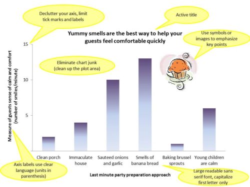
To sum it up, below is a graph of data showing how to make the best first impression on your guests…or science audience.

Next Post > Combating climate change in the floating city
Comments
-
Holly Padgett 8 years ago
Hahaha I LOVE the analogy to having a party! I was sad to have to miss last week's class but your post sums it up nicely! I especially like the part about getting feedback. I always find feedback to be so extremely helpful! Even when it seems like its not needed or you think you don't have the time for it, talking to other people and getting that feedback is always worth it!
-
Melissa Merritt 8 years ago
You combined more than one classes' worth of lessons in this blog post! I noticed your catchy And But Therefore statement setup at the beginning. Nice. I agree with everyone else that the party host analogy was a creative touch. I think it's an effective tool to bring in new readers, making this data visualization topic more relatable/understandable to people who weren't in the class. I also think you were really thorough- going over stoplight colors, excel graphing quirks, and the IAN library- you left nothing out! Good recap.
-
Kristie Gianopulos 8 years ago
This is a great way to think about this topic - first impressions, clarity, decluttering, etc.
One small thing - I thought that Bill had said text on the x axis at an angle made it easier to read, rather than vertical.??
Love your creative example graph at the end! :) -
Katie Goerger 8 years ago
Love the party idea! You're right, if the first impression is cluttered of unattractive, many people will just give up reading it and move on. This is a really useful way to remember the steps - I'm going to bookmark this one for future reference!