

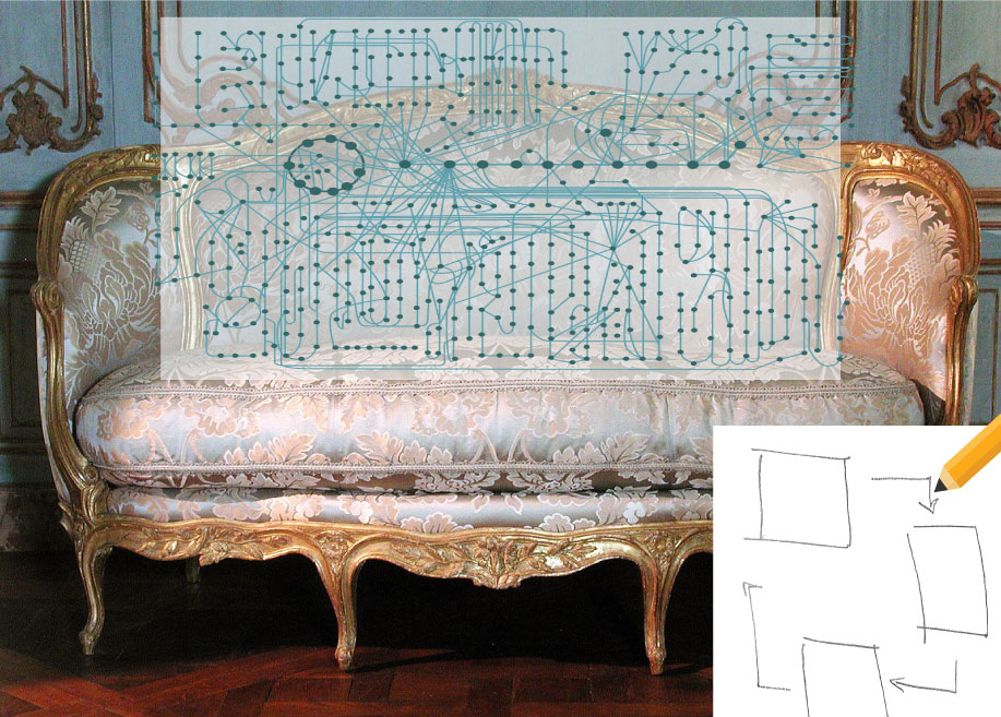
“Draw me like one of your.. Conceptual diagrams”
Alana Todd-Rodriguez ·It may have been Valentine's day on Friday, but the drawings done that day for the MEES Science Visualization class were less like Jack's steamy drawing of Rose than saucy, colorful depictions of scientific processes. Students were tasked with hand-sketching a conceptual diagram to represent some facet of their personal research, so passion was still in the air. While not quite masterpieces (yet!), the pen and marker illustrations were a preliminary attempt to condense otherwise complex topics into a series of basic symbols that convey a key message to viewers. Conceptual diagrams are one of many tools that facilitate effective science communication, as they provide synthesis, visualization, and context through symbols and concepts1. They aid in the dissemination of scientific data by transcending knowledge, cultural, and language boundaries. It is no wonder Napoleon Bonaparte supposedly said, "Un bon croquis vaut mieux qu'un long discours" (translated: "A good sketch is better than a long speech"), or Russian novelist Ivan Turgenev2 wrote, "A picture shows me at a glance what it takes dozens of pages of a book to expound."
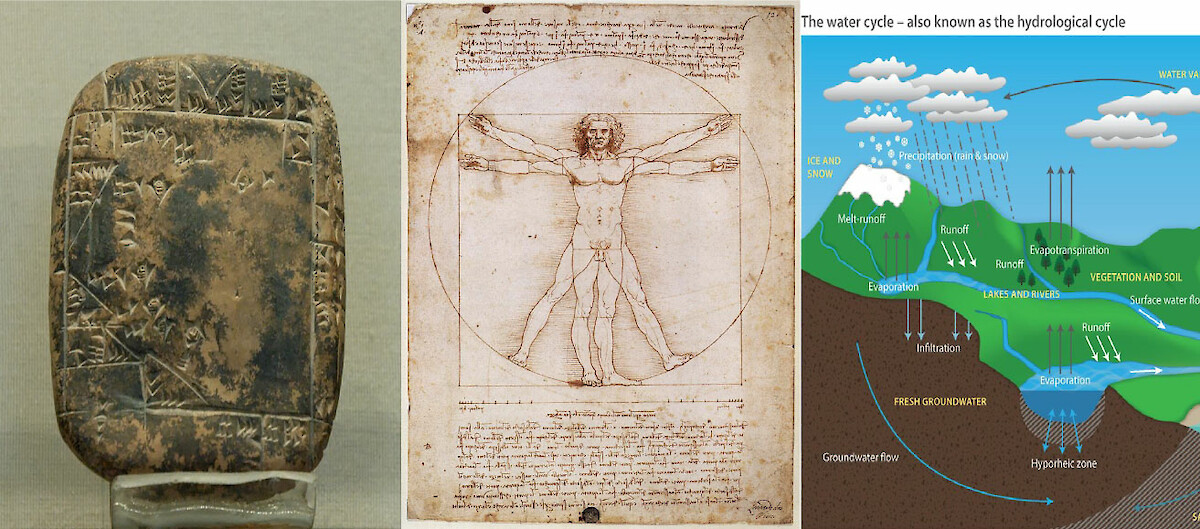
There is a reason visualizations are so compelling to humans; we have been using them as a form of communication for as far back as 73,000 years ago3. Even since the earliest civilizations, diagrams have helped us to create order in our environments, document observations and communicate otherwise unseen phenomena. For example, Sumerian clay tablets dating back to the Third Dynasty of Ur depict parcels of property and their acreage. Leonardo da Vinci's Vitruvian Man from 1490 CE combines mathematics and art to render the proportions of the human body. Today, conceptual diagrams are an essential element of science education, especially in illustrating 'big picture' processes found in nature. I'm sure most people can recall back to the time they first learned of the water cycle in primary school. The symbols that comprise conceptual diagrams have helped to simplify and abstract otherwise complicated and multi-faceted processes in all fields of science, from the social to the natural.
Conceptual diagrams are effective tools for aiding communication, but design plays a big role in their usefulness. The size, shape, color, and location of symbols are important considerations for the illustrator, as each element in the visual should help convey the key message to the audience. Although it may seem daunting, you don't need to attend art school to start creating your own conceptual diagram. Brianne Walsh, a Senior Science Communicator at the Integration and Application Network (IAN), identified some key steps to drafting an engaging and informative conceptual diagram:
- Identify the intended audience and medium for your conceptual diagram (i.e. the general public vs. other scientific experts at a conference or through a newsletter).
- Determine the main message, or issue statement, that will be communicated through the diagram.
- Prioritize the essential features and drivers that are necessary for illustrating the message.
- Develop a short list of symbols that will demonstrate the concepts and any necessary contextual information.
- Draw a sketch with a base, representing the context, and symbols, illustrating the process.
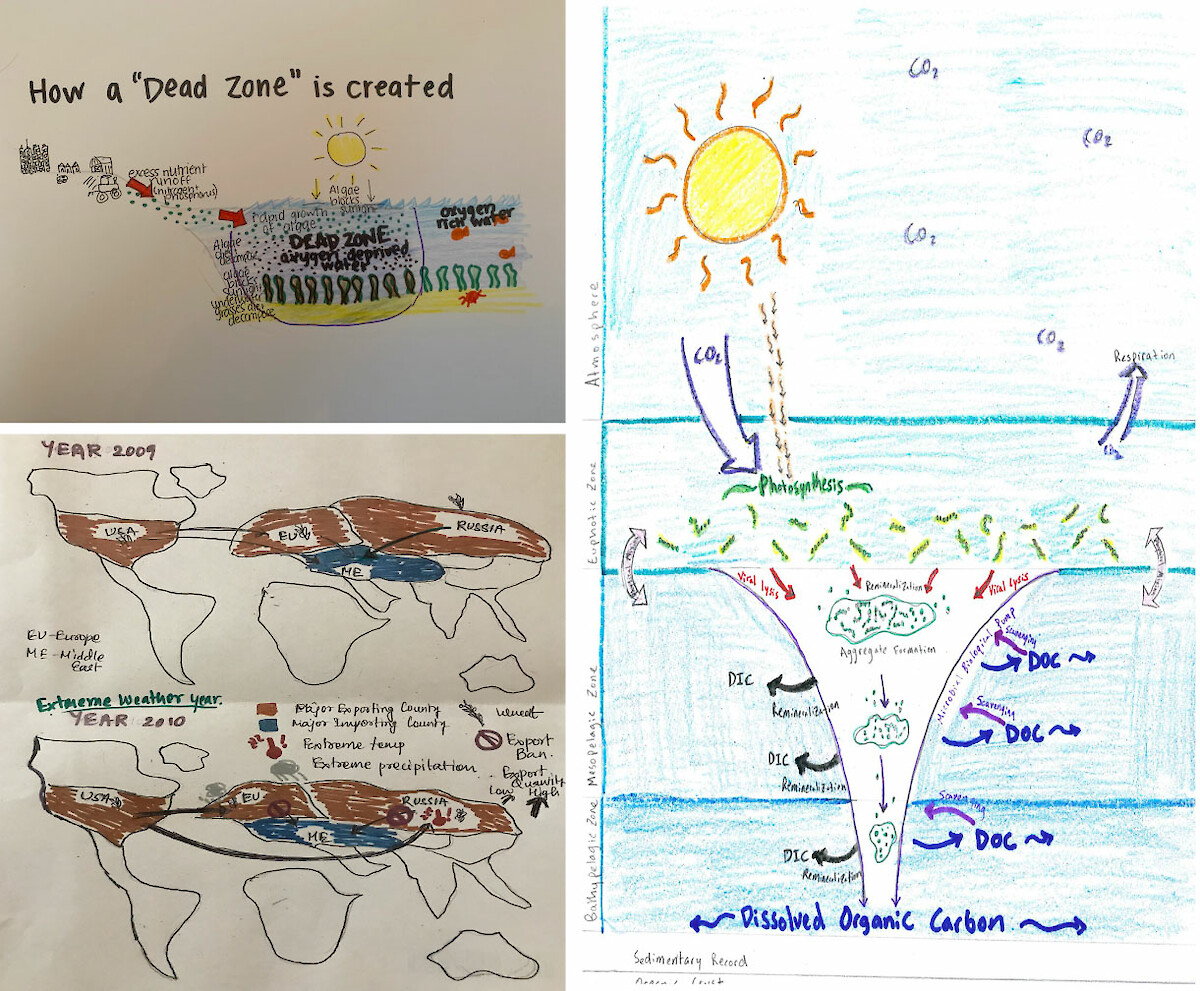
Students of MEES 708T were tasked with hand-drawing conceptual diagrams, which we reviewed and critiqued in class. Students used pens, markers, and even Snapchat to create their draft diagrams. A variety of approaches were taken to depict diverse attributes at different scales, such as two-sided diagrams, step-by-step processes, and big-picture ecosystems. The collection of symbols portrayed experimental methodologies, socio-ecological processes, biophysical cycles, and other phenomena. The instructors and student peers asked questions and provided feedback to improve their designs. Some important recommendations emerged from the discussions:
- Every conceptual diagram should have some kind of title; an active title expounds the movement and and message of the diagram.
- A process should flow from left to right, similar to the way we read (i.e. before and after, start to finish, or control vs. experimental variables).
- A background "base" ecosystem or map provides a setting to better orient the reader.
- Colors convey subtle messages, so they should be used wisely (i.e. red typically denotes negativity or to stop).
- Minimize the amount of text on the diagram, and instead put labels in the key or caption.
- The caption and key should provide the reader with enough context for the diagram, where they will understand each symbol and its purpose.
- Better yet, it's useful to combine the legend and the caption into an embedded legend, so it reads like a paragraph with symbols interjected in the text.
- If labels are necessary, consider making them a muted color, such as a grey, so that they don't overpower the other symbols.
- Simplicity is best; avoid overcrowding the diagram with too many symbols.
Conceptual diagrams offer graphical narratives that can be applied to a variety of science communication platforms to supplement, or even supplant, written text. It has become apparent to me that not every academic science program outfits students with the training and tools to effectively communicate through imagery. Perhaps that's why most scientific illustrative figures are reduced to mere line graphs and box plots, and scholars gather each year at academic conferences just to read their latest paper word-for-word. Imagine science journals and conference presentations chock-full of colorful diagrams instead of pages or slides replete with text. It would make for more accessible and engaged audiences that better understood the purpose, messages, and key take-aways by the end. The ability to develop effective diagrams is a skill that will manifest abundant returns for any scientist wanting to create impact with their research. So, for the love of science communication, go make some conceptual diagrams.
References:
-
Walsh, Brianne. "Science Visualization: Conceptual Diagrams." Youtube Video, 20:48. Posted by "Integration Application-Network," February 1, 2018. https://www.youtube.com/watch?v=ibHnJgYDgC0&feature=youtu.be
-
Turgenev, Ivan Sergeevich, Rosemary Edmonds, and Isaiah Berlin. 1975. Fathers and sons. Harmondsworth [England]: Penguin.
-
Henshilwood, Christopher S., Francesco d'Errico, Karen L. van Niekerk, Laure Dayet, Alain Queffelec, and Luca Pollarolo. "An abstract drawing from the 73,000-year-old levels at Blombos Cave, South Africa." Nature 562, no. 7725 (2018): 115-118.
About the author
This blog was produced by students in the Science Visualization course, offered by the Integration and Application Network through the Marine, Estuarine, Environmental Sciences (MEES) Graduate Program at the University System of Maryland. Bill Dennison and a team of IAN Science Communicators are teaching the course as a 'flipped' classroom so that class time is spent on hands-on training and discussions and feedback on student projects.