How to build a website that looks better than your Myspace when you were younger
Isabel Sanchez ·When I think about the Internet, I think of black magic. To this day, "the internet" is a hard concept for me to fully understand. I remember when I was in elementary school if we wanted to use the Internet, we couldn't use the phone. Back then, it was "dial-up Internet," and I had to put up with the terrifying noises coming from the phone while the computer was connecting, initially. For my brother, that noise would get him all excited, for me, it was terrifying, to this day, I do not appreciate it.

But what is the Internet? In simple words, it is a wide network that allows computers around the world to connect and talk to each other. BUT let's keep it simple, if you want to learn more about the Internet without getting a headache, I recommend this video or this simple, yet informative website.

Figure 2. How to visualize the Internet. Source: How-To Geek
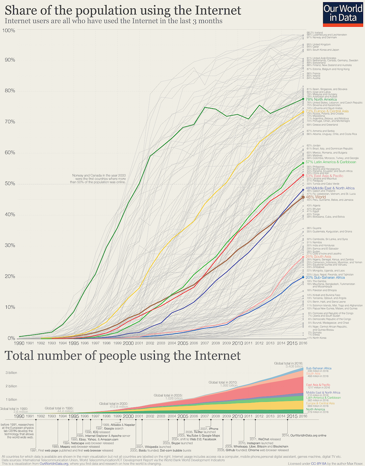
Now, let's focus. Last week we had Guy Stephens teach us about web design and how to build an attractive and effective website to communicate our scientific research. But why use the Internet? Well, nowadays, roughly 3.5 billion people use the Internet, and that number increases every day! Not only are more people using the internet than ever before, but the multitude of things they are doing while online is growing too. For example, online retail stores selling and us buying their products. Using the web can help you transform your data into an easy to digest format, and it gives you the ability to tell your story and reach multiple audiences regardless of who you are and where you are. Our task last week was to build a website following Guy's web design class and develop an interactive graph for your website.
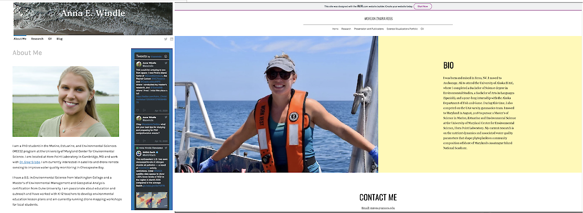
Some of our classmates are ahead of the curve, and currently have or have maintained a website long before this class. For example, Anna Windle, built her website before starting her Ph.D. at UMCES and keeps her audience up to date with her research, posters, and other accomplishments. At the same time, Morgan Ross has managed her father's website for a long time. Anna shared a list of students who started their website off of Twitter. Click here to see those cool websites.
Others, like me, have never thought about building a website. So, we followed Guy's advice on what we need to do before making our website. Guy's recommendations are the following:
Before you build your website:
- Think about what you want to accomplish with your website. If you're going to talk about your research experience, only include the information related to it.
- Identify your audience and tailor your content to that audience. This is important. Be thoughtful because if you try to target multiple audiences, you might end up serving no one. A successful product needs to understand who the audience is and what their needs are.
- Once you have identified your audience, you can perform a User Task. Here you ask people to test your website. Again, if you want your website to inform the audience about your research, can the user learn about it quickly? If they do, you have the right content if you don't, you might want to re-think and re-structure the content on your website.
- One of the most important things to do before building the website is to talk to key stakeholders and learn what their ideas and expectations from the end product are. It will make creating the website a lot easier to organize the structure and content of the website.
- Think about your content and develop a strategy. What are the basic needs for what you are trying to communicate? Use graphs, pictures, videos, charts, etc. The best way to start this is by doing a paper sketch. Having a sketch can help you test the effectiveness of your content without actually investing time building your website by having users test the paper prototype and accomplish tasks. Also, create an inventory, think about how you are going to promote, evaluate, and maintain your content.

- Lastly, before you move on, visit other websites, find their weaknesses and strengths, there is always room from improvement. Visiting other websites will help you organize your ideas and content effectively and see examples of how similar content is displayed and organized. The list of students who started their website off of Twitter is a good place to start "stalking" other websites.
What makes a website a good website?
- Design! A well-designed website will make it successful. A good design goes beyond how it looks; it also involves how it works.
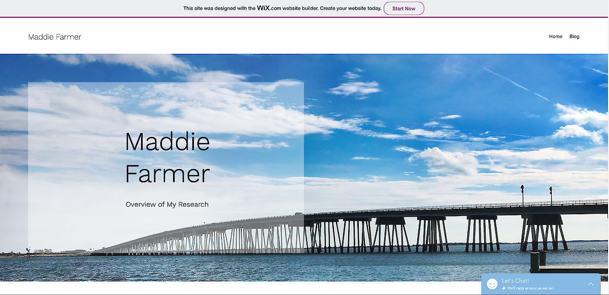
Figure 6. Maddie Farmer's home page
- Content! This is why people re-visit your website. Good quality content is critical, and it keeps your audience focused.
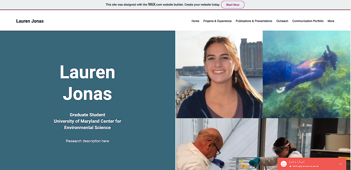
- Technology! It should be invisible, and it should only be there to help.
- User experience! The audience should be able to accomplish their tasks and have overall satisfaction.
- User interface! Keep things simple, be consistent, use a purposeful layout or template, use color and texture strategically. Use typography and fonts to create hierarchy and clarity on your website.
Hyperlink to an infogram of a word cloud
Talking about content, though. Here are some cool tools, recommended by Guy to help you create interactive charts, maps, graphs, and other visuals so you can make your website pop.
- Tableau Public - This platform is free and useful. You can upload your data and publish it anywhere on the web. However, learning Tableau can be hard and time-consuming at the beginning.
Taylor Armstrong Tableau
Anna Windle Tableau
- Infogram - is very similar to Tableau but more user friendly.
Maddie Farmer Infogram
Srishti Vishwakarma Infogram

- Chart.Js requires Java and HTML coding knowledge; however, it is powerful, simple, and free. Other tools are Leaflet, FusionCharts, Google Charts, and many more.
And finally, here are some platforms you can use to create your website:
- HTML, CSS, and JavaScript are here to help you build your website from the ground up, BUT this requires previous coding skills, and so can be more time-consuming if you are looking for a quick way to build your website.
- Squarespace offers an inclusive website, easy to use with a robust, extensive, and stable platform. It is very customizable, inexpensive, and is good at handling numerous visitors without losing your pretty website.
- WordPress is a hosted platform from WordPress, easy to use with numerous templates with inexpensive subscriptions. The only downside from this website is that you have to get the business plan to embed interactive documents into your website.
- Wix is another platform similar to Squarespace and WordPress
Whether you want to communicate your research, sell your products, or build a portfolio, these guidelines will help guide the way to a useful and beautiful website. And keep in mind that a website is a living document, it will always need to be updated and you might even change your layout after a couple of months or years.