

Let your data speak! Less is more…
Srishti Vishwakarma ·On the last Friday of February, we learned the concept of Data Visualization in MEES Science Visualization class. Data Visualization was born a long time ago (Friendly, 2008). Humans have continuously evolved and tried to showcase their experiences. For example, Cave paintings displayed wars and battle fields. However, those were earlier artistic events sometimes falling under the category of infographics when no data is required showing an older form of art. With advancement in science and engineering, humans have more data to show what they want people to see. The data need to tell a story through simple figures of illustration (Kirk, 2012). There are many pioneers of data visualization and their practices are still seen today.
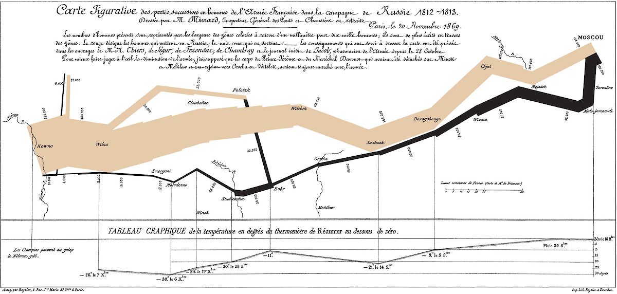
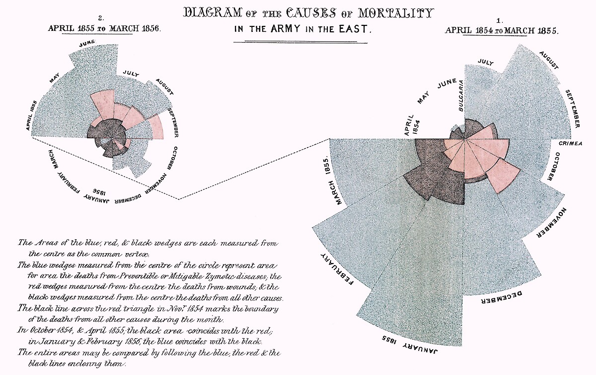
Charles Joseph Minard, a French civil engineer, was a specialist in cartography to display his data. The beige area represented the way forward of the army and thickness shows the size of army, whereas the black line shows the size of army returned and the concept of thickness still applies. The thin black line at the bottom shows the temperature faced by the army. Another example is from Florence Nightingale, "mother" of nursing practice, where she provided a monthly presentation of deaths in the military hospital when she was appointed there. Likewise, there are plethora of evidence that data visualization had remarkable contribution even 200 years ago. In fact, those practices are still observed today.
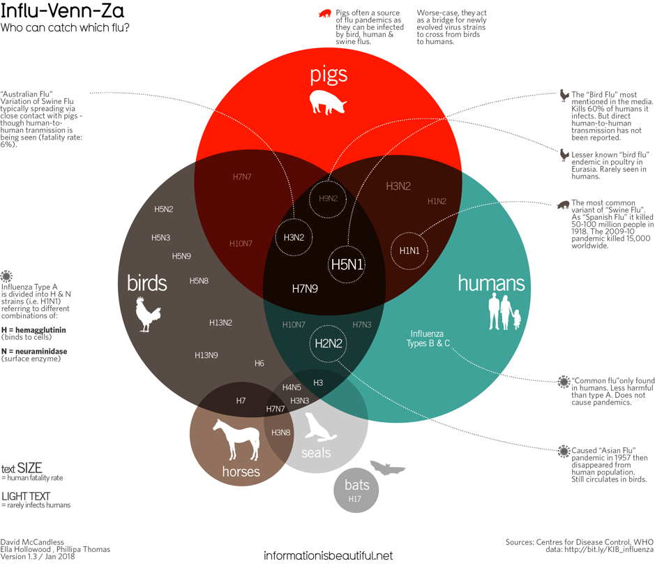
Even today, the concept and application of data visualization have not changed a lot. A graph in data visualization should deliver effective and succinct (Friedman, 2008). David McCandless, a British data-journalist and founder of visual blog Information Is Beautiful, in his TED talk also showed that a complex message should be simple enough to be understood by audience. Prof. Edward Tufte, an American statistician and emeritus faculty at Yale University, also explained that an information can be displayed effectively without confusion. He has also published lots of books on data visualization which could be worth exploring. These exceptional examples set an inspiration for students who have started learning ways to deal with lots of data, and extract the relevant information.
The aim of MEES Science Visualization class was to introduce students with the theory and concepts related to data visualization. Before attending the class, Emily Nastase, Science Communicator at Integrated and Application Network (IAN) provided an overview of data visualization through flip classroom lecture. In that lecture, she discussed the goal of data visualization is to communicate clearly and efficiently. We can use various ways to display our data. For example, graphs, plots, charts, etc. A good visualization helps to untangle the trends, insights, and complex datasets. She answered three questions during her lecture: why we need data visualization?, what makes a good visualization?, and what is the process of data visualization?
Why data visualization?
- To represent or synthesize our data
- To represent data that people cannot see
- To represent context
She also mentioned pioneers of data visualization like Tufte and McCandless, and their principles like content-driven, presentation facilitates thinking, small multiples, influence yourself, remember visual languages, simplicity is good, re-skin the wheel etc.
What makes a good visualization?
- Data
- Good story
- Clear overall goal
- Choice of visual form
Data visualization process?

"Function follows form" where function is data, and form represent design elements to convey your data.
Her number one tip was "Get an objective opinion". Upon which she added "Your data should be the element that changes not the font or colors or graphical elements".
Students were requested to submit their past plots/graphs/charts regardless when it was produced and for what purpose. The class was not merely reading text and having discussion on the topics learned. It was more of discussion with student's own work in a collaborative environment. The discussion proved beneficial in figuring out the theme and issues in the data visualization.
Below are some highlights from the class:
- Think about your intended audience before beginning the visualization
- Choose colors wisely considering color blinded people (Color Blind, Color Scheme )
- Font should be adequate in legend and tick marks
- Notice whether your image is self-explanatory or not
- Using parenthesis for units of parameters in labels
- Clear up the figure: remove horizontal grid lines, for example
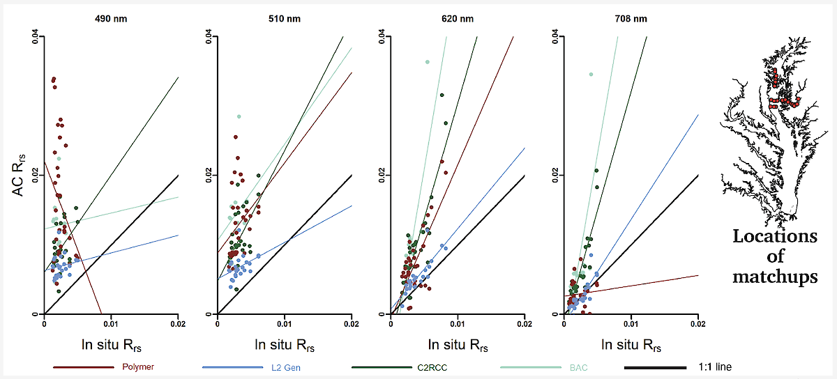
- Picking representative sites and display them in a map
- It is not necessary to show each and every data point
- Use effective colors
- Be consistent with the lower and upper cases in axis and title
The key to have good data visualization is to have fun while working on it!
References:
Friendly M. (2008) A Brief History of Data Visualization. In: Handbook of Data Visualization. Springer Handbooks Comp. Statistics. Springer, Berlin, Heidelberg
Vitaly Friedman, "Data Visualization and Infographics," Smashing Magazine, January 14, 2008, https://www.smashingmagazine.com/2008/01/monday-inspiration-data-visualization-and-infographics.
Kirk, A (2012) Data Visualization: A Successful Design Process. Birmingham: Packt Publishing, ISBN 9781849693462.
About the author
This blog was produced by students in the Science Visualization course, offered by the Integration and Application Network through the Marine, Estuarine, Environmental Sciences (MEES) Graduate Program at the University System of Maryland. Bill Dennison and a team of IAN Science Communicators are teaching the course as a 'flipped' classroom so that class time is spent on hands-on training and discussions and feedback on student projects.