What Makes a Good Data Visualization?
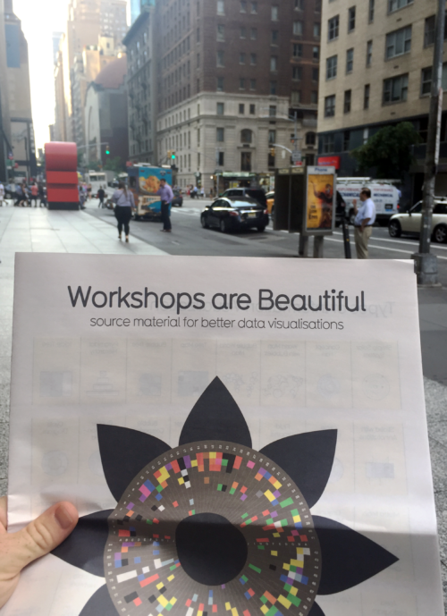
Dylan Taillie · | Learning Science |As the only two Science Communication Assistants on the Integration and Application Network’s little team, it was a great feeling for Emily Nastase and I to venture out on our own and attend a workshop in New York City in search of new ways to present data and expand our science visualization toolboxes. The workshop fell on Monday, August 21st - the same day as the eclipse! - down in Midtown Manhattan, at the Dolby Theatre on 54th St.

Our teacher was David McCandless, a data visualizations expert from London, UK. For a number of years, McCandless focused his efforts on creating valuable and understandable visualizations for data that can be dense and hard to understand. He has also written books on the subject, such as Information is Beautiful and Knowledge is Beautiful. Luckily for us, he also gives workshops about his creative process and some of the techniques he uses to develop clear and vivid data visualizations.
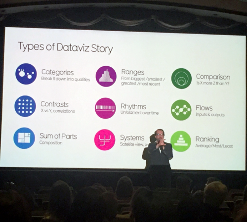
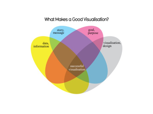
McCandless led an interactive workshop with multiple activities to assist in data visualization and communication, and lectures about his own creative process to help inspire our own creativity and endurance. To start off, he talked about the components of a great visualization, and offered examples of how he manipulated huge or complicated data sets into understandable visualizations. We then jumped into an activity he called concepting.
In concepting, McCandless challenged us to find a partner and brainstorm ten concepts for infographics and visualizations that were not necessarily related to our field of work. My partner and I came up with ten solid ideas that would be pretty cool to visualize, here are a few:
- Relate the bike sharing program in NYC to number of bike accidents, particularly to see if there was a notable increase after its creation. Have a heat map for hot spots of bike accidents in the city.
- Relate the aspect ratio of a fish’s caudal fin to its speed and food source.
- Relate changes in the president’s cabinet to roster changes in a minor league baseball team.
- Relate health care choices in countries across the world to their average life expectancy and hospitalization rates.
- Relate abandoned buildings in Appalachia and their relation to the change in mining jobs as a heat map (oops – this one was sort of work related for me!).
Concepting really interested me because it allowed us to escape the sphere of work-related ideas of data and think of concepts we are casually interested in. Then, we could dig a little deeper into what may be affecting or relating to that idea. After this activity we found a new partner and explored more concepts, but this time we took a new angle: relating the concepts to their metrics, or finding out how these ideas could be measured. This was followed by the introduction of the bottom up process which really brought the concepts that we had learned so far together. This progression involves identifying ideas and metrics, choosing an appropriate visualization, and finally mapping out your visualization. McCandless had lead us through the bottom-up process without us even realizing!
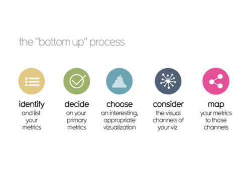
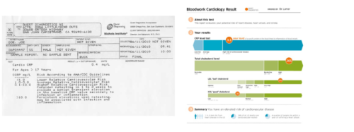
This led us to the next step of the process: choosing an interesting and appropriate visualization. McCandless gave us a list of visualization techniques, and asked us to sketch out our visualization using one of them. He always seemed to have great examples to keep us on the right track. One of my favorites was the improvement of a typical report one would get from their cardiologist.
This activity led us into lunch time, and it just so happened the solar eclipse occurred during the workshop! We broke for lunch and joined the hordes of people crowded around central park to catch a glimpse. While the eclipse only covered 70% of the sun, we still anticipated watching it. We found it fascinating, albeit slightly disturbing, that that the majority of people looked straight up at the sun with no eye protection. Emily and I saw the sun through my camera, but we mostly focused on eating lunch and people-watching – that was much more exciting.
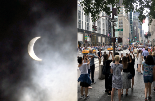
After the late lunch and eclipse viewing, we finished up the day by reviewing more workshop participant diagrams. McCandless then left us with ten tips on displaying your data visualizations:
- Fonts speak
- Make text work harder – text is a graphical element too.
- Re-skin the wheel – don’t throw out what you already use, just design it better.
- Color, color, color – colors must be chosen specific to your subject matter.
- Grids are good
- A hierarchy of information – there must be structure in the presentation of your data.
- Remember visual language – add an icon if possible to peak readers interest.
- Less is more –what you can take out and still keep the same message?
- Influence yourself – keep your mind nimble by looking at good data visuals online.
- Have fun!!!!!!
Overall, I thought that the workshop was worthwhile, and we were very happy with the variety and engagement of the other participants. Participants who we worked with were mostly working in the education/non-profit sectors and seemed to be both young and predominately female, so both Emily and I felt right at home. This blog only touches on a few of the concepts that David taught us. To learn more, I highly recommend heading to an Information is Beautiful workshop.
About the author
Dylan Taillie

Dylan is a Science Communicator with IAN. He has experience in various areas of visual information, science communication and technical analyses. Strengths in data management, environmental assessment and stakeholder engagement. He has worked with IAN in various positions since 2016 and enjoys fishing and hiking.