A Gestalt of 0s and 1s: The Tips and Tools of Web Design
Alyssa Wellman Houde · | Science Communication | 6 commentsAlyssa Wellman Houde
For our last week in class, we decided to focus on a topic that puts all of the graphics we have developed and techniques we have honed over the semester to use: web design. While creating your own website can seem a bit intimidating initially, a website can be a great way to showcase and provide credibility to your work.

Our professor, Guy Stephens, led us through a few simple steps that can help streamline the process:
- Define your business case or end goal. What do you want to include in your website? What is the overall purpose?
- Define your intended audience. Who is this website for? Don’t be afraid to get specific!
- Determine your users’ needs. What tasks do you want users to be able to do on your website?
- Do a little research. Workshop your website and get some feedback from potential users. What works and what doesn’t?
- Determine your content.
- Take an inventory of what graphics you already have.
- Create or source new material (if you find you don’t have what you need).
- Promote your content! Get the word out there!
- Evaluate your website – analytics are available to monitor and assess your website’s success at reaching your target audience. Check in and see how your site is doing!
- Maintain the relevance of your material. Periodically check and ask yourself if anything on your page is dated or no longer factual.
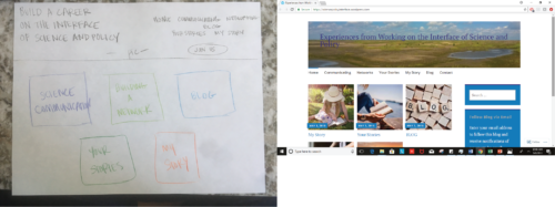
- Make a mock-up. Paper versions of your website can be a helpful tool to visualize and edit your website design before putting in all the hours to get the site online. It is much easier to fix something on paper than further down the line!

Now that you’re onto your paper prototype – and soon the realized web page - it may be helpful to keep the following in mind when designing your page.
- Your overall design. A sleek, well designed, website can vastly improve user experience, help to boost your credibility, and eventually help you create a brand.
- The tech behind your website. What program do you intend to use? Are you a beginner or a pro at web design? You do not need to code put together a cohesive site, you just want to make sure that you use the program that is the best fit for you. Don’t let the technical aspects of web design be a limitation or show that limitation to your audience.
- User experience. Is it possible to complete the user tasks you initially planned? Is your site visually interesting enough to hold a reader’s attention span?
- User interface. Tying into a couple of the previous points, the easy of navigation of your site can have a huge impact. Is your site intuitive? You are bound to have less web traffic, if it is incredibly difficult to access your content.
- Your content. At the end of the day, this should be the most important aspect of your site. All design with no substance would make for a poor website.

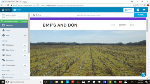
While it is a lot to keep in mind, I know that following this process personally helped me. As a novice web designer, each step served to break the large overall goal into smaller less daunting tasks. As with all of the work we have produced over the semester, these websites can always be improved and edited. These guidelines provide a good framework for starting but, at the end of the day, it is up to you to take a look at the entire picture and see what works the best for the story you are trying to tell.
Next Post > Pigs in Water: living underwater with Susan Williams
Comments
-
Bill Dennison 8 years ago
Alyssa’s excellent blog represents the last student blog of the semester. I had a wonderful time with this class and enjoyed the class time discussions and thoughtful blogs. I also especially enjoyed the fantastic science visualizations produced throughout the semester. I took this Monty Python song “Always Look on the Bright Side of Life” and adapted it for this Science Visualization class.
Always Look on the Bright Side of Life
4 May 2018
William C. DennisonCheer up, Class. You know what they say.
Some science communication is bad,
It can really make you mad.
These things just make you swear and curse.
When you're chewing on science gristle,
Don't grumble, give a whistle!
And this'll help things turn out for the best...
And...
...always look on the bright side of life!
(whistle)
Always look on the bright side of life...
If science seems jolly rotten,
And there's something you've forgotten!
Then it’s time to laugh and smile and dance and sing,
When you're feeling in the dumps,
Don't be silly chumps,
Just purse your lips and whistle -- that's the thing!
And... always look on the bright side of life...Always look on the bright side of life...
(whistle)
Life without science is absurd,
And data's the final word.
You must always face the audience with a bow!
Forget about being too serious -- give the audience a grin,
Enjoy it -- it's your big chance anyhow!
So always look on the bright side of data!
Just before you draw your conceptual diagram.
Science can fill the gap,
It covers the entire map.Life's a laugh and powerpoint’s a joke, it's true,
You'll see it's all a show,
Keep 'em laughing as you go.
Just remember that the last laugh is on you!
And always look on the bright side of life...
(whistle)
Always look on the bright side of life. -
forhad 7 years ago
Tnx. for your in depth analysis for web designer and developer. Your highlighted point are very much important for web designer.
-
Nicole Basenback 8 years ago
Great blog! I like how you summarized Guy's lecture with the bullet points. I agree with Lexy that drawing out/storyboarding ideas was an extremely productive process. It helped me organize the details while still considering the big picture/end goal, and it can be applied to basically every product we used in class. Cheers to an awesome semester!
-
Lexy McCarty 8 years ago
Alyssa, nice blog! I enjoyed how you included your paper prototype - that is one of the major lessons I have learned from this class. Regardless of what you're making, I have learned that it is best to start by drawing it out. You then go on and highlight some of the key points to keep in mind when beginning to design your webpage. I think this blog is very helpful and worth the read if you're a first-time blogger (or even a seasoned one)!
-
Tom Butler 8 years ago
Alyssa, this blog is wonderful. It was very easy to read the bulleted points and it had a good flow representing the way that we worked through planning and then making our sites. I think that under the determining content section it might be beneficial to have a bullet point on how people will view the site. Since not everyone works on a desktop these days it might be a worthwhile consideration when planning for mobile and tablet users. Overall, I think this blog was very well thought out and a worthwhile read.
-
Erin 8 years ago
Great job Alyssa! I think you pulled out very useful points and emphasized how important it is to think about the function and purpose of your website before you make one.