Designing Posters that POP!
Caron Gala · | Science Communication | Learning Science | 5 commentsCaron Gala
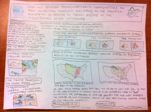
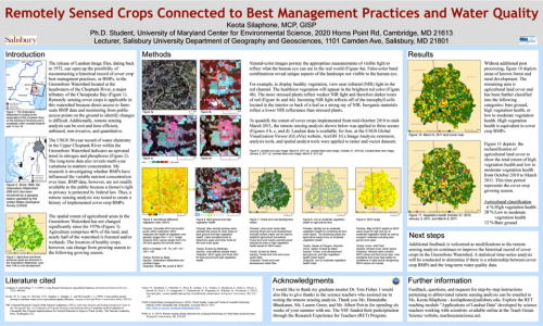
Academic poster sessions are now a mainstay for workshops, professional meetings, and collaborative conferences. The audience that you are designing the poster for will determine what the content of your poster will be. However, regardless of how you communicate your scientific outcomes, seek feedback, or articulate methods, you will want to follow some simple design/layout rules for your poster.
Helpful guidelines:
- Make sure that your title is as short as possible.
- Take advantage of the subtitle—don’t be shy, tell the audience a little more.
- Always identify funders with logos in top or bottom corners of the poster.
- Limit the amount of paragraph text (maximum of 800 words)—you do not want to mentally exhaust your poster reader!
- Keep fonts relatively uniform or use simple, straightforward font pairs.
- Your images and text boxes should be on horizontal and vertical grids.
- Make sure that if you have legends, that each legend is clear from a meter away.
- Typically, three columns on a horizontal poster will use the reader’s tendency to move sequentially from left to right as they view the poster.
- Horizontal posters accommodate the natural vantage points of a broader set of readers.
You really want the poster audience to be able to take interest in the poster narrative similar as one takes in information on a billboard. Bright colors and large text with clear messaging will make your poster more appealing to the ‘drive-by’ reader. As a result, you will likely engage new contacts that you are not already connected to. Reinforcing key elements of the narrative at more distant vantage points can grab the reader’s attention.

The second way a person will read it is standing next to you (or by themselves) right at the poster. You want to make sure that when an individual is standing close to the poster, it will take them only about three minutes to take in the information on the poster. After they’ve paused for a moment to read (scan) the poster, you can lead them through it directly. Remember, facilitated poster-reading is always more effective than self-led poster reading. The more interaction that you have with the individual as they are taking in information about the subject, context, purpose, and outcomes of your study, the more they will take away from your poster. It is a tool to facilitate greater communication.
“Smearing” a paper across a poster surface is unappealing to audiences at both distances. You can perfect all aspects of design for your poster but it can be too inefficient of an information exchange if you put more words on the poster than a person can read standing in front of it.

Have fun making your poster! Presenting a poster is a great way to include all elements of visual communication because it is both a visual and a literary form. Use photos, graphs, and the story narrative to create an effective medium.
Finally, I tend to agree with those experts who argue that you shouldn’t include an abstract on your poster—that your poster is an abstract of your work. Additionally, it was advised during class to minimize the literature cited. You can always provide a literature list to those interested. Also, some discussants in class like the colon in the title and others didn’t. I would suggest not using a colon because it just makes your poster title longer.
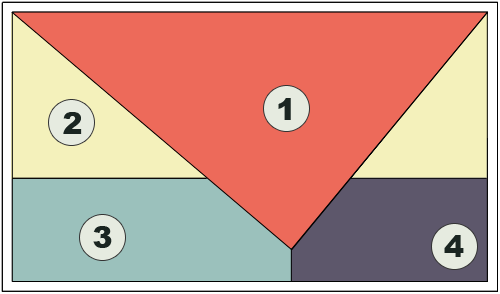
Looking around there are other resources that you might want to acknowledge and use. For example, there is a great graphic on this page that talks about how people read posters.

They make the point that people typically read section 1 first (and if they look at the poster up close, they may look at it more than once), so that is the most important section of the poster. The other information is supportive. So, if you want to make your poster POP, you want to focus on this section.
Some great poster designing links that are full of tips include:
Colin Purrington Poster Design Page
Nature Education Scitable
University of Wisconsin
Next Post > WWF-UMCES Retreats Poetry
Comments
-
MbS 10 years ago
Smearing a paper across a poster board. Thank you for that, C, for that is what I did in my first version. My project includes about 17 people across five institutions, so I think we all smeared..... :)
I am struck by the idea of the poster as a visually-enhanced abstract, from class, but an important take away.
Your idea of handouts to carry information for selected readers is helpful, particularly the sources list. This leads me to think also about whether the poster can stand alone. Hosted sessions mean you will be there, with the poster.
Powerpoint presentations are like this too: some stand alone, while others are really a partner with the speaker.
I agree with BW above about the scanning/reading pattern image from UW. Really helps us design for the audience eyes and not the structure smear of an IMRAD (Intro, methods, results, analysis, discussion) paper.
-
Kate Gillespie 10 years ago
Thanks for sharing this, Caron! The way in which we "read" information on a poster was especially useful to me. I imagine that the marketing psychologists had a hand in formulating this, like the way we are "directed" to be focused on name bands when we shop.
-
Ben Wahle 10 years ago
Great blog, Caron! I really like your analogy of reading a billboard. I definitely tend to give conference posters the same passing glance as I give billboards on the highway. It really does take a big bold phrase or image to make me actually read it.
That graphic of the order which people read posters is really cool too. You provided some great advice!
-
Noelle O. 10 years ago
I agree with leaving off your abstract from your poster and allowing the poster to be a visual representation of the words. Besides, your abstract will already included in the conference booklet if anyone is really interested in reading it!
Thank you for the U Wisconsin poster tips! I tried to keep that in mind when redesigning my poster. Reminds me of hearing about how infrared cameras can be used to track eye gaze and facial movements. I first heard about it being used to track how people perceive different types of written communication, but I couldn't find a link for it. Instead here is a link to a lab using this technology to better understand how children with autism react to different social cues:
http://www.emerson.edu/news-events/emerson-college-today/face-autism-research-lab-launched#.VxkLZTArLIU
-
Dean Brabin 9 years ago
I agree, Great blog, Caron! Yes we have to make sure that we are designing poster right that is according to targeted audience even they are kids, youngsters or senior citizens. Our purpose should be clear from poster's appearance.
Thanks
Dean Brabin
(Thomas Dean Design)
https://thomas-dean-design.co.uk/