Integrating science, message, and design
Liz Myers · | Science Communication | 5 commentsLiz Myers
Dancing among disciplines to protect ecosystems
Science communicators pursue an ambitious, worthwhile goal. We integrate knowledge across disciplines and fields of expertise - physical and life sciences, rhetoric, art, psychology, public administration, publishing, and digital technology - each with its own rich history and strikingly different culture. We reach optimistically across the divide between research and practice, hoping to shine light on complex subjects and thereby inspire action, expand minds, shape policy, and improve ecosystem health.
It's not an easy task. Our backgrounds as scientists and communicators vary, but I suspect we all have a tendency to embrace, or even favor, fields based in rational inquiry. When we try to engage wider audiences, we must draw on artistic principles of design to make scientific concepts accessible, compelling, and beautiful.
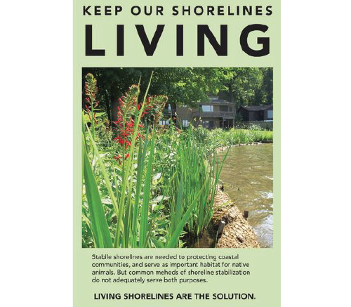
As students in IAN's Science Visualization course assemble the components of their semester-long work (graphs, symbols, diagrams, maps, photos) into full-fledged newsletters and posters to be shared with real audiences, we have seen the creative process in action. A few themes have emerged from this experience as we wrangled with the science, the design, and the and-but-therefore (ABT) narratives.
Design projects evolve in different ways. Storyboards are a useful approach to planning a publication's narrative and envisioning a layout based on solid design principles, and Adobe InDesign software is an ideal tool for compiling the pieces, as we learned in two IAN videos: Publications and Storyboarding and InDesign Tutorial, presented by Alexandra Fries. Each student began their publication project using the storyboard as an organizing tool, but we also learned that there is not necessarily a clear, linear progression as we move toward our final product. A publication's layout—even its content—can shift midstream in response to feedback and reflection on design dilemmas. Sometimes it's helpful to print out what you have and take a step back, even if you're not close to finished. Doing so can help you get a sense of where adjustments will help you achieve balance, alignment, consistency, and clarity.
Integration is hard work. Some of us experience an uncomfortable tension between attending to our overarching message and design, on one hand, and wrestling with important technical details, on the other hand. This discomfort, articulated by classmate Jen Shanahan, feels deeply familiar to me. The dance between details and big-picture thinking is a necessary part of the integrative, creative process, and it can lead to moments of illumination. But it's helpful to shift your mindset when the dance becomes too frustrating—take a walk or listen to music. Give the other side of your brain a chance to pitch in.
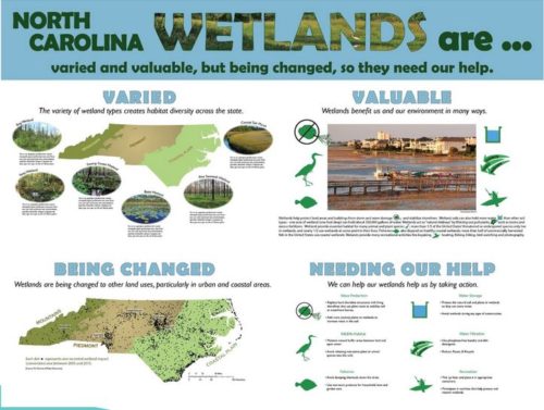
Teamwork counts for a lot. One of the best poster drafts shared among classmates was developed by Kristie Gianopulos and Amanda Mueller, who have worked together throughout the semester, at times showing their individual, in-tandem drafts of the same diagram or map. Together, they created a single, information-rich poster that tells a clear story and reflects input from instructors and fellow students.

Staying grounded in the message is critical. Whenever classmates struggled with decisions about content, wording, and design, instructors reminded us to revisit the ABT statements underpinning our narratives. This approach shed light on ways to make headings more active, and how to structure the sequence of information so that audiences will embrace key messages. In fact, the struggle to formulate clear, compelling, active headings popped up again and again for most of us, as our attention during the design process flitted from aesthetics to scientific accuracy to program goals, and then returned again to the underlying narrative and message.

The audience should stay in the foreground. If revisiting the message is key to the design process, staying focused on the intended audience is also absolutely fundamental when making decisions about our publications. Efficiency may dictate that we usually address more than one audience in a single publication. But it is also realistic to acknowledge that our range of potential audiences is vast, and sometimes it's not possible to communicate with all of them in a single publication–in which case, we may need to prioritize. Being explicit about who we expect to reach with our messages/publications can help us set priorities and make crucial decisions during the design process.
Harnessing the power of the project site; or, beyond the poster session
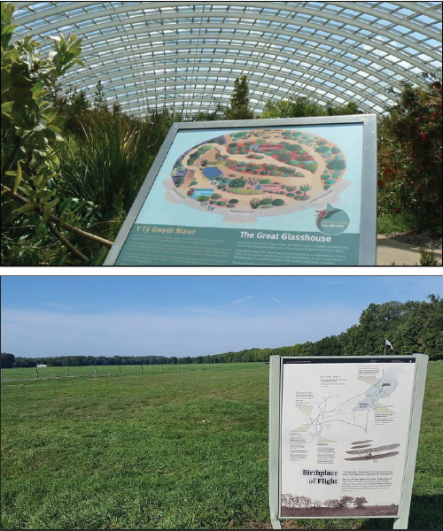
Scientists usually think of posters as a means of attracting attention and sharing information with professional peers at conference poster sessions. But posters can also be viewed more broadly as signage, offering a chance to reach a much wider range of audiences who may become deeply interested in the work of a program at a specific time and place.
Imagine, for example, the experience of a hiker at a trailhead, a boater at a public launch area, or a school group or government leader touring a wastewater treatment facility. At a single moment, these individuals are immersed in sounds and smells unique to the site, in a rich real-world experience that can inspire awe and interest. In these crucial moments, a well-designed sign/poster can convey a message that will stick, making sense of a rich experience and providing crucial context. A sign or poster here could seize on a "teachable moment" that is impossible to replicate with a newsletter or website, answering key questions at a moment when minds are open and ready to learn.

If designed for this type of setting, posters or signage should not replicate the same thing that visitors see when they are standing at the site, but should instead reveal important details that would not meet the visitor's eye – insets showing what's underwater, graphs depicting changes that have occurred over time, maps showing how the site relates to a larger watershed or ecosystem. A simple website listing or QR code can help visitors find and bookmark the program website, so they can learn more about the project later on.
While the size of the audience reached at these sites is likely smaller than the one reached by mass-mailed newsletters or a website, the potential to make an impression on a highly motivated audience is powerful and unique.
Next Post > The Basin Report Card Initiative goes to Monterrey, Mexico!
Comments
-
Amanda Mueller 9 years ago
The idea of,
"Imagine, for example, the experience of a hiker at a trailhead, a boater at a public launch area, or a school group or government leader touring a wastewater treatment facility. At a single moment, these individuals are immersed in sounds and smells unique to the site, in a rich real-world experience that can inspire awe and interest. In these crucial moments, a well-designed sign/poster can convey a message that will stick, making sense of a rich experience and providing crucial context. A sign or poster here could seize on a “teachable moment” that is impossible to replicate with a newsletter or website, answering key questions at a moment when minds are open and ready to learn."
was a total Ah-ha moment for me! It opened up a world of possibilities as Kristie and I consider ways to educate our various audiences. Thanks for the great inspiration! -
Kristie Gianopulos 9 years ago
Love it! Great job.
I think one of the major surprises I learned from these lessons is the amount of time it should/would take to create a publication - on the order of a few weeks for a poster or report card, a few days for a conceptual diagram. This was very helpful in adjusting my expectations! -
Jen Shanahan 9 years ago
The first paragraph is amazing! It is clear Liz is a very successful writer....I appreciate the depth she has provided in this blog in the sense that this is "hard and critical work" - After reading this I feel like Liz knows my daily career challenge way better than most of my coworkers who are focused on daily tasks of managing open lands. Science really matters but only if we can use it, apply it with our audiences and in turn maintain long term support for it, right? In an era of fake news and lying leadership, science communication matters even more (I think..?).
-
Melissa Merritt 9 years ago
This was really nicely worded blog! I really enjoyed it. I think your beginning paragraph really pulls the reader in. It was a great overview of things we've done this whole semester, as well as recent classes, and I appreciated the addition of other information, such as the suggestions regarding project site signage.
-
Katie G 9 years ago
"A publication’s layout—even its content—can shift midstream in response to feedback and reflection on design dilemmas. Sometimes it’s helpful to print out what you have and take a step back, even if you’re not close to finished."
This is the biggest adjustment for me throughout this process. Particularly when working for a team, changes like these can really alter your timeline and trying to keep this in mind has been something I've been trying to work into my plans in advance. I suppose it's better to finish something early than rush it - and there are always roadblocks like these to overcome. I've also found the paper and pencil storyboarding to help with this a lot. As a mediocre drawer, I've tried to avoid doing this but now that I see how helpful it is, I plan on continuing the practice.