

Map It Out: from Babylonian Clay to GIS
Mariah Kachmar ·Flashback about 18 years, my dad is unfolding a map of Pennsylvania on the kitchen table to draw out our trip to visit my brother at college in Philadelphia. He's using a highlighter to outline our path and writing down his exits on a notepad. Seven-year-old me saw hundreds of roads and symbols leading to wherever you could imagine. It was like a magical treasure map. Unfortunately, as I grew older, the magic of a paper map faded. Still, today I couldn't imagine not having a GPS to get me to where I need to go. Having that visualization to "turn left at the next red light" has kept me from getting lost many times. The use of maps, regardless of the medium, has been an essential tool for generations (even if there is no magical treasure).
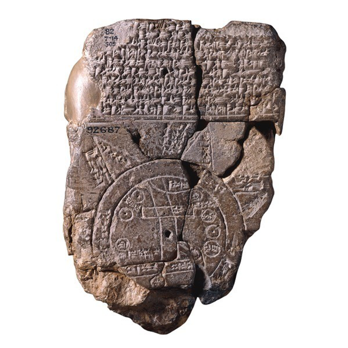
Maps are a universal means of communication despite language or cultural background. Cartography, the art and science of making maps, and the use of maps date back to 2300 B.C. Many of the maps from this time were preserved on Babylonian clay tablets (academic.emporia.edu). One of the oldest surviving maps is the Babylonian Map of the World, created around 700-500 B.C. (Figure 1) (Smithsonianmag.com). During the 17th, 18th, and 19th centuries, maps became more advanced, accurate, and used for the application of scientific methods, as many of us use them for in our research. Today, most are familiar with Geographic Information Systems, or GIS, which was developed in the 1970s and 1980s (academic.emporia.edu).
In Scientific Visualization, our class spent the week creating a draft map conveying our research, whether it be depicting sample site locations, research data, or both. At the end of the week, our instructors (Bill Dennison, Steven Guinn, and Dylan Taillie) took the time to give us some constructive criticism and expert advice on how to improve these maps.
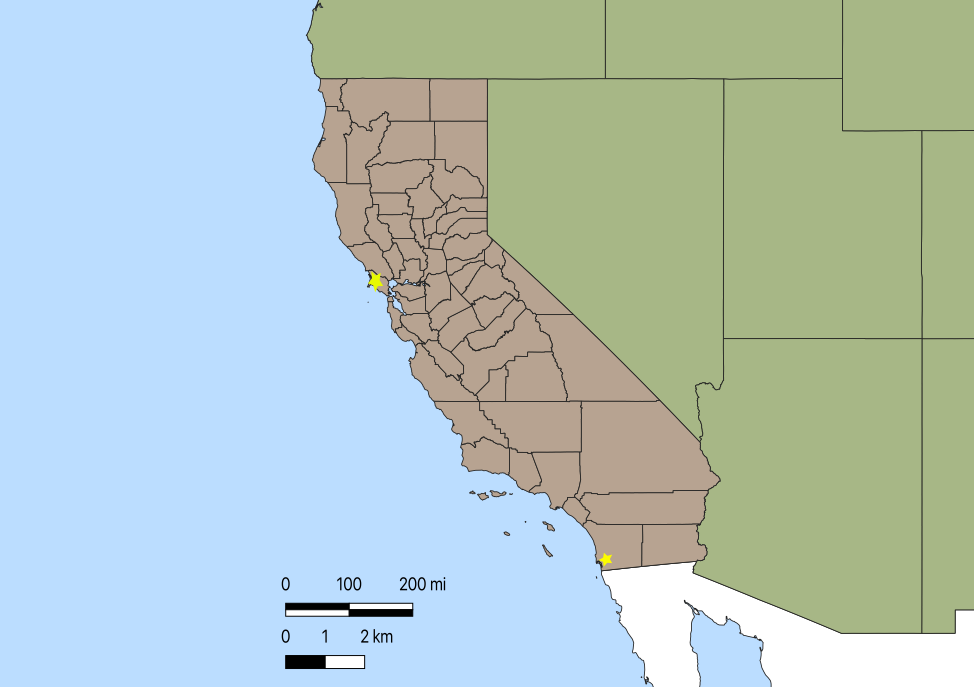
Figure 3 is a photo of the rough map I created, using a combination of QGIS and Illustrator, showing detection sites of the marine bivalve virus OsHV-1 in California, USA. Personally, I lack skills in GIS and Illustrator. Hence, the advice and direction given to me by our instructors were crucial for my improvement and development of scientific communication.
Here is the advice given concerning my map:
- Use a more realistic appearing map rather than an outline/cartoon such a Google maps image.
- Make sure your scale is accurate. By zooming in or out of the map in the QGIS program, you can create accurate scales for an image. Make sure you're adding your scale where your image is zoomed into.
- Remove "junk" like the California county boundaries. They are not important to the information being conveyed.
- Use this current map as an overview or 'inset locator map' and create "blowouts" or zoomed-in maps of the specific detection sites.
Generalized advice given on all maps presented:
- Map projection matters! Find a good base map.
- Orient the user. Include an accurate scale bar and/or north arrow. (Scale bars are not necessary for global maps.)
- Simplicity is key! Remove any unnecessary regions, data, or labeling. (i.e., removing Antarctica in a global map or titles such as "legend")
- Make sure your data and geographic sites are clearly depicted and represented on your map.
- Add descriptive titles, legends, labels, or symbols where needed.
- Avoid using acronyms and jargon that users may not be familiar with.
- Choose a color scheme that best represents your data and geographic region. Be considerate of color-blind users.
If you are like me and lack skills in GIS, creating a map and improving it based on this advice may seem challenging. In my experience, finding reliable resources and asking for help is vital to move forward. (The instructors for this particular class are a great resource!) There are vast numbers of tutorial videos, shapefiles, and data sets available online.
References:
Aber, J.S.,"Brief History of Maps and Cartography". 2008.
http://academic.emporia.edu/aberjame/map/h_map/h_map.htm
Thompson, Clive. "From Ptolemy to GPS, the Brief History of Maps". Smithsonian Magazine. July 2017.
https://www.smithsonianmag.com/innovation/brief-history-maps-180963685/