Maps should tell a story
Ben Wahle · | Science Communication | Applying Science | Learning Science | 7 commentsBen Wahle
The summer before I started fifth grade, my family took a road trip from Washington DC to Nova Scotia, Canada. A few days before we loaded our luggage and our dog, Chloe, into the car and headed off, my mom picked up some maps from the local AAA office. That night, she and my dad poured over them, highlighting our route and circling places to stop. During our trip, my mom would write something next to each circle such as “great food”, “awful”, or “don’t come back” (our hotel in New Jersey where Chloe tore the wallpaper off the wall). By the time we got home, my mom’s AAA maps told the story of our mishaps and adventures in Canada and New England.
Maps can show much more than just a location. For scientists, maps can reveal trends and relationships that would not be apparent in non-spatially descriptive figures. For week 6 of class, we learned how to create such maps and display spatial data (i.e. data that corresponds to a geographic location) using computer-based Geographic Information Systems (GIS) software.
Using GIS can be daunting. It is surprisingly technical software and definitely not intuitive in the way that some visual design programs are. Since each visual element (called a feature) in a GIS map corresponds to an actual set of geographic coordinates, you can’t just draw a freehand map like you would in Adobe Illustrator. Also, features have descriptive attributes that you can display using color, size, and shape like you would in a graph or conceptual diagram.

Basic ways to keep your map clean, simple, and easy to interpret:
- Use appropriate colors (e.g. blue water, green forests, brown/tan land)
- Include as few layers as possible (i.e. eliminate map junk)
- Place cutouts, scale bars, and legends in the appropriate place
- Include a title, legend, scale bar, and a north arrow in the finished product
Maps are a good way to add a spatial element to your data visualization. But are GIS maps are always a superior method of visually displaying information? My guess is that it depends on the story you are trying to tell.
Some maps show the location of sampling sites or delineate a study area.

Others distinguish the qualitative or quantitative values of features at different locations. These maps leave the door open for spatial analysis to examine relationships between the values at each site and nearby features.

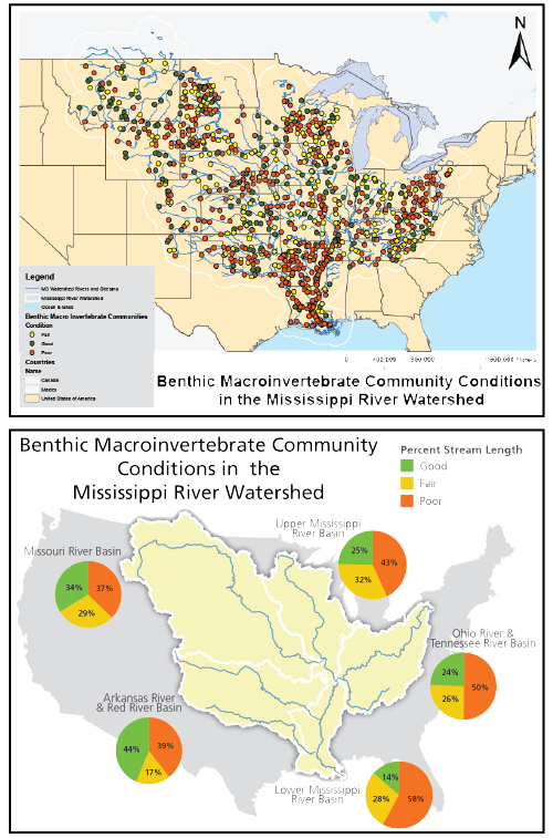
My map fell into this second category. I used the exact same data on benthic macroinvertebrates (benthic MMI) in both my map and my data visualization figure from last week. For both, my goal was simply to show benthic MMI conditions in the Mississippi River Watershed. But does this map really do a better job than the pie charts in my other figure?

Personally, I think the pie charts are simpler, cleaner, and, when superimposed on a map, much more intuitive. But that’s just it – the spatial element of these data becomes much more apparent when displayed on a map. A set of pie charts alone would lack the context provided by the basemap in this figure. So perhaps my mistake was the way I displayed my data.
As point data, the watershed in my map is jumbled with red, green, and yellow dots. The dots are so large that they overlap each other, which could be misleading if one color of dots disproportionately covered another. This map would be much better off if, like my data visualization figure, the watershed was divided into sub-basins with a color that reflected the average score (poor, fair, good) of sampling sites in each. (See the IAN blog “How maps can lie: Chesapeake watershed stream health” for more information on this topic)
At such a large scale, the dots in this map leave no room to view additional layers. I’m basically limited to showing the benthic MMI condition in the watershed. But if I wanted to examine the spatial relationship between benthic MMI and some nearby feature (say, shoreline development or human uses in the waterways) I would need to zoom in on a location so that the other layers would be visible.
I should have known those dots were too big. They crowd out other features and each other! They create the potential for misinterpretation, and they leave no room for spatial analysis. Maps need to tell a story, and in my case, the story should be more than just giant dots.
Next Post > Determining what makes a good environmental champion
Comments
-
Juliet Nagel 10 years ago
Fantastic blog Ben, I love the story from your childhood road trip! That connection to maps is something that is much less intuitive when using a road GPS instead of paper maps. I also have similar memories of road trips, following the progress made along a little line on a map, watching for cities and other landmarks to come and go. When following the GPS, you can know you are headed the right direction, but not really know where you are! They lack the context that a good map will provide.
I also enjoyed the comparison of your two maps, two very different ways to present the data. Each has it's strong points, and you are right, in the end the best one comes down to the story you want to tell.
-
Noelle O. 10 years ago
Nice job Ben! Thanks for sharing your childhood memory! You're absolutely right--maps can have such strong emotional ties.
We, as science communicators, need to pick and choose the best ways to display our data which often requires a synthesis of multiple techniques to tell the story we wish to tell! Your map with the pie charts is a great example this type of synthesis!
-
Christina Goethel 10 years ago
Ben, nice blog! I particularly enjoyed how you compared your before map to your other figure because it shows that there are many ways to tell a story and many ways to present generally the same information, although each method has its own unique nuisances. That being said, I think that your data visualization with the pie charts is a perfect example of how we can use pieces of each method we learn in this class, taking the best of each method to produce a quality product. I think it is important to remember that we don’t treat all of these methods as separate entities but again to combine them. We have already seen the overlap in products when discussing characteristics like color choices or font style and size.
-
Kara Hawkins 10 years ago
I enjoyed the beginning where you talked about your experience with map as a child. If my parents had done that maybe we would have remembered where not to go to eat on vacation each year because it wasn't any good (a problem we still have).
Having a background in geography, I know that map making is really an art (so much so that I have maps and globes everywhere in my house). Just adding data to a base map doesn't always do it justice you really have to think about color and symbol choice. Just a small change can make a world of difference. These differences, however, are sometimes hard to come up with when you are evaluating your own map. That's why having others take a look is so beneficial. The feedback last week was really helpful. Making maps has never been something that I have excelled at. But, I really do appreciate a beautiful map!
-
MbS 10 years ago
Hi Ben. You are totally right. Maps tell stories. We do use them to get places. But, this is part of the glorious part of maps about storytelling: a story is underway RIGHT HERE.
To use a true but crude metaphor: the map making tools of QGIS and ArcGIS are kicking my butt. Yet, I can see how utterly powerful these maps are with the necessary shapes of the land and the features. However, the power here is the ability to layer richness upon richness of real data, some of this linked to real-time data collection nodes. We live in wonderful times! My plan? To keep working on these programs and watching tutorials. My new best friend, however, is a GIS beast master.....where are you? ISO....
The layering option, as Christina notes, is also a way to tell the fuller story that is rooted in a place.
Kara -- and yes, to be beautiful!
I want to link to this beautiful "map" of the Chesapeake Bay, now at the Renwick Gallery of the Smithsonian Museum. "Molding the Chesapeake" is Maya Lin's glass marble interpretation of our bay. Photos by Ron Blunt. http://americanart.si.edu/exhibitions/online/wonder/lin.cfm
-
Keota Silaphone 10 years ago
Ben, I had another thought about your map. I'm wondering if you can apply the values (poor, fair, goo) to the attributes of the stream layer. Your map would show only the streams symbolized in yellow, green, or red and you would still overlay the watershed boundary layer. So, instead of displaying pie charts, sampling sites, or perhaps aggregated data to the watershed level, you could consider polylines as the main feature of your map. This just goes to show how data can be depicted in a number of different ways! In the end, you have to decide if the final product tells the story that you want to tell.
-
Keota Silaphone 10 years ago
Sorry about my earlier typo! Clearly, Ben isn't mapping "goo" but rather "good" benthic macroinvertebrate community conditions!