Plan your build and build your plan
Kristie Gianopulos · | Science Communication | Applying Science | Learning Science | 5 commentsKristie Gianopulos
Over 40% of the world population has an internet connection (3.42 billion people), and we all recognize the importance of using the internet to find and broadcast information. So if you want to use the web to get your message out, how should you go about it? How do you make your website effective? You may be surprised to learn that building effective websites requires most of your work prior to building the site itself.

Here are some important steps to keep in mind:
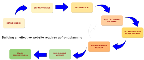
1. Ask yourself what you hope to accomplish with your website. Develop a clear idea of your mission that will guide all further work. What do you expect your users to accomplish once they come to your website? What general take-home message do you want them to leave with?
2. Define your audience as specifically as possible. Though it is tempting to say your website is for the “general public”, web designers get a headache when they hear that. Trying to be all things to all people is a recipe for much difficulty on your part. Defining your audience as narrowly as possible will give you a clear idea of what to say, how to present your information, and how it can be used. Even if it is a broad audience, try modifying it to “the general public who….. (live in a specific watershed, are interested in coastal preservation, etc.)”.
3. Do your research. What else is available to your audience? Discovery research assures you are meeting user needs. This can be done, for example, through stakeholder interviews, user workshops, and comparisons of similar products available. Remember, a product that doesn’t meet the users’ needs won’t be successful and won’t be used.
4. Develop your website content on paper. This is called developing a content strategy, where you create SKETCH all pages, subpages, etc. and test them out on potential users to see if they can accomplish a given task. You may be surprised!
5. Build your website. Find a tool - Several free (or inexpensive monthly subscriptions) web-site building services are available, including wordpress.com, weebly.com, squarespace.com, and wix.com. These provide professional-looking templates that can be edited to suit your needs.
Get interactive:
- Infogr.am is an easy online tool for creating interactive data visualizations
- Tableau Public has free data visualization software for creating interactive charts, graphics, and maps.
- ArcGISOnline has a platform for creating and linking to interactive maps.
- Visme.co is an online tool for creating web-publishable infographics.
Follow some guiding principles in designing your webpage:

- Keep first impressions favorable. First impressions count when it comes to websites – it’s been said that online attention span is only 15 seconds! If your user’s first impression turns them away from your website, you won’t be able to get your message to them. But if you give a credible, professional first impression that engages and encourages the user to continue into your site, your message will have a chance. This is relevant for all pages on your site, since some visitors may arrive into the middle of your site from a search engine result.
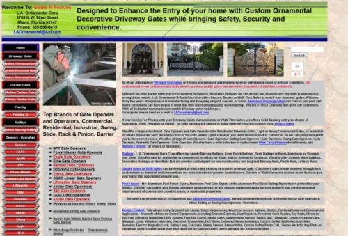
- Keep it simple. Web pages should be clean and simple. One effective photo may be better than several photos in a grid, for example. Don’t be afraid of white space, and edit your text to be clear and concise, to get your message across.Keeping colors and presentation consistent across pages keeps the user oriented and minimizes the “work” needed to understand your site.Overloading pages with too much information can turn off users. Some websites have compiled examples of bad web design, if your eyes can handle it!

This webpage presents an overwhelming amount of information on the homepage. Credit: http://www.gatesnfences.com/ - Keep it informative. What is a website without content? As Guy Stephens said in his instructive YouTube video on web design, “Content is king.” Your content is the reason your website exists, so make sure it is informative, interesting, and accurate. Content is what will keep your users visiting and sharing your website.Once you outline your main messages, make sure your content stays on that message. Beware of too much extraneous or distracting information. Even pretty photographs can be distracting from the main message. Evaluate, revise, evaluate.
- Keep it easy. Easy means easy to navigate, so it is abundantly clear to the user where they are in your website at all times and how to get where they want to go. Consider the user experience – can they easily find what they are looking for, and return to where they came from? If they land in the middle of your website from a search engine results, are they able to find their way around your site from that location?
Easy means easy to use on mobile devices – a third of website visits are originated on mobile phones or tablets, and many people use mobile devices as their only means of internet connectivity. This all means that websites must be responsive to different screen sizes and orientations. Many website templates in SquareSpace and WordPress use responsive web design to accommodate different devices types, and will allow you to preview your website look on different displays.
Easy means easy to find – The acronym “SEO” shows up a lot in web design information. This means “search engine optimization”. SEO makes it more likely that your webpage will show up when a user searches for terms relevant to your message. You can increase your visibility by including keywords throughout your content, in page titles, and in captions. Several guides to increasing online awareness of your site through SEO are available, including Moz.com’s Beginner’s Guide to SEO.
- Keep improving. Use tracking tools available such as Google Analytics to track which pages are being used and how much time visitors spend at your site. This will help understand where you are being most effective, and enable you to target improvements on pages that aren’t working for users. Websites can almost always be improved upon once they are built. Improvement is certainly important; however, it’s also essential to keep your central vision in mind when adding content.
Building a website can be an exciting prospect, and new user-friendly tools are being developed all the time to help you create a professional looking website in a short amount of time. The key is restraining yourself from diving in without a plan. Have a plan, get feedback and revise your plan, and then implement it with confidence!
Next Post > Raising the Grade for the Upper Mississippi River Basin
Comments
-
Steven Woods 7 years ago
Thanks for all of those resources! Especially the link building planing was excellent website full of golden tips.
-
Melissa Merritt 9 years ago
I appreciate that you provide several links in your blog, beyond what was talked about in class- even links to the examples of bad websites! Also I really think its a great hook that you began with the number of people who have access to the internet. Validates our work.
Finally, I really like that you did some of the graphics yourself! Particularly the first one. That was really going above and beyond! -
Michelle Canick 9 years ago
Thanks for the "get interactive" links and for parsing "keep it easy" into the importance of easy navigate, responsive design and search engine optimization. Great blog!
-
Holly Padgett 9 years ago
Nice blog! I really like the emphasis on defining your messages and audiences and doing research before starting to build anything. Coming from a government perspective (though I think its also true for NGOs), I think its particularly important in this day and age for us to be able to connect with a broad public audience through websites...which means we really have to work hard to make our websites effective!!
-
Katie G 9 years ago
The list of "Get interactive" options is really going to change the way I approach webpages and data. It may take time but I'm so glad that this class introduced me to this!
Also, "Easy means easy to use on mobile devices" is a great tip! It can be difficult to figure out how to make this happen and I'll definitely look into some wordpress options as you suggested.
Great blog post, Kristie!