Prepare, Point, Think, Shoot, Edit: How to take a great photograph
Laura Wood · | Science Communication | Applying Science | 5 commentsLaura Wood
Photos are a great way to quickly catch people’s attention and get them interested in a subject matter. In fact, they often provide the first impression for your work, as people take in and react to visual images much more quickly than they do text. So, whether you’re working with data visualization, outreach material, or web design, a good photo can send a message to your audience about the content and quality of the information it represents.

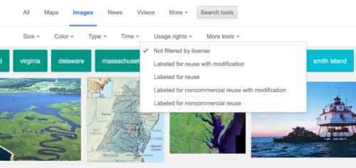
Luckily, there are a ton of great photos available online! With public sources like Flickr, Google images, and of course the IAN image library, you’re pretty much guaranteed to find something that relates to the topic at hand. When using someone else’s photos, however, it’s important to make sure that you don’t violate any copyright or licensing restrictions. A good way to avoid this is by limiting your search to only images tagged for reuse. You can do this by filtering Google image searches and searching Creative Commons images.

Despite the plethora of images available online, there will still be some times when you just need to take photos yourself. Maybe you’re working with something very site-specific or you want to document a particular event. Whenever this is the case, you’ll want to be able to take your own high quality photos. Today, with smartphones in everyone’s pockets and endless photo editing apps, its easy to think that anyone can just snap a quick picture and it will instantly be ready to publish. But, like anyone who’s asked their technologically inexperienced Dad to take a commemorative photo and ended up with a picture of a thumb knows, quick snapshots by unskilled photographers aren’t always what you’d want to use to represent your organization or project.
So, after listening to all of the suggestions from this week’s class, I’ve changed the classic instruction “point and shoot” to the more helpful advice “prepare, point, think, shoot, and edit”.
Prepare. If possible, pick good timing for the best light. The mid-day sun can be harsh and cast shadows but early morning and late afternoon light can be softer and more conducive to good photos.
Additionally, don’t be afraid to stage photos when necessary! This is especially true for photos of people. Get people to wear your organizations’ t-shirts to emphasize your brand, ask your subjects to turn towards the camera so the image will show their faces and emotion, whatever it takes to make the photo feel more inviting and impactful

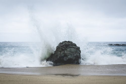
Point. Aim for the best composition possible to clearly demonstrate your focus and create a compelling image. Using the rule of thirds, filling the frame, and incorporating lines that draw the audience into the photo are all great techniques to make people react more positively to your photo. Additionally, coming at your subject from a new perspective, whether that be taking an aerial shot of an area or getting down low to capture the energy of a wave hitting the shore, can make an image instantly more interesting.

Think. Scan your viewfinder for anything you might want to include or exclude from your photo. Are there extraneous branches inching into your frame? Is your horizon line level? Are you accidently cropping out a part of the scene that adds context?
When someone glances at your photo while scrolling through your website or flipping through a handout, the intent of the image should be instantly obvious. Get up close to your subject and keep unwanted objects out of the frame in order to draw viewer’s eyes to the message of your image and nothing else.

Shoot. Take your picture. Then take two steps forward and take it again. Then flip your camera for horizontal to vertical and take it again. Any small changes that are easy to do in the moment and provide you with options when you get back to your computer are worth trying.

Edit. Even though taking the best photo you can in the moment is important, there is still a lot you can do to edit the image afterwards in photo editing programs like Lightroom and Photoshop. You can crop out extra space, straighten horizon lines, enhance colors to make them pop, and adjust brightness and white balance. Sometimes there are details of an image that you didn’t notice in the moment that become obvious when the photo is on your screen so editing can be a great way to fix small problems and enhance certain aspects of your image to make a good photo even better.
This week’s lectures and class discussion made it clear that photos are very useful in capturing attention and engaging an audience. It also became quickly evident how important it is for the photos you use to be good ones. While having viewers look, step back, ponder, and speculate at an image can be a sign of interesting art in a contemporary gallery, it’s not what you want from photos used for communication purposes. So, don’t just point and shoot! Instead, take the time to prepare for, think about, and edit your photos into being the best images possible to represent your work.
Next Post > Communicating science effectively—working through environmental report cards
Comments
-
Kristie Gianopulos 9 years ago
Great job; clearly and well spoken.
One thing I find helpful is to squint at the picture and see what stands out (does it still send the message?), or alternatively, look at just a little thumbnail of the picture. This emphasizes the basic elements, which may not always be communicating a message.
-
Holly Padgett 9 years ago
Nice blog! I like the 5 step process you laid out for taking a picture. It really is much more complicating than just pointing and shooting!
-
Jane Hawkey 9 years ago
Laura, you hit the nail on the head, capturing all the key points of the class discussion. Well done.
-
Katie Goerger 9 years ago
"A good photo can send a message to your audience about the content and quality of the information it represents."
This is very true and i think it goes both ways. A photo that looks like it was taken on a cellphone by a 4-year-old looks unprofessional but I think it's also important to consider that using stock photography that *looks* like stock photography can be equally as unprofessional.
To illustrate, I found this post that offers advice for the types of stock photos to avoid (I know we've all seen and cringed at photos like this in real life!): http://webmeup.com/blog/stock-images-to-avoid.html
-
Melissa Merritt 9 years ago
I really like the organization of this post, and how you frame it from the very beginning. "Prepare, point, think, shoot, and edit." And you sum it up again at the end. Really hits the point home. Also love how you incorporated some specific feedback from the instructors on the images you included in this post. That's super helpful!