

Putting it all together
Sky Swanson, Max Hermanson ·
We're near the finish line of the 2020 Science Visualization course, and last week was the perfect time to become familiar with Adobe InDesign. So far, students have applied principles of design through a variety of digital mediums/software, and for last week's homework assignment they applied this experience to the creation of science communication documents via InDesign. InDesign was specifically designed for professional and amateur publishers to create multimedia documents for both digital and print formats, thus familiarity with design, photography, vector images, and data visualization are essential prerequisites. One could use Adobe Illustrator or Photoshop to achieve the same results as InDesign, but doing so is sloppier and far less efficient for multipage or text-heavy documents.
Prior to getting started with InDesign, students were assigned to watch video tutorials on how to use InDesign, and to storyboard documents related to their research. These documents included brochures, posters, and fliers for a range of audience demographics (see last week's blogs). These storyboards were then used as templates for their InDesign documents. Nathan Miller, a science communicator with IAN, critiqued these InDesign drafts during lecture.
It was great to see how much progress the class made as a whole in becoming better at communicating their research. People clearly retained knowledge and built on feedback from previous lectures. A combination of interesting titles, concise text, inviting coloration, beautiful vector images, and properly edited photos were among the improvements apparent in submissions. Students' adaptation to InDesign was equally impressive, considering the steep learning curves associated with Adobe software.
Nathan gave a ton of individual feedback to students, and some common themes emerged on how students' documents could be improved. These included:
1. Use more white space. Try not to cram too much into your documents, as it can make them less inviting.
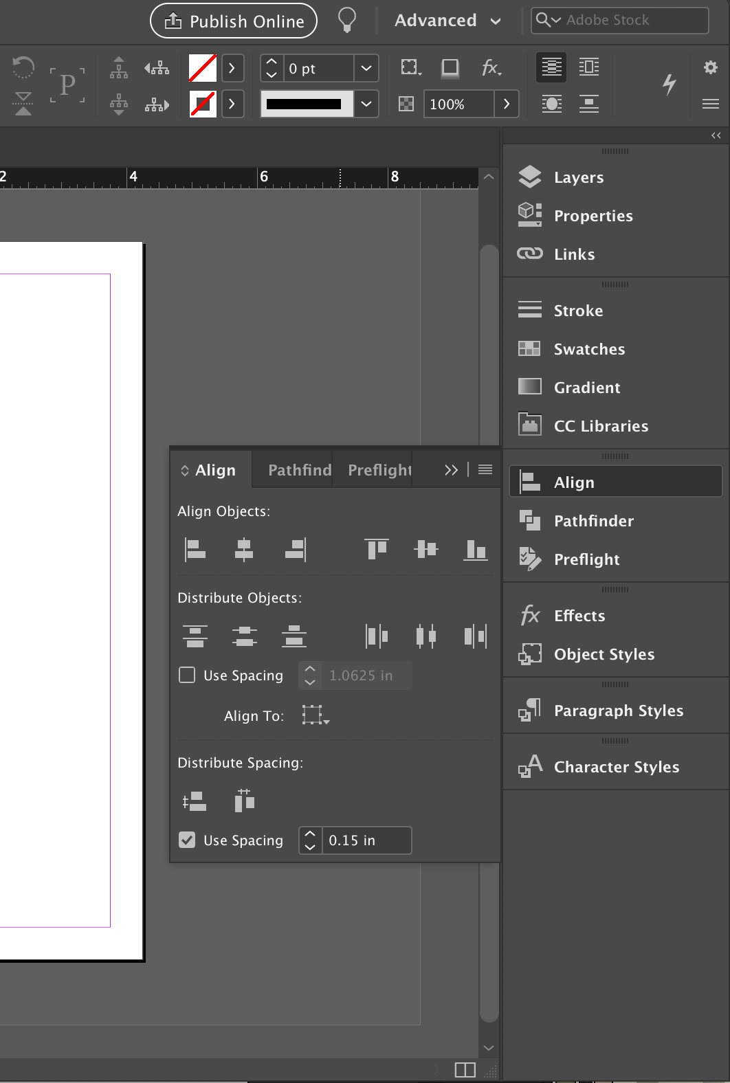
2. Align text, objects, and images to encourage a more effective layout. You can use the Align toolbar, to do so. Click Window > Align , to pull up the toolbar if it isn't open already.
For those who found the transition from Adobe Illustrator/Lightroom to InDesign difficult, consider investing an extra hour to watch or read more introductory tutorials. I used to find working with text in InDesign to be awkward, but one YouTube video later I solved this and vastly improved my workflow. Not only will an hour or two of research save you lots of time and effort, but will build the foundation to use a highly versatile and reliable piece of software for the rest of your life.
About the authors
Sky Swanson

Sky Swanson was born and raised in Annapolis Maryland, where he spent his youth exploring the wilderness and growing a great appreciation for the environment and its many wonders. After a few years of doing that he moved off to Hempstead New York to study at Hofstra University. There he got a degree in Film Production and a minor in Mass Media studies, which he applies to the many video products IAN produces annually. Now with 3 years of science communication under his belt, he Works for UMCES-IAN as a science communication assistant and happily spends his nights playing Dungeons and Dragons.
Max Hermanson

Max is a graduate of SUNY ESF, where he majored in Environmental and Forest Biology. Max will be using a variety of communication medium as he assists Senior Science Communicators and Integrators. In his free time he enjoys maintaining terrariums and aquariums, playing chess and Settlers of Cataan, and is hoping his new location will facilitate picking up sailing again.