

The art of calculating scores
Siuling Cinco Castro and Javier Ramirez Ramirez · | Environmental Report Cards |Siuling Cinco Castro and Javier Ramirez Ramirez
We have thresholds and so, what is the next step? Yes, calculating scores and determining grades! Our class this week on "Developing an Ecosystem Health Report Card" continued with Step 4 of the report card process - "How does it add up? Calculating the scores and determining the grades".
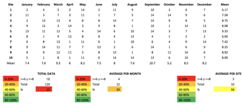
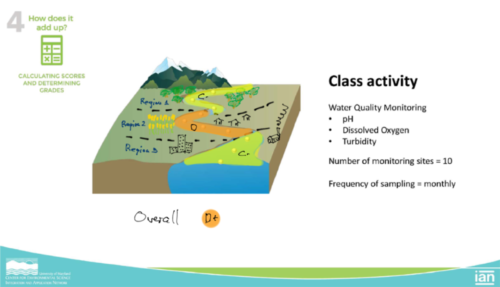
The class began with Dr. Heath Kelsey answering all the questions related with the lectures on calculating scores and determining grades. The video lecture for this week was from Dr. Simon Constanzo where he explained how to calculate scores using examples so it was easy to understand. He showed three methods of calculating scores: using all the data for each indicator, using mean or median of the station (rows), or using mean or median of the column (month). Using different approaches can yield different results but the overall results can still be similar in the end. It is also important to keep in mind that calculating the scores must be a transparent process since the threshold for each indicator can be different for each region, site or season. Also, having a non-linear scale can affect the results. To understand this process, we calculated the scores for three indicators (pH, DO and turbidity) using the example river below.
As results of this activity we learn that the grades can change depending on how we decide to calculate the scores. Using pH as an example, if we calculate using all the data, the score is red (bad), if we calculte by month the score is orange, and if we calculate per station or site the score is yellow. We can also see that the grades can be different if we calculated the mean instead of the median.
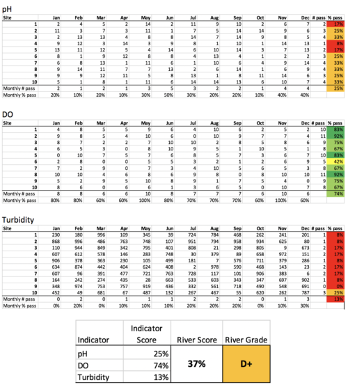
Another method of calculating the scores is by determining the percentage of data that was passed as shown in the figure below. When we calculated the overall grade of the river by averaging the scores for the three indicators, we got a D+ grade. In this case, we can use the average because these three are all water quality indicators. In other cases, we have to be very careful which indicators can be combined. Additionally, each indicator can also be weighed differently but this is not ideal since stakeholders will have different ways of weighing indicators.
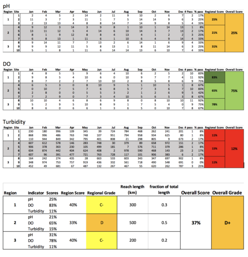
As part of the class activity, we made a modification on the exercise by dividing the river in three sections. Using this approach, we were able to compare these different regions that have different characteristics and see if one region is more impacted than others. Although we got the same D+ overall grade, we see that the middle section has a lower grade compared to the upper and lower region of the river. We also see that the overall grade is influenced by the middle section more so than the other two. This could be because the size of that region is greater than the rest or the grades are just too low that it lowered the overall grade.
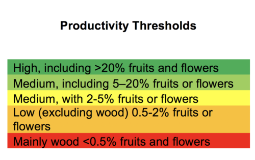
Using what we learned in class, we calculated the score for mangrove litter productivity, using literature values for the productivity thresholds, and using 3 years data from mangroves in Progreso. This calculation can be done in different ways as mentioned before. However, to capture all variability we calculated the score by getting the overall average, resulting to 16.4%. Based on this and the thresholds, Progreso mangroves have a good condition.
Other approach for calculating scores can be using percentage of total values for each scale, however, we need to define the slope that include these values and the thresholds for each.
Overall, we learn that because of the different ways that the scores can be calculated or how the indicators can be combined, it is very important that the process is well-documented and communicated to the different stakeholders and users of the report card.
References:
- Ellison, J.C. 2012. Climate Change vulnerability assessment and adaptation planning for mangrove systems. Washington, DC: World Wildlife Fund (WWF). ISBN: 978-92-990069-0-0