Believe it or not, maps are still useful!
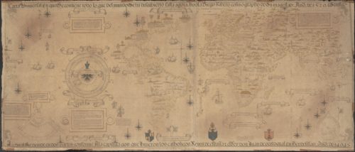
Lexy McCarty · | Science Communication | 7 commentsOne might try to argue that maps are irrelevant in today’s society due to the creation of the GPS, which allows anyone to enter their desired destination into a device, online program, or even a wide array of mobile phone applications to obtain detailed directions in less time than it probably took you to read this sentence. How did Christopher Columbus ever make it to the New World before this technology was available?!

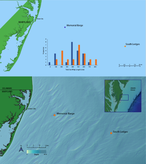
As Dr. Dennison mentioned in our last class, good data visualization intrigues the reader to think further and question the data in front of them. This week in class, we focused on revising our maps in hopes of sparking these thoughts in our audience. The “before” and “after” images by Rebecca Wenker shown below display some major improvements after a round of revisions.

The most striking change in the example above is the bathymetry data that Rebecca added to her map. This serves to remind the viewer that the ocean bottom is not flat and encourages the individual viewing the map to think about the varying ocean bottom and how this effects marine life. Her locator-map in the right-hand corner helps orient the viewer if they are not familiar with the Maryland coast, as well as indicates where the ocean shelf drops off. She also includes a bounding box in the inset to highlight where her zoomed-in version is specifically located. The removal of the bar-graph allowed for further simplification of her map. The reader can visually see the location of the two sampling sites, so there is no need for different symbol colors in the revised map. Additionally, she added some orientation to her map with a compass. She grouped the scale, compass, and bathymetry scale together, cleaning up the overall look of her map and simplifying it for her viewers.
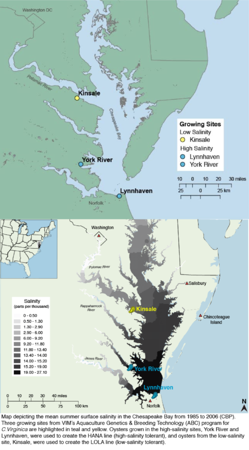
Below are my “before” and “after” maps depicting the three sites where oysters for my experiment were grown. Similar to Rebecca’s, the locator-map in the upper left-hand corner orients the viewer on a larger-scale. A bounding box highlighting the Chesapeake Bay would add even more clarity to my revised map. On the smaller-scale, the labels for nearby cities and tributaries help orient the viewer within the Virginia portion of the Chesapeake Bay. Most noticeable is the salinity gradient, which strengthens the overall map and enabled me to leave out the legend all together. In this case-as well as in Rebecca’s case above-these additional data layers really enhance the map. Additionally, the oyster symbol helps to inform the viewer about the organism of interest without the need to read the caption.

One important thing to mention is that working in mapping software can make it difficult to get base layers to line up. If you notice, the peninsula portion of Virginia does not look realistic in my “before” map. This might seem minor, but is actually very important for map accuracy.
Of course, every map is different. Each map requires different base maps, colors, scales, legends, and additional information depending on the overall message and purpose of the map. When planning and building a map, it’s important to keep the following in mind:
- Details are important. Which colors you use in your map, for example, can have a strong effect on how the audience interprets your visual. When highlighting specific points on a map, think about your symbol shape. Would a circle, triangle, star, or square fit best? In my “after” image above, I used triangles for my city locators. Triangles are usually used for sampling sites, and, in this case, a simple circle might be a better choice. Most importantly, make sure to include the necessary geographic locators and region labels so the audience knows where the map is located in the world. Clarification and details are important in map development.
- Fonts and labels. An active, explanatory title will inform and guide the viewer on what exactly they are looking at. This will eliminate confusion and ultimately enhance their understanding of the map. Font size and style are extremely important and should be selected with the audience in mind. Lastly, it is important to be sure that all aspects of your map are included in the legend. My “after” map includes a descriptive caption, but a short, simple title would help further guide the reader’s attention from the very beginning of their interaction with my map.
- Consistency. Be consistent with your style throughout your map. This should include consistency in your use of color, font, size, etc. Be consistent with where you put your map components, as well. If you have the legend inside the map, for example, make sure the compass, scale bar, and locator map are also inside the map’s boundaries. Lastly, the items in the legend should be identical to their depiction on the map so your viewers can clearly and easily make the connection.
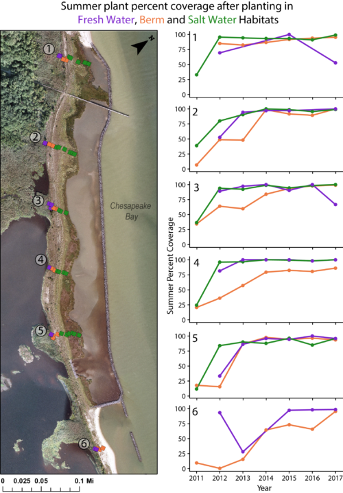
- Juxtaposition. Antagonistic to Aristotle’s belief, sometimes the sum of the parts is greater than the whole. In short: One map might not always be the answer. Using side-by-side maps or comparing a map and graph can declutter a visual and help better convey the information intended. Additionally, juxtaposition can be used when two pieces supplement each other nicely. A good rule of thumb is to use the same style and colors across the two pieces to help with consistency and understanding. Erin Reilly does a great job of this in her image below.

As with many things in life, our maps will continue to get better with time. Multiple rounds of revisions will be made until each of us is satisfied with the final product. With the criticism, comments, and suggestions from our classmates, we will be empowered to improve our maps and make them more effective than we originally imagined.
Next Post > Good luck and Godspeed, Ricky Arnold
Comments
-
Alyssa Wellman Houde 8 years ago
Overall, I thought this was a really solid blog post. It might have been helpful to add another paragraph/ bullet point about the importance of keeping in mind that while some map design choices are not explicitly "wrong" there are certain map-making conventions that may be smart to follow. I know one of the factors I went about correcting for my map was the projection. The first map of the US looked flatter and slightly off. It was geographically technically valid, but proved overwhelmingly distracting to a reader. Certain traits like that projection and color choice (the recurring theme of loaded colors light red as a warning, blue tending to indicate water presence, etc) are something to keep in mind.
All of that said, I really enjoyed your blog post! I liked the examples you chose to highlight from class and how you walked the reader through the changes that were made and the reasoning behind the map alterations.
-
Natalie Peyronnin 8 years ago
Great job on the blog Lexy! I love the use of a lot of examples from class. That is super helpful. For those that aren't in our class, it may make more sense to include the bulleted list of guidelines first and then examples but either way, I enjoyed it.
-
Nicole Basenback 8 years ago
Interesting blog Lexy! I like how you underlined important points throughout your examples.
-
Rebecca Wenker 8 years ago
Good blog Lexy, and I agree with you that maps are still relevant! I like your use of before and after, visuals like that help me (and others who aren't actually in our class) understand what you're highlighting. Especially with my map, you can see how simple changes can make a map look a lot better. Good job!
-
Erin 8 years ago
I really liked how you underlined key terms to highlight them, but it might have been good to link to something defining them. I also really liked your walk through of how Rebecca changed her map!
-
Bill Dennison 8 years ago
Lexy’s excellent blog about the ongoing relevance of maps serves to remind me that maps are not something that the current generation of graduate students grew up with. The ubiquitous availability of smart phones and GPS in vehicles has meant that maps have not been needed for navigation, at least to the extent that they were when I was growing up. This means that there is more pressure on the current students to ‘find their way’ when creating their own maps. Fortunately, this blog highlights some of the excellent examples of doing just that, and doing it well.
Adam Levine from Maroon5 wrote a nice song about maps, and although I find the music video very disturbing, I have adapted the lyrics as follows:
Maps
28 March 2018
William C DennisonI miss the legend of a great map
I miss the juxtapositions
I'm searching for a map tonight
I'm finding all of the stations
I like to think that we had it all
We drew a map to a better place
But on that road I took a fall
Oh baby how did I get lost?Maps were there for you
In your darkest times
Maps were there for you
In your darkest nightBut I wonder, where were you?
When I was at my worst
Data without a GPS
And I couldn’t find my way
So I wonder, where were you?
All the roads you took came back to me
So I'm following the map that leads to you
Ain't nothing I can do
The map that leads to youFollowing, following, following to you
Ain't nothing I can do
The map that leads to you
Following, following, followingBut I wonder, where were you?
When I was at my worst
Down on my knees
And you said you had my back
So I wonder, where were you?
All the roads you took came back to me
So I'm following the map that leads to you
Ain't nothing I can do
The map that leads to youFollowing, following, following to you
Ain't nothing I can do
The map that leads to you
Following, following, followingOh maps were there for you
Oh In your darkest times
Oh maps were there for you
Oh In your darkest night -
Tom Butler 8 years ago
Lexi, good job! I really enjoyed your bullet point on detail. I might have liked to see some information on the techniques for how to select different symbols such for points of interest, ie how to overlap close points. Otherwise I think it was very interesting reading about your perspective regarding juxtaposition. A very valuable concept for how to convey ideas using a map to show more than just locations. Good job!