Data is the Centerfold: Illustrating statistical data to communicate your research
Katie Fitzenreiter · | Science Communication | 10 commentsKatie Fitzenreiter

One of the most effective ways that researchers can communicate their findings is through data visualization. Emily Nastase said it best; she described data visualization as a way to effectively reveal trends, tell a story, and represent things that are not easily observed from words and numbers alone. However, producing a visual representation of data can be quite challenging.
As scientists, we collect complex pools of data and spend countless hours analyzing it. We become so engrossed in our own research that we sometimes forget how obscure our subject matter is to most people who are unfamiliar with our work. Practicing data visualization techniques that we have learned in class can help us forge stronger lines of communication with people outside of our fields, and help us to better understand our own data as well. According to David McCandless, a world-renowned data journalist and information designer, in his Ted Talk, "data is the new soil." This means that data is a "fertile creative medium" from which "visualizations and infographics are blooming."
David McCandless presents examples of figures and graphs that creatively and humorously tell a story based on statistical data. Posted by TED-Ed under Standard YouTube License
The way we present our data in a figure, graph, or other visual display depends on our audience; therefore, knowing your audience is the most important thing to consider when creating visualizations. The second most important thing is knowing your data. It is helpful to ask yourself, "What is my data telling me, and what is the significance?" Knowing your data is crucial to communicating it clearly and efficiently. In order to tell a captivating story of your data, you need to know the information inside and out. After all, how can your audience understand your data if you don't understand it yourself?
Tips for creating your visualization:
- Know your audience
- Know your data
- Find that story to tell (captivate your audience, don't lose them)
- Let the data do the talking (data should stand alone without a caption)
- Eliminate variation in font style, font color, and font size (consistency is key)
- Avoid "chart junk" (unnecessary gridlines, graphics, or anything distracting from the data itself)
- Red and green are "loaded" colors (use them sparingly if you must use them at all)
- Include an active title - clearly and effectively states what your data shows
- Sites and stations should be given descriptive and meaningful labels (i.e. based on location, depth, zone type, etc.). Avoid "meaningless" letters and numbers (i.e. Site A, Site B, Site 1, Site 2)
- Go with the largest font size possible (without drawing attention from the data)
- Stay away from "Acronym Hell" - too many acronyms confuse the viewer
- Avoid using colors that are too closely related (red and pink lines on a graph are a "no-no")
- For colorblind viewers, try to use different shapes if they struggle to distinguish between colors of symbols
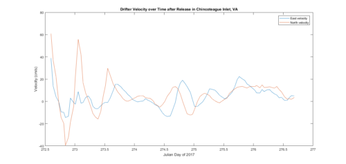
I learned a lot in class last week about what it takes to clearly and effectively present your data in a visual display. Below is a figure I had created before the class. Can you guess what I did wrong with it?

Where I went wrong:
- I should have used a stick plot instead of a North and East velocity plot (would have been easier to understand and interpret)
- Too much white space in my plot made my figure look static and uninteresting
- The legend should have been larger
- I could have increased the font size
- I failed to include wind velocity data to compare it to drifter velocity
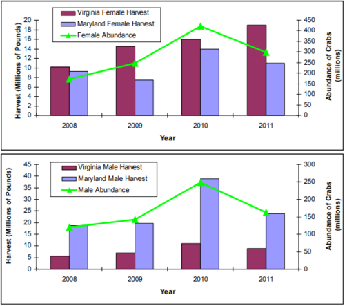
On the other hand, this figure, produced by the Chesapeake Bay Stock Assessment Committee is an excellent example of how statistical data is used to tell a story and reveal trends clearly and efficiently:

Here's what the author(s) did correctly:
- Allowed the data to stand alone and speak for itself
- Kept font size, font style, and font color consistent
- Used colors that were easily distinguishable from one another
- Included a legend that was easy to read
- Data tells a story and reveals trends
- Avoided chart junk
There is no title for the figures, but I think the data speaks for itself well enough that a title is not needed in this case.
Overall, applying data visualization techniques is useful for people in all stages of their scientific career. It is never too late nor too early to improve your methods of data communication to a selected audience, and there is always room for improvement. When presenting data, always remember to modify your presentation based on your audience, and be sure to ask yourself, "What is my data telling me?" Lastly, when communicating research through a visual presentation, your data should always be the centerpiece.
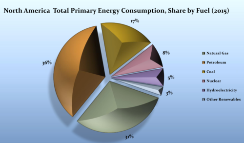
1 "North America Total Primary Energy Consumption in 2015" by Shahzad under CC BY-SA 4.0
From the Chesapeake Bay Stock Assessment Committee, 2012 Blue Crab Advisory Report Figures [pdf].
Next Post > Returning to My Ohio Roots: Scoping Out A Lake Erie Report Card
Comments
-
Nicole Basenback 8 years ago
Nice blog! You did a great job summarizing the main points from class discussion. I like Tom's suggestion about moving the () tips to the next line. I think they compliment why you chose the tips, but get a little lost.
Your tip on "Sites and stations should be given descriptive and meaningful labels" really stuck with me, because I feel like I see it and use it a lot but didn't realize until this class how it's really not helpful to the audience.
-
Lexy McCarty 8 years ago
Great job! I like how you included both your image and the image from the Chesapeake Bay Stock Assessment Committee, and then pointed out the imperfections and successes, respectively. I'm a very visual person and was able to understand the message you were trying to portray in the text just by looking at the images. Nice work!
-
Chelsea Wegner 8 years ago
I'm just impressed with Bill's lyrical skills.
Great blog, Katie! I also like the use of lists for tips and including a video.
-
Bill Dennison 8 years ago
Katie’s excellent blog about data visualization approaches used the title “Data is the Centerfold” which made me think of the 1981 song “Centerfold” by the J. Geils Band. I adapted their lyrics to the following:
Centerfold
1 March 2018
William C. DennisonDoes data walk? Does data talk?
Does data come complete?
My science visualization
Always pulled me from my seatData was pure like snowflakes
No one could ever stain
The purity of my science
Could never cause me painYears go by I'm lookin' through a science journal
And there's my science viz on the pages in-betweenMy blood runs cold
My graphic has just been sold
My sci viz is the centerfold
Sci viz is the centerfoldMy blood runs cold
My graphic has just been sold
Sci viz is the centerfoldCalculated results right on my desk
While I was thinkin’ about the story
I was really carried away
Because data caught my eye
I was shakin’ in my shoesWhenever data flashed those patterns
Something had a hold on me
When sci viz passes close by
Those soft and fuzzy ideas gelToo magical to touch
To see data in that new light
Is really too much
My blood runs cold
My graphic has just been sold
My sci viz is the centerfold
Sci viz is the centerfold -
Natalie Peyronnin 8 years ago
I love the list of tips and how you used those to point out the improvements to your graph but also pulled an outside example and analyzed it.
Come on Bill...can we get J. Geils Band??
-
Jamie Currie 8 years ago
Nice work! I liked what you did with the comparison, pointing out the successful and unsuccessful elements of the different graphical elements. Your choice to list the more important lessons of class was cool too -- I particularly focus on how important it is to know your audience, and bear in mind what they think will be significant when representing the data. And, of course, I liked the video.
-
Rebecca Wenker 8 years ago
I think the point you make about knowing your data is a good one. Understanding/interpreting what your data is actually telling you is the critical first step, and then based on that message you can determine how you want to present it. The sequence of interpretation to presentation is important! Good job on the blog!
I also think I know what Bill's song is going to be based on... -
Tom Butler 8 years ago
Good luck linking a song to this one... I think that the use of bold titles over sections such as "what went wrong" and "how to fix it" were a good way to clarify examples of what you talked about before. I enjoyed that things were listed, sometimes it's nice to see breaks in text. I might try and put the descriptions in parentheses on the next line down and indent them so as to create a more hierarchical structure. But I think that the blog covers the topics comprehensively.
-
Jessie Todd 8 years ago
I like how you tagged Emily Nastase and quoted her in your blog since she was such a big part of our lesson last week. The video was a nice addition to getting your point across. Using your own graph and exploiting your errors was a nice touch because it followed what you had just talked about, which were the tips for creating good visualizations.
-
Alyssa Wellman Houde 8 years ago
I really enjoyed the video that you chose to include! I also liked how you broke down the tips into bullet points (instead of simply writing a paragraph or two with that information). It really helped to increase the overall clarity of the blog post.