Guild of Natural Science Illustrators 2018 Annual Conference
Emily Nastase · | Environmental Literacy | Science Communication | 3 commentsScientific illustration is a beautiful form of science communication. The goal of scientific illustration is to accurately depict and teach scientific concepts. Illustrations can be created traditionally or digitally and are generally highly rendered – not to mention stunning – works of scientific art. These images are as informative as they are captivating.
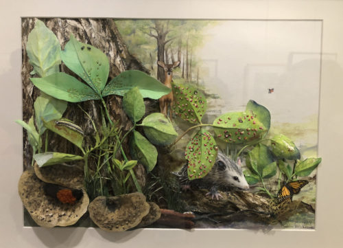
Scientific illustrators are life-long learners and are inherently curious about the world around them. They have to be; in order to teach a scientific concept visually, artists must first have a thorough understanding of the material. This means that every illustration these artists create is a learning experience for both the viewer and the artist. The best part about scientific illustrators is that they love to teach, which means that the Guild of Natural Science Illustrators (GNSI) 50th annual conference in Washington, DC this July was an amazing opportunity to hear what they had to share. While scientific illustration is outside the realm of IAN’s usual forms of science communication, this conference was the perfect chance to branch out and expand our science communication toolbox.
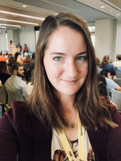
Even though this conference was only three days, the Guild managed to squeeze an impressive amount of content into it. The plenary speakers were hotshots in the science communication world – not to mention my idols – each with unique experiences and perspectives. The line-up was Nancy Shite, Editor in Chief of Science News, Fernando Baptista, Senior Graphics Editor for National Geographic, Callan Bentley, Geologist and Professor at Northern Virginia Community College, Jen Christiansen, Senior Graphics Editor for Scientific American, Dr. Kirk Johnson, Sant Director at the National Museum of Natural History, and Liz Neeley, Executive Director of The Story Collider. In addition to these plenaries, there were smaller workshops on interesting topics, a scientific art exhibition at the American Association for the Advancement of Science, and a lively auction. Some of the other workshops I attended included underwater field sketching, “erased drawings” for conservation, and creating a scientific illustration from start to finish about collaborative international research in the Arctic Circle. I took home invaluable information from all of these plenaries and workshops. Here are the top five things that I learned at the GNSI conference:
- It takes a good idea to make a good graphic
This seems like a pretty obvious statement, but it’s something that can easily be under-considered. It is the job of the science communicator to determine what is the main idea? and then how do I depict that visually? As opposed to, I want a visual here, what can I make a visual about? Fernando Baptista from National Geographic insists that the best illustrations and information graphics he has ever made came first from some interesting idea that he wanted to explore further. Of course, working for NatGeo means that his ideas can be explored in the coolest (and most expensive) ways. When Fernando begins a new project he must first consult with experts in the field from around the world, meaning he has had the fortune of traveling to some amazing places for the sake of his artwork. But it is because of his tireless researching and consulting, and through trial and error that Fernando creates these incredible illustrations and information graphics for National Geographic. With the foundation of a good idea, Fernando knows what direction to move in and what work he needs to do in order to create his masterpieces.
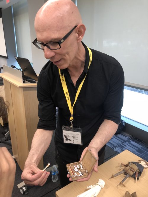
- You need to learn to find the balance between time, quality, and price
This was the most practical piece of advice I learned during this conference. In the world of freelance art (and really for any business) we are faced with the conundrum of: take time, quality, and price – now choose only two. For example, if you spend the appropriate amount of time on a piece to achieve the best quality, you won’t be cost-effective. Should you choose to create your high-quality piece for the right price, then it’ll likely take up a disproportionate amount of your time to do that. There’s no right or wrong way to approach this challenge; it really boils down to what you as the freelancer are comfortable with. “Solving” this problem comes from finding the right balance between the three pieces in order to make you and your client happy with the end result.
- Visualizing science is a continuum
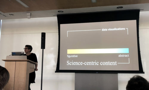
Jen Christiansen, Senior Graphics Editor of Scientific American, is a wealth of information when it comes to forms of visual science communication. Through her experience with the magazine, she has created a continuum of science-related imagery and she shared with the conference her top tips and lessons learned about each part of that spectrum. Simply put, her continuum has three main segments: the most detailed, representative illustrations; illustrated diagrams and information graphics; and the most “abstracted”: data visualization.
For representative illustrations, Jen advises that every detail is worth your attention and care. The best way to address this is to actually get your eyes on the subject matter before putting pen to paper. If you can’t manage to get a physical reference, then it’s okay to make an informed approximation. Just as there is power in hyper-rendered images, there is also power in non-photo-realistic imagery. It is up to you as the science illustrator or communicator to determine what level of detail will be the most effective for your audience.
With illustrated diagrams and infographics, composition is key. How do you guide your viewer’s eye? Leading your viewer through the image should be like telling a story; you shouldn’t jump all over the page. Rather, gently walk the audience from start to conclusion. The elements you choose to use in your visual will influence how your viewer interacts with the image. Use text for example. Where is text beneficial in the diagram? Where would it detract? What text is necessary to communicate your message with the viewer? Jen also insists that whenever possible, you should engage your viewer with “moments of joy”; relatable details that your audience can connect with. This will draw your audience into the piece and ultimately make your illustration more effective.
When creating data visualizations, fully explore the dataset… and then explore some more. It’s okay to embrace complexity, so long as you provide the necessary tools to interpret the information. Novel shapes and forms can draw readers into the image, however, sometimes the most straightforward representation is the most effective option. Jen also advises that your source data is likely not objective or complete, so be mindful of this when creating and sharing your data visualization, so as not to misrepresent the information.
- It’s your story. Tell it well.
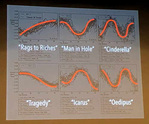
Until this conference, I was under the impression that “the Hero’s Journey” was the most direct and powerful narrative to use in storytelling. The Hero’s Journey is a narrative pattern made popular by Joseph Campbell, in which an ordinary person transitions from their average life into their “adventure”, where they are thrown out of their routine and into the world of unknown. In this “unknown” the hero faces different challenges that they must overcome in order to solve some conflict, as well as become a better person. It’s a classic narrative that we see time and time again. Liz Neeley, Executive Director of The Story Collider, explained how there is so much more than the Hero’s Journey to consider in narrative structure; we shouldn’t confine ourselves to one just story arch. Some different narrative structures worth considering are: “rags to riches” – starting at the bottom and ending on top; tragedy – beginning at the top and ending at the bottom; “Icarus” – beginning in the middle, reaching your peak, then coming to your downfall; and “Cinderella” – starting at the bottom and through many ups and downs, eventually reaching your happily ever after.
According to Liz, your audience is ultimately interested in your umwelt. What is “umwelt” you say? Umwelt is a German word meaning the world as it is experienced by another. People want to know how others experience the world around them. They want to hear your voice from your perspective. The best way to share your unique story is to actually transport your audience into your world. You can bring your audience into your world with this simple formula: have believable characters [1] that experience meaningful events [2] and are ultimately linked by some profound causality [3].
No matter what narrative structure and style you choose to use, do yourself a favor and don’t over-moralize at the end of your story. Leave it to your audience to interpret and apply your story.
- The best way you can teach anyone about the natural sciences is to first inspire them
Dr. Kirk Johnson, Sant Director of the Smithsonian Museum of Natural History, claims his fascination with fossils and geology stems from a childhood experience with a local geologist. The geologist took young Kirk to the rocky shores of Washington state, where he cracked open a smooth rock to expose the fossil within. It was as if the geologist had cracked Kirk’s whole world open. That was Kirk’s unknowing first step in a lifelong career in geology and paleontology.
Dr. Johnson’s passion for fossils is evident. He claimed things like, “All the good stuff is still in the ground” and “Fossils are tweets from the past”. He has even written several children’s books about road-tripping across the US in search of fossils. Dr. Johnson has made it his mission to share his passion with rising generations of scientists by inspiring them to get out into the world and discover. He wants to share that feeling of wonder and excitement with as many children as he can, and he believes we should all strive to do the same. It’s one thing to be able to communicate scientific information with a young audience, but it’s another thing entirely to inspire a child to explore, learn, and discover the world on their own. That is how we are going to have the most impact in this world.
Next Post > When herding cats it helps to have a map
Comments
-
Sandra Bush 8 years ago
This is a great article/ post, Emily. 'So glad you had the Guild conference experience. There's nothing more motivating than the words of those who are established in your own field. I loved your reference to Joseph Campbell's inspiring work, The Hero's Journey. 'Seems that the hero is present in the artist with every new creation. 'Look forward to hearing more from you!
-
Nsaa 8 years ago
Fantastic article, Emily! That trade off between price, quality and time is really interesting and applies to so many fields, Natural Science illustration being one of them! Especially true in the case of startup businesses and other freelance professionals too.
-
Suzanne Spitzer 8 years ago
Awesome blog, Emily! I especially enjoyed your fourth point about umwelt, and not confining science stories to a single narrative template. Interesting food for thought, and a wonderful new vocabulary word!