How maps can lie: Chesapeake watershed stream health
Bill Dennison · | Environmental Report Cards |In order to create a map of stream health in the Chesapeake watershed, Katie Foreman, Scott Phillips, Claire Buchanan and colleagues in the Non Tidal Workgroup of the Chesapeake Bay Program generated a data set of benthic macroinvertebrate condition using data collected by state agencies in the Chesapeake watershed. The original map created by Katie and her team in 2009 had approximately 3,200 data points, distributed throughout the watershed. A stoplight color scheme (red = very poor; orange = poor; yellow = fair; light green = good; dark green = very good) was developed and a dot was placed on each stream sampling site. This map was featured in the 2009 IAN newsletter; New stream health indicator being developed.
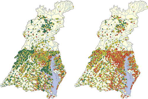
By mining more data from the state agencies, Katie was able to increase the sample size to over 10,000 data points. Due to the over 3X data density, the maps generated in the same manner—placing the colored dots on the stream sites—have a significant number of dots that overlap each other when the map is at the scale of a newsletter or a single computer screen shot. This is especially acute in the state of Maryland where the Maryland Biological Stream Survey program provides the densest data density in the watershed. The overlapping dots result in a major science communication challenge. By selecting green dots to be on the top layer, the message conveyed is that the watershed is in relatively good shape. The map generated in this manner resembles a hula skirt, in that the middle region of the watershed (Maryland) is primarily green. Alternatively, by selecting red dots to be on the top layer, the message conveyed is that the watershed is significantly degraded. The data are exactly the same, but the messages from maps created with the 'green dots on top' vs. 'red dots on top' are very divergent.

The title of this blog post, "How maps can lie" refers to the ability of someone to choose 'green dots on top' for a good news story vs. 'red dots on top' for a bad news story, depending on their intent. The Chesapeake Bay Program chose the 'green dots on top' for their Bay Barometer. On the Chesapeake Bay Program web site, a Google Earth type interface was created to facilitate viewing the individual dots at variable scales, and the problem of overlapping dots disappears with maps at smaller scales. But the Science Communicators with the Integration and Application Network were not satisfied with either 'green dots on top' or 'red dots on top' that leads to a biased message and explored alternative ways to convey these stream health data. In particular, Sara Powell, working at EcoCheck explored various options:
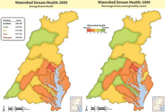
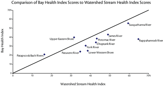
First, making the dots smaller so that there was less overlap was investigated, but it becomes difficult to visualize the watershed regions with low data density. Second, the approach of placing the mid range values on top, 'yellow dots on top', was attempted, but this just provided a different bias than either 'red dots on top' or 'green dots on top'. Third, the approach of aggregating data points in various sub-watersheds and then coloring the entire watershed with the appropriate color was investigated. Initially the entire watersheds were used (e.g., the entire Susquehanna and the entire Potomac watersheds). However, these two large watersheds dominate the map and do not provide enough spatial resolution to infer much information. Sub-watershed maps provide a better spatial resolution and when compared with the Chesapeake Bay health index map, generated using water quality and biotic indicators, some common patterns are evident. For example, the streams in the Patapsco River watershed are the most degraded, matching the most degraded portion of Chesapeake Bay, the Patapsco/Back Rivers.

Based on the visualization that the integrated stream health map provided, a correlation analysis comparing the stream health index with the Bay health index was conducted and a statistically significant correlation was obtained. This correlation uses data that was completely independently collected and analyzed—different indicators, different sampling teams, different analyses. This is the first Bay-wide connection between the watershed and the Bay, based entirely on data, rather than based on models. Furthermore, the correlation is intuitive—healthy streams result in a healthy Bay makes sense. This provides direct evidence that by cleaning up our streams, we can clean up the Bay. This analysis only emerged after IAN Science Communicators responded to the science communication challenge that the 'red dots on top' vs. 'green tops on top' presented. So avoiding having maps that lie, a further insight into the linkages between the watershed and the Bay was discerned.

About the author
Bill Dennison

Dr. Bill Dennison is a Professor of Marine Science and Vice President for Science Application at the University of Maryland Center for Environmental Science.