It’s alive! Tips for creating maps that take on a life of their own
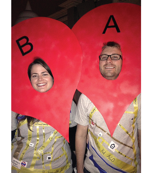
Dylan Taillie · | Science Communication | Applying Science | 2 commentsSimilar to a good Halloween costume, you want any map you create to convey a clear and understandable message that it doesn’t take long for the viewer to digest. Someone viewing your map should not need to take more than a minute or two to understand it’s purpose. Also similar to a Halloween costume, the big winners in map creation pay very close attention to detail.

So, you don’t need to be Dr. Frankenstein to create a map that lives. You just need to be smart and thoughtful in the design of your map.
Michelle Canick’s blog ‘Goldilocks: The Unheralded Mapping Guru’ focused on “choosing wisely” when designing your map and adding each element to your map. To expand on this point, I’d like to focus in on a few tips that can help your map stand out from the crowd.
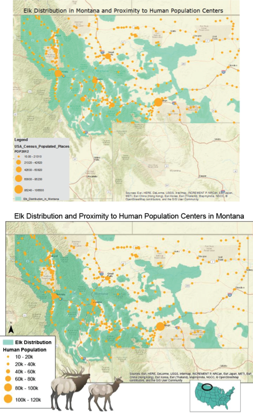
1. Be creative but design conscious. Holly Padgett added symbols to her map of Elk Distribution that immediately grab the viewer’s attention. The symbols she added, however, seem to only add to the map and not distract from the message. This is because they are in white space below the map and a locator map and legend also take up the white space, so the symbols do not distract from the message – just add to it.

2. Include what’s important and pertinent. Think about how you will be presenting the map. Will it be in a large document? Will it be a standalone slide in a PowerPoint Presentation? If you will mention a small town that you stayed in close by to a study site, should you include this town on your map to orient your audience?
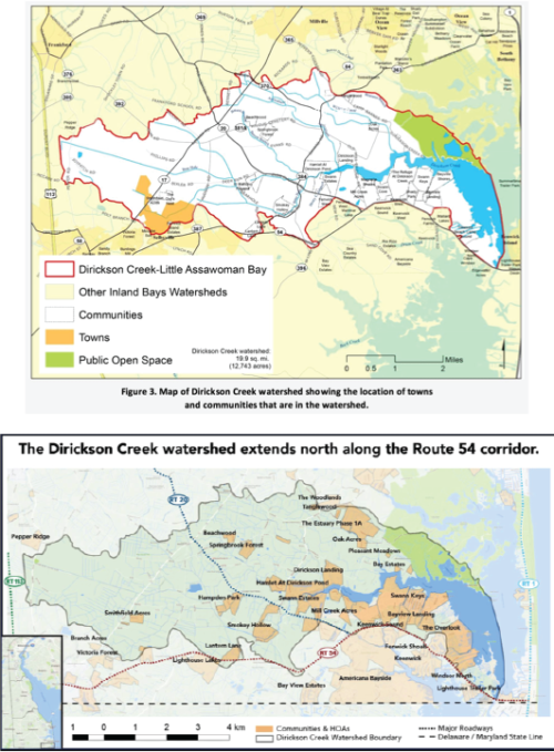
3. Colors: how to stay pretty, not pretty ridiculous. Michelle did a great job going into detail about this but I just wanted to reiterate. Contrast is good. Choose colors according to what you want to stand out. In Katie’s ‘before’ map, the yellow background really distracted from the message she was communicating about communities in the watershed. As you can see in the second map, the faded color in the surrounding lands really makes this message pop. She also softened out the colors overall, making the map easier to look at. Also consider colors that go along the lines with your theme - if you are grading a river, make the healthy parts green and the unhealthy ones an orange or red. If the map will be in a larger document, think about coloring the title and legend to match the theme of this document.

4. When combining your data with a map, try and try again. There are many different ways one can display data on a map. Heat maps can show population changes, but you could also show population growth using circles that get larger and larger in further iterations of the map. Similarly, you could show your study sites as simple dots or you could add more information to each dot (for example if you are sampling for biogeochemical makeup of a certain site, you could show the sand/mud ratio’s on the map instead of in a different table). At this point you will be giving your map a voice not only about where you sampled, but your actual results.
5. Keep your audience in mind, but give your map some life. We discussed this a bit in class last week. If you are presenting your map to a small community audience who are very familiar with the surrounding area, do you really need a locator map? In the end, we say yes. This is because well-designed maps often go further than their original purpose. You don’t necessarily want to design your map at the output so anyone can use it, but it is not a bad idea to keep in mind as you are creating your map that your audience may broaden over time.
6. Input, input and more input. Similar to the feedback each week in Science Visualization, the more eyes that glance over your map before finalizing it, the clearer the map will be in the end. Getting more input will almost always improve your map, and at the very least will help you to look at it from someone’s eyes who are less familiar with the project.
If you keep these few tips in mind, and the in depth advice from ‘Goldilocks: The Unheralded Mapping Guru’, the maps that you create will at least be able to speak for themselves. Although, I don’t see them getting up and walking around anytime soon…
Happy Halloween!
About the author
Dylan Taillie

Dylan is a Science Communicator with IAN. He has experience in various areas of visual information, science communication and technical analyses. Strengths in data management, environmental assessment and stakeholder engagement. He has worked with IAN in various positions since 2016 and enjoys fishing and hiking.
Next Post > The report card game “Get the Grade!” was launched in Stockholm, New Delhi and Honolulu
Comments
-
Holly Padgett 10 years ago
I really liked the analogy to halloween costumes! And I really like this part: "Someone viewing your map should not need to take more than a minute or two to understand it’s purpose." This is definitely something I always try to keep in mind...we don't want our users/readers to have to think a whole bunch in order to figure something out. Better to make it intuitive and always make things "user friendly"!
-
Katie Goerger 10 years ago
My biggest takeaway from this is: "You don’t necessarily want to design your map at the output so anyone can use it, but it is not a bad idea to keep in mind as you are creating your map that your audience may broaden over time."
Particularly when working in Illustrator, this can be difficult, but this just highlights that I need to (1) become more comfortable with using GIS applications - so that all of my maps have an easily editable starting point, and (2) saving, saving, saving! It will be easier for me to go back to a simple, editable map (in illustrator) if I save at key points before making output-specific changes. It's much easier to start at a generalized point than it is to have to disassemble a map created for a specific purpose.