Maps and Legends, Are We Really Understood?
Tom Butler · | Science Communication | 9 commentsWhat does a man named Tony Kushner have to do with a data visualization course? He’s quotable. Mr. Kushner’s use of words creates a vibrant image of a situation that might otherwise go unseen:
"A compass, I learned when I was surveying, it'll... it'll point you true north from where you're standing, but it's got no advice about the swamps, deserts and chasms that you'll encounter along the way. If in pursuit of your destination, you plunge ahead heedless of obstacles, and achieve nothing more than to sink in a swamp... what's the use of knowing true north?"
So, what happens to us in the field of science when we find the true north of our research but cannot successfully convey this to others? Scientists are all the time working to discover novel concepts about the world around us. And we often appear out of touch with not only “regular” people but other scientists. But it is crucial that we find some way to bring our true north to everyone in such a way that they do not find themselves sinking in quicksand. Therefore, we must create not only metaphoric but literal maps.

In last week’s class, we examined our initial foray into the world of mapmaking with programs such as ArcMap and QuantumGIS (QGIS). These Geographic information systems, GIS for short, are software platforms which allow anyone who has access to them the ability to visualize information in terms of the world around them, that is by creating maps.

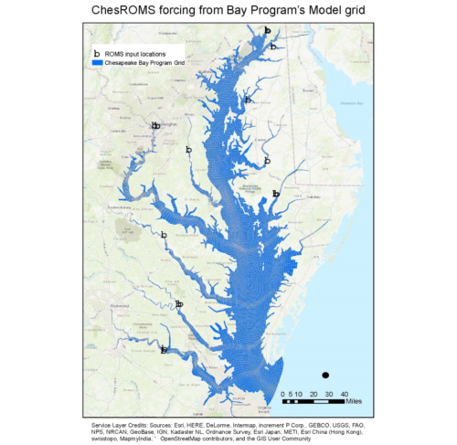
This first example was my initial attempt to display on a gridded structure of Chesapeake Bay the places that I was taking data from to study water quality. From our class discussions I can point out some obvious flaws:
Basemap. The actual map which all my data is projected on contains “chart junk.” It has city names, county lines, and colors which distract from the main point of the map. It is very important that when selecting a basemap you pick a map that has the CORRECT amount of detail for your intended purpose. In this case you should be able to see the Bay itself, the rivers feeding it, the grid, itself, and the places I collect data from. Sometimes it is hard to find where to find a good basemap. The ArcMap software comes with many different forms pre-loaded, in QGIS, the openlayers plugin can reveal a suite of possible basemaps. NOTE: regardless of the basemap you chose it must still be a MAP, not a screenshot of google earth or an aerial photo.
Data. Since this is the “meat and potatoes” of my map it is important to get it right. As we have seen earlier in class the data tells the story. In my map you might be able to see an attractive blue color for Chesapeake Bay, this is a grid. And those sometimes weirdly shaped black dots? Well, they should be separate points, not one jumbled mess. It is crucially important that the message you want to convey through the map does not become obscured in a purgatory of cramped lines. A better way of trying to convey my message might be to alter the line thickness and object sizes to better display the grid structure and input locations. Another solution would be to eliminate certain data from the map so the grid structure can be seen. If non-essential data ever inhibits your story telling abilities then it’s got to go!
Titles and Legends. A common theme amongst any data visualization is the choice of words, fonts and styles for images, this is no different for maps. It is always important to have an easily read text that is descriptive and leads the viewer exactly where you want them to go so they don’t walk into a swamp of uncertainty. It also helps to follow these same rules with legends, scale bars, and North arrows.
Some other issues which I might not have done with this specific map but which caused other students trouble include:
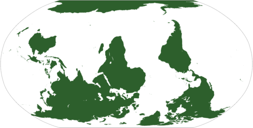
Projections. This is likely one of the more rigorous concepts to get down to but is crucial to the way the map looks. Across the globe there are multiple ways to project data onto a map. Some of these projections follow the earth's curvature relative to a specific point. Some projections display the earth as flat, with no curvature. Although this may not be technically wrong, it can create a distracting image which draws the audience away from the map's information and leave them puzzling about why the area looks different.

Orientation. Closely related to the issue of projections is the way a map is oriented. As the map maker, being familiar with the data can put you at a disadvantage when it comes to displaying it. If you are so familiar with the orientation of your map location you may forget to display the map so that viewers can understand what they are looking at.
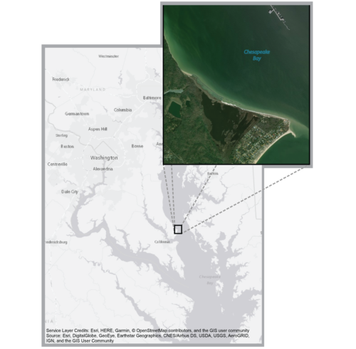
Reference Point. Even if you get the projection and orientation correct you may have such a specific area displayed that no one aside from you knows where it is. One way to combat this is to add an inset of the specific area within a larger box, as done by one of my classmates below.

As always, we will keep pressing forwards and making updates on our maps. This will entail further use of software such as Adobe Illustrator. We will keep you informed as we move along our path towards a finished product!
Citations:
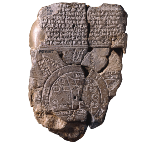
- “The Babylonian map of the world from Sippar, Mesopotamia" by Osama Shukir Muhammed Amin FRCP(Glasg) license under CC BY-SA 4.0
- Cerco CF et al. 2010. The 2010 Chesapeake Bay Eutrophication Model: A Report to the US Environmental Protection Agency Chesapeake Bay Program and to The US Army Engineer Baltimore District [pdf]
- “World map, upside down version of the common one” by: Nicoguaro, license under Creative Commons CC0 1.0 Universal Public Domain Dedication
Next Post > Visiting the National Press Club to talk about Chesapeake Bay
Comments
-
James Currie 8 years ago
This was a really cool blog! Nice summary of class. That quote at the beginning was actually quoted in the movie Lincoln: https://www.youtube.com/watch?v=yViWabafdUg
-
Lexy McCarty 8 years ago
I second what Jessie wrote - had to do some Googling. I really enjoyed the Tony Kushner hook. It did a great job sparking my my interest to figure out who he was in the first place, but proved to be even more successful in tying into our mapping material from class. Really interesting!
-
Natalie Peyronnin 8 years ago
Nice, clear blog Tom! It actually helped reiterate some things that I need to clean up on my map
-
Bill Dennison 8 years ago
Tom Butler’s blog “Maps and Legends, Are We Really Understood?” is homage to the R.E.M. song “Maps and Legends”. That homage, plus the wonderful Tony Kushner quote about the use of knowing the real meaning of true north, does a wonderful job of introducing the topic of producing high quality maps for use in science communication. The importance of using a legend with a map is emphasized in my version of the R.E.M. song. Since the early R.E.M. recordings were notorious for the mumbled lyrics, perhaps my version can just be substituted without anyone noticing.
Maps and Legends
14 March 2018
William C. DennisonHe's not to be lost, he's to be found.
He's not to be lost, he's to be found.Called the fool because he is lost
Knowing not where he'd rather be.
Where he ought to be he sees
What you can't see, can't you see that?Maybe he's caught with no legend,
Maybe he's caught with no scale.
Maybe these maps and legends
Have been misunderstood.Down the way the map's divided
Point out the places you have seen.
Those who know what I don't know
Refer to the yellow, red and green.Maybe he's caught with no legend,
Maybe he's caught with no scale.
Maybe these maps and legends
Have been misunderstood.He's not to be lost, he's to be found.
He's not to be lost, he's to be found.The map that you created didn't seem real.
You need to insure you’re points are seen
Point to the legend, point to the east,
Point to the yellow, red and green.Maybe he's caught with no legend,
Maybe he's caught with no scale.
Maybe these maps and legends
Have been misunderstood.
(Maps and legends)Is he to be found?
He's not to be lost.
(Maps and legends)
Is he to be found?
He's not to be lost anymore. -
Jessie Todd 8 years ago
This was an interesting read Tom; I ended up googling a lot of new things (i.e. more on Tony Kushner and R.E.M.). I enjoyed that you used your map as an example for flaws, so that people can relate. Erin's map was a great choice to show a clean example of a blowout.
-
Nicole Basenback 8 years ago
Great blog Tom!
I really like how you brought the focus back to the overall goal of communicating tools, and maps as just one tool to do that.
I think one more point on applying the tips we have learned with color, fonts, titles, legends, etc. as also applying to making map could have been added to your list of things to consider.
-
Chelsea Wegner 8 years ago
As all others have stated previously, I really loved that Kushner quote you selected for this. I also liked your choice of map to show your point about projections. This was a good read!
-
Rebecca Wenker 8 years ago
Ignore what I said about qgis2web, it actually MAKES an OpenLayers web map from your map. Regardless, 'openlayers' still isn't in QGIS 3.0, for those interested haha.
-
Rebecca Wenker 8 years ago
I love the way you used the Tony Kushner quote to relay how scientists may fall victim to overlooking the importance of successfully communicating their research in their fervor to obtain the "true north" of results. As a heads up, through many trials and errors I've found that the latest version of QGIS doesn't have all the same plugins as previous versions, so I think 'openlayers' is now 'qgis2web'.
Anyways I thought the tips you gave were good, and you explained them well. Great job!