Practical visual literacy for science communication
Bill Dennison · | Science Communication |As part of our ongoing learning about science integration and application, our team reads and reviews papers that are relevant to the IAN mission. We recently read and enjoyed a paper by Estrada and Davis titled "Improving Visual Communication of Science Through the Incorporation of Graphic Design Theories and Practices Into Science Communication", published in the Journal Science Communication in 2015. In this paper, they called for the inclusion of 'visual literacy' in science communication. This set us to thinking about what constitutes a practical 'visual literacy', which is the subject of this blog.
Visual literacy for science communication can be construed as the following seven principles:
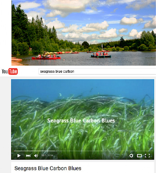
- There are many forms of visuals that can be used for science communication including photos, conceptual diagrams, maps, graphs and videos.
- A diversity of visual elements enhances the appeal of science communication to a wide audience.
- The creation, selection, and editing of visual elements should be given as much attention as is given to text.
- Visual elements need to be fully integrated with text; not just sprinkled in and not distracting.
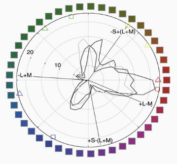
- Color selection should be internally consistent and recognize the cognitive impacts of different colors.
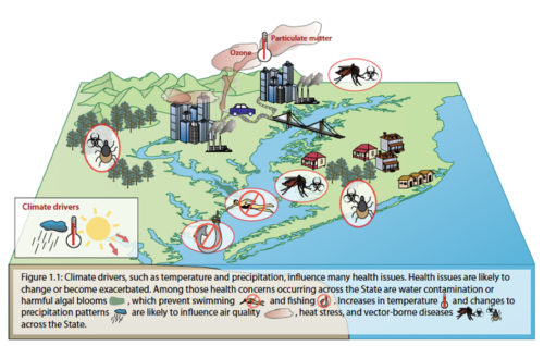
- Visual elements should have enough information or captions to allow stand alone comprehension.
- The process of reducing extraneous information in the visual elements (e.g., 'chart junk', 'map junk') allows the viewer to focus on the content of interest.
Each of these principles will be discussed and illustrated as follows:
- There are many forms of visuals that can be used for science communication including photos, conceptual diagrams, maps, graphs, videos and combinations of different visual elements.
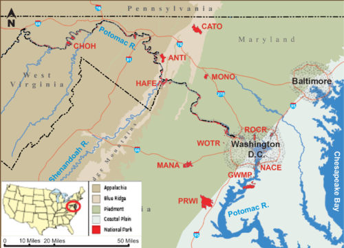
There are many different visuals that can enhance the effectiveness of a science communication effort. Photographs, carefully selected, cropped, and enhanced, if necessary, can illustrate key attributes or processes. Photos can often be annotated to aid comprehension. Conceptual diagrams can be considered 'thought drawings' that highlight key features and processes. They are particularly relevant when photographs cannot fully capture the breadth and scope of a concept. Maps that contain the minimal extraneous information while providing geographical reference points, location insets, scale and orientation information, can be effective. The use of geographical information systems facilitates good map production, but is often insufficient for good communication products without additional editing. A variety of different graphing styles (e.g., line, bar, stacked bar, pie, two dimensional, three dimensional) can be used to display data. Different graph styles can be selected for different data types, with care taken to use color, size of symbols and data orientation to provide a clear depiction. Videos, particularly short videos, can enhance a science communication effort. Videos can capture scientific presentations, used to illustrate processes, or provide an overview of a system. These various visual elements can be combined to produce compelling visual elements. For example, a conceptual diagram embedded into a photograph, a map with graphs located at different sites or a graph that includes photos can be effective.
- A diversity of visual elements enhances the appeal of science communication to a wide audience.
People are quite visual animals, with a large portion of our brains devoted to processing and interpreting visual information. But different people have different preferences or aptitudes for different visual elements. For example, a person with strong spatial orientation will appreciate maps, another person with strong analytical skills will appreciate graphs and another person with strong abstract thinking skills will appreciate a conceptual diagram. The use of a diversity of visual elements insures that different people will be engaged with at least some of the visual elements. Having complementary visual elements insures that different people with differing visual attributes will receive the same message.

- The creation, selection, and editing of visual elements should be given as much attention as is given to text.
Scientific writing requires significant editing and multiple iterations throughout the creation, editing and production phases. Scientific authors are accustomed to receiving feedback, and take text editing very seriously. Visual elements often do not receive the same level of scrutiny as text, yet they can benefit from editing just as much as text. The majority of scientific editors are experienced wordsmiths, but have little experience in visual editing. In addition to providing feedback on each visual element, the consideration of which style of graphic would be most effective or replacing a photograph with a diagram is rarely undertaken. The assessment of color, contrast, layout and design of visual elements should be the part of the process of producing any science communication product.
- Visual elements need to be fully integrated with text; not just sprinkled in and not distracting.
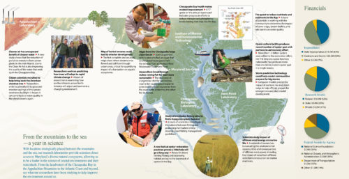
The order and placement of visual elements within a document is important. Writing a document independently of visual elements, and retroactively sprinkling in a few illustrations just to break up the monotony of text is rarely effective. The layout of a science communication product can be enhanced by mocking up a design in which text and visual elements are laid out as they will appear in the final product. A 'story-board' approach can be used to provide an overall 'look and feel' of a product, as well as identify the various visual elements to be obtained and provide a rough guide of the word counts for text used in the science communication product.
- Color selection should be internally consistent and recognize the cognitive impacts of different colors.
Color perception is a powerful cognitive feature of humans. Different colors evoke different emotions and physiological responses. Color can be a very powerful component of visual elements, but it can also be distracting. For example, red hues often evoke a strong emotional response, often associated with danger, while green hues are more soothing. Red color, used sparingly, can serve to highlight or draw attention to certain components of a visual element. Colors can help tie different components together by grouping by color borders or having the color in a graph correspond to the color of a map location.
Recognition that a small but significant fraction of the population, mostly male, has some form of color blindness should also be considered. There are various software programs that allow you to see what people with different color blindness can perceive and adjustment can be made to insure other aspects (e.g., texture, contrast) can be used to distinguish features.
- Visual elements should have enough information or captions to allow standalone comprehension.
One of the values of creating visual elements with enough embedded information that allow them to be comprehended in a stand alone manner is the interoperability of these visuals; they can be used and reused in a variety of science communication products. A key reason to have attached or imbedded captions is to avoid the reader having to search out the associated or explanatory text. Another reason is to allow readers who are not going to read the text to obtain enough information to understand the essence of the science communication product.
- The process of reducing extraneous information in the visual elements (e.g., 'chart junk', 'map junk') allows the viewer to focus on the content of interest.
The concept of 'silence' in science communication visuals refers to the importance of decluttering visuals. The use of 'white space' in publications is the use of gutters and margins without any text or visual elements in a document or on a website is an example of 'silence'. The home page of google is an example of abundant white space. Within text, having short sentences and paragraphs allows for silent spaces within a written document. The use of silent breaks in a video can be powerful as well. In addition to increasing white space with gutters and margins, the removal of tic marks, cross hashes, and extraneous information can help make the key content emerge more clearly.
In addition to these visual literacy principles, some rules of thumb we regularly employ include designing science communication products with roughly 50% visuals and 50% text. We often employ the adage embodied in the Albert Einstein quote; "Make everything is simple as possible, but no simpler." Consistency of style and form is a general rule of thumb, so that the content 'pops' out. We aspire to produce visuals that elicits a reaction from the audience, often by soliciting two-way communication. We like to use the most arresting visuals in the cover or landing page to induce the viewer to delve more deeply into the material. Another rule of thumb is to 'throw out the rule book' occasionally in order to vary the material and highlight some of the content.
About the author
Bill Dennison

Dr. Bill Dennison is a Professor of Marine Science and Vice President for Science Application at the University of Maryland Center for Environmental Science.