Ten classic scientific maps
Bill Dennison · | Science Communication |A well conceived and creatively constructed map can elucidate scientific concepts and effectively communicate important concepts. There are many examples of beautiful maps focusing on various geographic features, but this collection of classic scientific maps is notable for the scientific meaning that they convey. They are presented in chronological order.
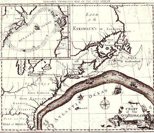
1) Gulf Stream: The 1770 map of the Gulf Stream by Benjamin Franklin was created to aid shipping traffic between Great Britain and the American colonies. Franklin learned the reason that the travel times on ships sailing from different ports varied by talking with ship captains. Ships sailing west against the Gulf Stream current were considerably slower than ships that avoided the Gulf Stream. The Gulf Stream, a term Franklin coined in 1762, was discovered by Ponce de Leon near St. Augustine, Florida in 1513, but this was the first map of this important western boundary ocean current. Franklin drew the Gulf Stream in the manner of a river, which was an apt metaphor to describe this current. Today, thermal imaging from satellites provides regular updates of the position of the Gulf Stream as well as the eddies or rings that form to the south (cold core rings) and north (warm core rings). Sailors still use the position of the Gulf Stream in navigation, just as Franklin suggested with his map. I recall riding a southern flowing meander of the Gulf Stream on the R/V Westward during gale force winds in 1988, making approximately four knots against the wind.
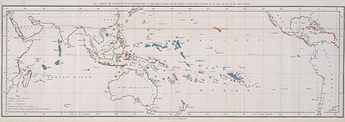
2) Coral reefs: The map of coral reefs throughout the Pacific Ocean created by Charles Darwin in 1842 as part of his first science book, The Structure and Distribution of Coral Reefs is a masterpiece. Although Darwin's subsequent books about natural selection eclipsed his insights into coral reefs, this coral reef map is part of the theory that Darwin had about the formation of coral reefs. Darwin correctly hypothesized that coral reefs were formed by the limestone accumulation by corals and that extinct volcanos were buried beneath modern coral atolls. It was over one hundred years before drilling associated with the nuclear testing on Bikini atoll that Darwin's theory was confirmed. Darwin did a couple of important things with this map: he color coded the reefs that were subsiding (blue) and uplifting (red) and he produced a large foldout to cover the entire tropical Pacific Ocean in a single contiguous map. In this manner, viewing the map instantly reveals the "magnificent and harmonious picture" of the broad patterns that Darwin observed. I am convinced that this is the first important piece of evidence supporting plate tectonics and the Pacific 'Ring of Fire', and that if Darwin had a bit more information available at the time, that he would have actually come up with the theory of plate tectonics.
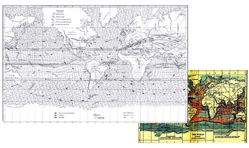
3) Ocean winds and currents: The global map of ocean winds and currents was produced by the first Superintendent of the United States Naval Observatory, Matthew Fontaine Maury. Maury collected enormous amounts of data from various ship's logs to construct maps of ocean winds and currents to aid sailors in choosing fair winds for transoceanic voyages. He published maps in The Physical Geography of the Sea in 1855. The significance of these maps went beyond the utility to sailors, as they developed a strong basis for oceanography. Maury helped form the American Association for the Advancement of Science, and even worked to eradicate slavery even though he fought for the Confederacy during the American Civil War. Today, there are many buildings named after Maury, including one at the Virginia Institute of Marine Science.
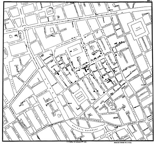
4) London cholera map: This map of cholera fatalities was produced in 1854 by John Snow, a London physician. Snow recognized the connection between cholera and water supply, as he also plotted the location of the water pumps on the map. A nice book, The Ghost Map: The story of London's most terrifying epidemic - and how it changed science, cities and the modern world, was written by Steven Johnson. Snow is credited as the father of epidemiology, and Johnson writes about Snow's self-administering ether for testing which he administered to Queen Victoria during childbirth, as well as describing life in the mid-eighteen century London. The genius of Snow's map was elegantly combining cholera fatalities with the water supply, since there were many competing (and incorrect) theories of cholera transmission. The city leaders responded to Snow's argument that the Broad Street water pump needed to be shut down, and they removed the pump handle and the epidemic dissipated shortly thereafter.
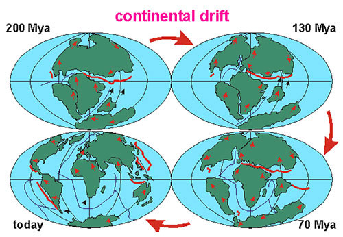
5) Continental drift map: The fitting together of the continents into a giant supercontinent, followed by gradual movements (continental drift) was promoted by in 1912 by Alfred Wegener, a German meteorologist and polar researcher. There were many predecessors to Wegener who noted the potential outlines of the continents, but Wegener coined the term 'continental drift'. Wegener provided evidence of continental drift through the similar fossils in the new world and old world, as well as geologic patterns. However, he could not provide the underlying mechanism and his theory was not generally accepted during his lifetime. It was not until the advent of plate tectonics and geophysical research findings that Wegener's theory could be coupled to an underlying mechanism.
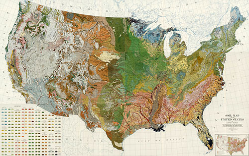
6) US soil map: The Soil Survey Program was initiated in the latter part of the nineteenth century and was an effort to map the soil types throughout the United States. The underlying motivation of soil mapping is to understand the underlying geology, with the advantage of developing a better understanding of lands suitable for different types of agricultural uses. Soil mapping involved field work in remote locations, with ever evolving technologies. Various soil characteristics (e.g., grain size distribution, color) were fastidiously mapped using survey equipment, and standardized methods developed. Various different federal agencies have morphed over the years to be responsible for soil mapping, and it is currently part of the National Resources Conservation Service, part of the US Department of Agriculture. The rich detail of color-coded soil types spread across the entire country is very attractive as well as being informative.
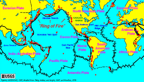
7) Plate tectonics map: The global map of the various tectonic plates, active volcanos, and mid ocean ridges provides an overview of the geologic forces shaping the planet. This map shows the connections between different land masses and the Pacific 'Ring of Fire' of active volcanos, which is consistent with Darwin's coral reef map developed over a hundred years earlier. The plate tectonics map pulls many disparate data sets together including sea floor mapping, historical tectonic activity, and tracking continental movements. The plate tectonics map is an outgrowth of the theory of continental drift that Wegener proposed as well.
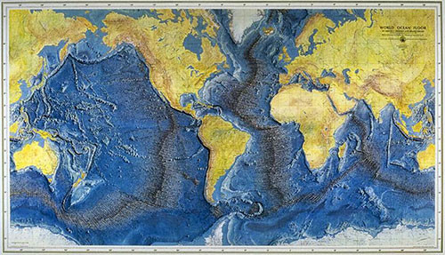
8) Ocean seafloor map: This map of the ocean provides a view of the seafloor if all the water were completely drained from the ocean. This map combines a tremendous amount of data painstakingly collected over decades of lead and sonar soundings throughout the world's oceans. The continental shelves are easily recognizable, thus the entirety of the continents can be viewed. The mid ocean ridges are easily recognizable, and the continuity of the ridges, as they connect with one another like the sticking of a baseball can be seen. The island chains in the Pacific Ocean are visible as a sequence of undersea mountains marching along, as a result of underlying volcanic 'hot spots'. The ocean trenches are visible along the subduction zones as well. This beautiful map was produced in 1977 by Marie Tharp and Bruce Heezen.
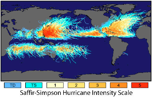
9) Tropical storm map: The tracks of various large tropical storms can be viewed as distinct patterns on a global map when individual storm tracks are combined into a single map. Individual storm tracks are quite variable and it is only when hundreds of storm tracks are combined into a single map that the storm track patterns become evident. The large tropical storms go by different nomenclature; the Atlantic Ocean storms are known as hurricanes, the South Pacific storms are cyclones and the North Pacific storms are typhoons. The rotation of the storms is controlled by Coriolis forces, so north of the equator, the storms rotate in a counter-clockwise direction, but south of the equator they rotate in a clockwise direction. The equatorial zone where Coriolis forces are too weak do not support tropical storm development. Until recently, there were no large tropical storms in the South Atlantic Ocean, which this map clearly demonstrates. The intensity of typhoons in the North Pacific Ocean is visibly displayed as well.
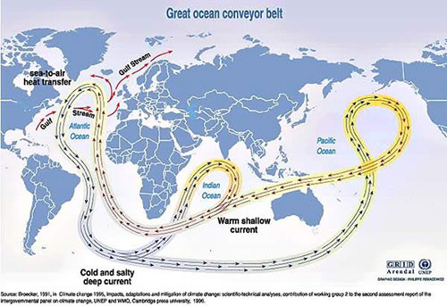
10) Ocean conveyer belt: The subsurface oceanic circulation patterns of the world's oceans are displayed with this simple conceptualization of the formation of ocean bottom waters and their movements below the ocean surface. This conceptual model of ocean circulation was developed by the oceanographer Wally Broecker. This map is receiving a lot of attention recently due to the potential impacts of climate change on ocean circulation, since ocean circulation has major consequences on global climate patterns. This map is an oversimplification, as the detailed data on subsurface ocean circulation that would be necessary for a true circulation map do not currently exist. Ongoing efforts to rectify this data paucity are underway using autonomous and passive drifters, but this conceptual map provided important impetus to collecting appropriate data.
Overall, these maps represent important conceptual scientific breakthroughs. The value of the maps was establishing patterns and linking causal agents to these patterns. Often, it is not just what is depicted, but also what is not included that makes these maps effective. These maps call attention to the salient points that the scientists were trying to make, using colors, arrows, and symbols to highlight the relevant features. Thus, in addition to being great maps, they are examples of effective science communication.
About the author
Bill Dennison

Dr. Bill Dennison is a Professor of Marine Science and Vice President for Science Application at the University of Maryland Center for Environmental Science.