Visual science communication: Using data visualization, conceptual diagrams and photographs to convey science information
Bill Dennison · | Science Communication |Science communication using visual elements can convey unambiguous information that words cannot. Words are often used by lawyers and journalists to argue cases or make points - science is an attempt to base arguments on all the facts available, not just the 'convenient' facts used to support an argument. Words can be interpreted in a variety of ways, but data is less ambiguous. Even in law, the rise of forensic science (e.g., DNA evidence) and video surveillance has supplanted eyewitness accounts and even confessions (particularly coerced confessions) as the most rock solid evidence.
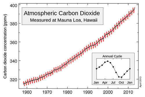
Data visualizations, conceptual diagrams based on data synthesis, and unaltered photographs provide important unambiguous information that can be used to frame a debate. An example is the famous Keeling graph of atmospheric carbon dioxide concentrations collected in Hawaii since 1958. There is an intense amount of discussion and debate over global climate change, but this irrefutable data set is not at issue. Even climate deniers do not attack the observation that atmospheric carbon dioxide concentrations are rising, and the power of the Keeling graphic is in the data density (every 15 minutes), data continuity (1958-present) and data collection site in a remote location (atop Mauna Loa, Hawaii).

There are several interesting scientific proponents of using visuals in science communication. Statistician Edward Tufte has written several richly illustrated books about visual communication and he regularly gives lectures about the topic. An engineer at MIT, Felice Frankel, is a proponent of the proper use of color in scientific literature has published books on the topic; "Envisioning Science" and "Visual Strategies". Bang Wong, originally from Johns Hopkins University, approaches science communication from the biomedical research field and he discusses sorting data into primary, secondary and extraneous information and then creating unique visualizations to convey complex information.

There is a good TED talk on the subject by David McCandless entitled "The Beauty of Data Visualization" in which he talks about eclectic data mining in order to condense knowledge. McCandless plots a variety of factors, including budgets, people's fears, political values, nutritional supplements as examples of using data visualizations to create new insights. McCandless has a journalism background and has published a book called "Information is Beautiful". These different proponents of visual science communication have come to this emerging field via different routes and from different backgrounds. Yet, the common element is the use of visuals as effective means of science communication.

The IAN approach to science communication is heavily visual. The extensive use of photographs, conceptual diagrams, data figures and tables, and maps to balance the number of words is a hallmark of IAN Press publications. Roughly 50% of the 'real estate' footprint of IAN Press publications is visual, thus reducing the contribution of the text to convey meaning. The carefully chosen words, particularly the active titles which attempt to make unequivocal statements, are directly linked to the visual elements.

As scientific methods and technologies become more complex and the data streams become more intense, more and more attention will need to be given to visual science communication. The act of obtaining data is becoming less onerous, but the processing and interpretation of data is becoming more challenging. My prediction is that visual science communication will continue to gain in popularity and importance and the current proponents of visual science communication listed above will be viewed as pioneers in this emerging field.
About the author
Bill Dennison

Dr. Bill Dennison is a Professor of Marine Science and Vice President for Science Application at the University of Maryland Center for Environmental Science.