When herding cats it helps to have a map
Bill Nuttle · | Environmental Report Cards | Science Communication | Applying Science |It makes me cringe a little to remember the debriefing that followed our May workshop on the Everglades report card project. The IAN team was complimented for keeping the project on track. “Great job at herding cats,” they said, referring to our ability keeping a meeting of scientists on track. There was just one loose thread that needed to be tidied up. But, then the “cats” got hold of it, and for a moment it seemed that things might unravel. The fact that it did not reveals how IAN is successful working with scientists.
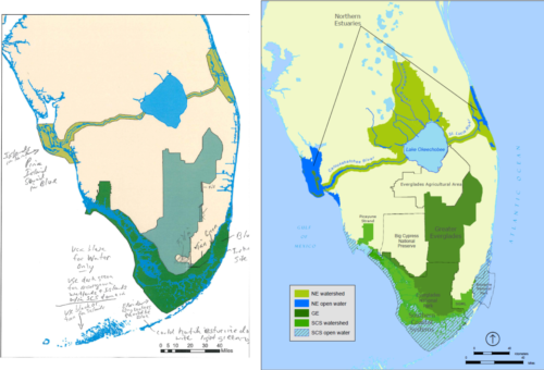
The purpose of the May workshop was to begin assembling a draft of the 2019 System Status Report for Everglades restoration. The IAN team came to the workshop with the first draft of the Everglades environmental report card, which will be the centerpiece for this report. An important element of the report card is a map of the four regions in which conditions in the Everglades ecosystems are being monitored. The existing map needed to be updated. So, copies were printed, and over lunch people marked them to indicate where changes were needed.

The following morning everyone was in a good mood when Alex Fries and I met with the project co-leaders, Patti and Donna. All agreed that the workshop had been productive, and the project was on track. When working with a group of scientists there is always the tendency for discussions to wander off track. We don’t want to discourage this, entirely, because the free flow of ideas is essential. As we assembled data from the last 5 years of monitoring to the report on conditions in the Everglades ecosystems it is important that we also keep track of the on-going recovery from Hurricane Irma, which hit south Florida last September, and the looming threat of toxic algal blooms.
Finally, our attention turned to the map. “Let’s just knock this out quickly, and we’ll be done,” Patti said. Knocking it out quickly meant editing the image file directly, by hand, to crudely implement the changes sketched out by the workshop participants. This seemed a reasonable approach because the purpose of the map as an element of the report card was simply to communicate to readers the relative size and location of the four regions: Lake Okeechobee, the Northern Estuaries, the Greater Everglades, and the Southern Coastal System. Absolute accuracy was not required, or so we thought.
The revised map attracted way more attention than we anticipated when we sent it back to the workshop participants for them to review. We had forgotten that for contributors to the Everglades Monitoring and Assessment Plan (ironically, known by the acronym MAP) the map of the monitoring regions is more than just a communications tool; it is crucial to documenting their work. Lines on the map represented areas of responsibility and features of the south Florida landscape that have particular ecological and programmatic significance. These had to be rendered exactly right.
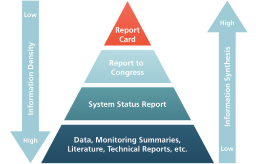
In this sense, the map became the manifestation of a metaphor the IAN team often uses. To define the role of the environmental report cards, we ask people to imagine all the information available about a place gathered into a pyramid. The broad base of the pyramid consists of the vast amount of raw data that has been collected. Above that, are the results of basic scientific analyses used to interpret those data. Next, above that are results of modeling and environment assessments that build on the scientific results. And so on, continuing upward, each higher layer representing a synthesis of the information below it. The report card sits at the very top of the pyramid, providing a concise synthesis of all the information about the Everglades ecosystems that has been gathered and analyzed by the MAP program.

Nowadays, maps are constructed in a similar fashion, as layers of information gathered and analyzed electronically. Ultimately, “knocking it out“ required 6 weeks of email consultations and the help of a GIS specialist at Everglades National Park. Each point represented on the map can be traced, through the magic of GIS and GPS, to its precise location on the south Florida landscape with centimeter accuracy. As with the map, our goal for the Everglades report card is to assemble it in such a way so that the information presented, the scores calculated for each indicator, can be traced back all the way down to the raw data on which it is based.

Our experience of recreating the map for the center of the Everglades report card reveals its third, essential function. The key to successfully tapping into the flow of information that science and scientists can provide is not in finding the secret to “herding cats.” Rather, it is in building ways to gather up the various strings of ideas that participants put into play. By taking the time to work with MAP contributors to define the key features of the south Florida landscape, we get not only and accurate representation of the geography of the regions covered by the report card. We also assure that the report card and the 2019 System Status Report that supports it represent a synthesis of all the ideas from the scientists and managers who have contributed to this project.