Bill Dennison speech to Latornell conference, Ontario, Canada: Part 2 - Incorporating visual elements
Bill Dennison · | Science Communication |PART 2; Incorporating visual elements
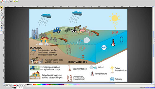
When I talk about using visuals, these are classes of visuals that we've tried to use in all of our science communication products. We try to use conceptual diagrams to provide context and synthesis. Historically, these were in the realm of graphic artists. But in fact, one of the things Ben Longstaff from Lake Simcoe Regional Conservation Authority and I are going to be doing in a couple of hours is running a session on this aspect of science communication. There are tools now that mean you don't need graphic artists. This is all now desktop, and everybody can do it. Maps are really important, it gives you geographic context, and it can provide lots of information. GIS [Geographic Information Systems] is a great tool to embed different layers on maps. A well-chosen and cropped photograph can provide an immense amount of information. The old adage that a photo is worth a thousand words applies. Tables and figures are another visual element Edwin Tufty has coined a term called "chart junk", in which the bits that are extraneous and distract from the message are included. So clean graphics are important.
There are two sets of tools I'd like to point out. One is the Conceptual Diagram Creator. Traditionally what we've done is posted our symbol libraries and we've grown this symbol library organically. We have about twenty-five hundred symbols now online, developed over the last six years. And sixty thousand people from two hundred and thirty-eight countries have downloaded and used those symbols using a graphics program called Adobe Illustrator. It can be rather expensive, unless you get a good NGO or educational discount. But now we have recently added an online Conceptual Diagram Creator, so you don't need to pay anything. It doesn't have the full functionality, but it gets you ninety percent of the way. And you can draw and edit diagrams like this quite rapidly using that program.

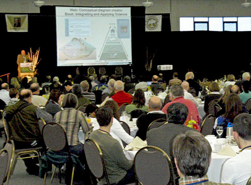
The other resource that we have is a recently published book called, Integrating and Applying Science – A Practical Handbook for Coastal Ecosystem Assessment. This is a book about how to engage the community, how to build community knowledge, how to analyze environmental data, and how to obtain environmental data. You can get a PDF online version or a print version.

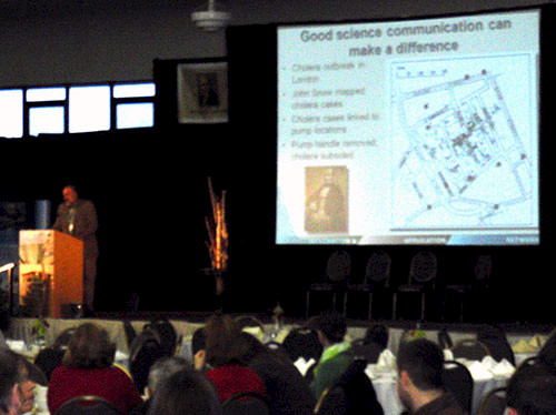
Let me give a couple of examples that Tufte uses in his books, the two NASA disasters, the Challenger and the Columbia. He attributes those disasters in both cases to bad science communication. The technicians and engineers beforehand, knew the problem and ineffectively communicated their concerns. But, that's kind of hindsight, and it was ultimately tragic. I would like to tell a story of good science communication that really worked out. There was a physician called John Snow who lived in London in the nineteenth century. There was a cholera outbreak downtown in London. There's a book written called, The Ghost Map, about the map that John Snow made with each dot on that map representing a fatality, a person who died of cholera. And each of the little red circles with a "P" is a pump. This is before London had reticulated water and sewerage, so they had pumps. You go fill up your bucket, carry it back to the house, and then the sewage went into a cesspool directly below the house, ergo the cholera from leaking cesspools and contaminated well water. Well, John Snow was able to identify that the Broad Street Pump, which was a favorite pump—it had the sweetest water traditionally in London, was the source of this epidemic. And so he took his map, this Ghost Map, to the city leadership and said, "I think there's a connection." They took the pump handle off and the cholera went away. So he saved lives with good science communication. His "Ghost Map" made a huge difference.

This is the second post in a series about Bill Dennison's keynote address at the Latornell conference in Toronto, Ontario, Canada.
Other posts in this series:
1. Part 1 – Science Communication
3. Part 3 - History of Science Communication
4. Part 4 - Environmental Report Cards
5. Part 5 - Report card examples
6. Part 6 - Five step program for environmental report cards
7. Part 7 - Oh Canada!
8. Part 8 - Communicating Science Effectively poster
About the author
Bill Dennison

Dr. Bill Dennison is a Professor of Marine Science and Vice President for Science Application at the University of Maryland Center for Environmental Science.