Bill Dennison speech to Latornell conference, Ontario, Canada: Part 4 - Environmental Report Cards
Bill Dennison · | Environmental Report Cards |PART 4; Environmental Report Cards
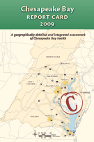
Let me talk about one science communication tool that we've been developing, that we think is really powerful, and this is the Environmental Report Card. They're really powerful for three big reasons. One is they are a really good peer pressure motivator, because peer pressure motivates human change. The story I'll give here is the Chesapeake Bay Report Card. Over on the Eastern Shore of Chesapeake Bay; there was a grade of "D minus" that was the second worse grade compared to Baltimore Harbor, which was an "F." The people over on the Eastern Shore rural community said, "We're almost as bad as Baltimore, we can't be that bad." It didn't matter how they compared to the Baltic Sea, or anywhere else in the world. But they knew Baltimore, and they knew they were better than Baltimore, so they got the message that they had to do something about their agricultural runoff. The other thing about Environmental Report Cards is that they are a common and shared experience. We actually published the Chesapeake Report Card in a little manila envelope. This works because we've trained everybody in report cards—they've done it for an average of twelve years of their life—getting these Report Cards. So it's good training, we can use this metaphor very effectively. I started realizing that Environmental Report Cards worked when we developed them in Australia around 2000. After around the third Report Card, the Mayor had caught on that this was going to hit the news and this was going to be a big deal, so about two weeks before the release, they called me up and said, "Bill, how did we do?" I said, "You got a 'C minus'." They said, "Is there anything that I can do for extra credit in this two weeks?" This is another common human behavior. And I said, "No, but we could help you tell the story about why it's still a 'C minus'." In some cases, they hadn't upgraded the sewage yet, or they hadn't given it enough time. So we learned that we had to pre-brief them, even with bad grades or good grades. And, that they would be able to handle any grade as long as they had advance warning.
Finally, Report Cards are really effective, because they take huge amounts of information and they make it digestible. They put data into digestible bits. They synthesize large amounts of information. So they're really a powerful way to communicate. They allow for us to bridge the disconnect that we have in society—the disconnect that scientists are really good at doing science, typically really bad at communicating, and effectively are ignored. Politicians are generally really good communicators, that's how they get elected. But, they don't typically have a science background. So we have this great disconnect. And then the people, the average stakeholder on the ground, the citizens, they have neither the power or the communication skills or the science background. So, they're really out in the cold. The only way we're really going to move it forward, is to take them on this journey. To take the power and communication that the politicians bring, the knowledge and the science the scientists bring, and inform and engage the community, so that they become a true partner in the process that you're going through in conservation.
Let me give you a few examples. And I've got a bunch of examples as we've been developing these Report Cards over the last twelve or thirteen years. I'm just going to focus on the Management examples. But my sort of philosophy is if you have the shared vision and you organize around that shared vision with Management, Research and Monitoring, you can do great things. There are three examples I want to give where these Report Cards have Management implications. And I'll leave the Research and Monitoring for a later date. That's more for the scientists.
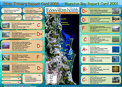
Here's the Report Card that we developed in the Southeast Queensland, Brisbane, Australia region. This was one of the first, the 2001 Report Card, which has since evolved to Watershed and bigger spatial scales. What it did, is that it really empowered the engineers in Queensland to go about upgrading their sewage. We mapped sewage plumes and watched the decline of nutrient loads, and the shrinkage of the plumes and the associated algal blooms. The report card helped catalyze these improvements.
Another example is from Maryland. This is what we're doing with newly reelected Governor, Martin O'Malley—the thing called BayStat. This is a really interesting experiment in governance. This is one that I find fascinating, because monthly, the Governor sits at the table with his Secretaries of Enviornment, Agriculture, Planning and Natural Resources. He also use the inmates from the Department of Corrections to plant trees and make oyster cages. Baystat also has academic scientists; budget people and legal counsel. BayStat works to include the people the Governor needs to make decisions. And he works in a very Socratic manner; he drills people about, "What did you do last month about our sewage upgrades?" And the Governor also provided a funding mechanism. There are two funding mechanisms we have that were based on license plate fees and other ways of getting money to do some targeting. So we're using the Report Card that we're doing to not only track progress, but also to help spend his money most efficiently. In this case, the Report Card is not just documenting the status, but helping guide the restoration.
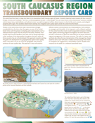
And then a very interesting Report Card that we did a few years ago was for the South Caucasus region (central Kura River basin), between Armenia, Azerbaijan, and the Republic of Georgia, located between the Caspian and Black Seas. The Kura River, which is shared by these three countries is heavily contaminated by open pit mines, raw sewage, and agricultural runoff. It's a trans-boundary river that goes between these three countries. And it turns out they don't get along. In fact, they are technically at war with one another. And that's without Russia invading a few years ago. So this is the kind of a place where you don't tend to come together. In fact, we had to meet in Georgia, because the Armenians weren't allowed to go to Azerbaijan or vice-a-versa. So number one, we got them into the same room. That was a big step. Number two; we put their data on a common map. When we first showed this map, we were going to go through it relatively rapidly. We had six indicators we were going to go through and show them how we integrated them. And they said "Whoa, Stop. We've never seen that map before. We've never seen our data compared to their data." And, they poured over this map. The report card brought them together, and then we published this report card in Russian and in English. The U.S. State Department actually funded this, because they thought, "Hey, if we can get people together to talk about something like water, maybe we can get them to talk about other things like peace." So, it's a really good opportunity to bring people together.
This is the fourth post in a series about Bill Dennison's keynote address at the Latornell conference in Toronto, Ontario, Canada.
Other posts in this series:
1. Part 1 – Science Communication
2. Part 2 - Incorporating visual elements
3. Part 3 - History of Science Communication
5. Part 5 - Report card examples
6. Part 6 - Five step program for environmental report cards
7. Part 7 - Oh Canada!
8. Part 8 - Communicating Science Effectively poster
About the author
Bill Dennison

Dr. Bill Dennison is a Professor of Marine Science and Vice President for Science Application at the University of Maryland Center for Environmental Science.


