Bill Dennison speech to Latornell conference, Ontario, Canada: Part 6 - Five step program for environmental report cards
Bill Dennison · | Environmental Report Cards |PART 6; Five step program for environmental report cards

Let me go through five steps of generating Report Cards that we've generated. And they are relatively simple and straightforward. First is to draw it, to create the conceptual framework. Second, is to choose the indicators. Third is to define the thresholds. Fourth is to calculate a scorecard. And fifth and most importantly, communicate it. This isn't something to leave in the closet. This is something to bring out publicly.
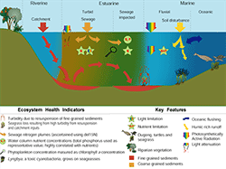
This is the conceptual framework we used in developing the Report Cards in Australia. This is the runoff of sediments and nutrients from the watershed and from sewage treatment, the re-suspension of sediment and loss of seagrass. There are turtles and dugongs in the diagram. We also tracked the nutrients and the sewage with isotopes and concentrations. So we ended up with six indicators. And these indicators were turbidity, seagrass area, nutrient concentration, nutrient plumes, phytoplankton, and a toxic cyanobacteria forming a harmful blue-green algal bloom. And so we used a combination of mapping with small boats and with remote sensing, to generate the data to support this report card. These indicators were chosen because they reflected the environmental values of that community. We generated a conceptual diagram with the community. One thing about diagrams is that they invite two-way communication. A graph or table might intimidate people, because that's data that they don't really quite understand, but they understand diagrams. And they'll say, "Hey, I want a dugong and a turtle on this. And that's what we linked the indicator, the seagrass, to that resource. So that's an important step, that conceptualization and the mind mapping that goes into the conceptual diagrams.
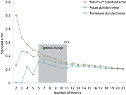
Second is to choose the indicators. And here's my rule of thumb. Pick the number of indicators that you can count without taking your shoes off. Don't make it too complicated. In Chesapeake Bay, we had a hundred and one indicators. The National Park Service Vital Signs Program had a hundred indicators. You can't get your head around a hundred. It's too many. Think about driving a car, if you're driving a car, you're glancing down at your dashboard, and you're looking at about half a dozen things. You're looking at your speed, your oil pressure, your rpm's, warning lights, and then you're keeping your eyes on the road because you're going forward. You don't have time to diagnose the whole car. If you have a problem, you go to the garage and they hook it up to a computer and they have a hundred indicators they look at. But to make that car go forward, to make your conservation effort go forward, we have to glance at the dashboard and keep moving. That's why you need a small number of indicators. We actually did some research on that, where we took twenty-two indicators at Rock Creek that the National Park Service had generated, and randomly picked those indicators and then sorted them different ways and ran it over and over again with different numbers of indicators. You find after about six indicators, the amount of variability reduces dramatically. So you can actually get pretty reliable, reproducible results with a half a dozen indicators. If you get any more, it's just diminishing returns. So that was our lesson there. That confirmed our sort of intuitive thing that we wanted to be able to count the indicators on both hands.
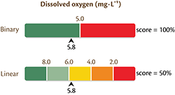
The other thing is to pick thresholds. And this is where many, many of my scientific colleagues get hung up. They get all concerned about, "Should it be an aspirational goal?" I sat in a room for a whole day once when the Department of Environment wanted a fifty-milligram per liter chlorophyll standard, and the Department of Natural Resources, they work for the same Governor, and they wanted a five-milligram per liter standard. And it just wasn't going to happen. I said, "We can have multiple thresholds. You can have your fifty over here, and you can have your five over here. We'll just grade it on this multiple threshold scheme." In general, a single threshold can work if you have lots of data. because the variability of the data will sort itself out. If you have a limited amount of data, I recommend the multiple thresholds.
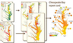
The next step is calculating the Report Card. And this is where the science blends into the art, because you are typically grading on a curve. So here's our Chesapeake chlorophyll, water clarity, and dissolved oxygen. And what we did, because these were collected on the same boats by the same field team on the same monthly schedule, we grouped those and called it a "Water Quality Index." And then we had three other indicators of benthic index of biotic integrity using grab samples, a seagrass survey done with an airplane and ground truthed, and then a phytoplankton index of biotic integrity done with water samples. So you have different field approaches, different timing of sampling once or twice a year, and we combine that into a biotic index. Then the water quality and the biotic index were collected together for our ultimate Report Card. So what we share with the public and the Governor is this very short version. But, it's supported by all the data underneath it. We developed a website, and we have about two hundred and forty unique web pages every year with ninety different maps and graphs and such to support that, so that they have the rigor and the believability.
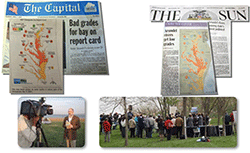
And then finally and most importantly is about communicating widely. This is about getting the message out to the broadest possible audience. This isn't about targeting and marketing to a small, narrow niche. The political support that we've generated has always been because we had the community involved. And so we do public releases with television, and newspaper, and generally get good coverage. That actually builds over time. Expectations get raised, and last year our Governor did the release with us. So it's an important event.
This is the sixth post in a series about Bill Dennison's keynote address at the Latornell conference in Toronto, Ontario, Canada.
Other posts in this series:
1. Part 1 – Science Communication
2. Part 2 - Incorporating visual elements
3. Part 3 - History of Science Communication
4. Part 4 - Environmental Report Cards
5. Part 5 - Report card examples
7. Part 7 - Oh Canada!
8. Part 8 - Communicating Science Effectively poster
About the author
Bill Dennison

Dr. Bill Dennison is a Professor of Marine Science and Vice President for Science Application at the University of Maryland Center for Environmental Science.