Comics for Science: using diagrams to illustrate a point
Annie Carew, Lexy McCarty · | Science Communication | 10 commentsAnnie Carew and Lexy McCarty
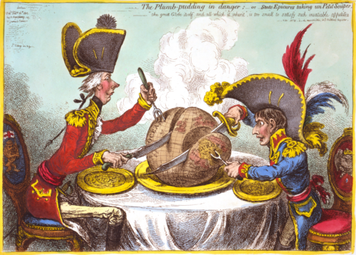
We’ve all seen political cartoons, whether in an antiquated physical newspaper or somewhere online. What makes political cartoons so compelling? They get their point across, quickly and simply, with an eye-catching visual and brief, clever text. These comics condense often complex sociopolitical issues into a panel or two with devastating effectiveness. This week, we discussed implementing similar techniques in scientific communication using hand-drawn conceptual diagrams.
Like political cartoons, the conceptual diagrams we discussed are intended to link objects and processes together. However, in order to be useful in scientific papers or presentations, conceptual diagrams have to be a little more complicated than a single-panel cartoon. The struggle to balance complex ideas with simple communication was at the heart of our in-class discussion this week. See this cartoon from the Augusta Chronicle for a political cartoon that addresses the multiple possible outcomes of climate change in a simple, amusing manner.

Tips for Creating Effective Conceptual Diagrams
Determine your audience and message. Important questions to ask yourself when preparing for science communication are: Who is the audience, and what do you want them to know? Having a clear goal for your communication can help streamline your thinking and curtail your use of scientific terminology that may not be known to people outside your field. Also keep in mind that many audiences will want the quickest version of information possible, and design your diagram accordingly.
Keep it simple, but not too simple. Scientific processes are complex; it can be difficult to effectively summarize them in text, let alone in a diagram. But it’s important to ensure that the diagram is not too busy or cluttered, so simplification is necessary. Conversely, simplify things too much and you run the risk of misrepresenting your science.
Make the flow of scenarios/processes clear. Every conceptual diagram you create will require a different approach. For example, a diagram of the water cycle will be laid out differently than a diagram of habitat succession. When designing your diagram, make sure that the eye naturally flows through the diagram in the order that you want. If your project involves multiple processes or scenarios, it is probably better to create a separate diagram for each one.

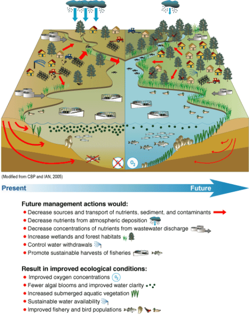
Choose appropriate symbols. Symbols are used in conceptual diagrams to represent larger, more complex objects. When choosing symbols for a diagram, it is important to keep the real-life model in mind, but not to the point that you’re shrinking life to fit into your diagram. Think of diagram symbols as caricatures, and use the fewest lines possible to convey the image you want.
Use a legend or caption. Diagrams do not and should not stand alone. Provide your viewer with some kind of guide to what they’re looking at. A legend defining your symbols is vital; make it prominent and easy to read. As with all scientific figures, a caption explaining the image is necessary.
You’ll know it when you see it. While these guidelines can be helpful in constructing a conceptual diagram, they are not ironclad rules. Every audience is different, and every project is different; therefore, every conceptual diagram will be different. In this class, we review each other’s work and provide constructive feedback. This is a key step in the process of scientific communication because it ensures that you’re getting your message across.
A special thank you to Brianne Walsh, Senior Science Communicator at the IAN, for her guidance on conceptual diagrams.
1Caricature gillray plumpudding. created by James Gillray. No known restriction on publication.
Further Reading
Fandel, C. A., Breshears, D. D., and McMahon, E. E. 2018. Implicit assumptions of conceptual diagrams in environmental science and best practices for their illustration. Ecosphere, 9(1):1 – 15.
Next Post > Learning About Transdisciplinary Science Through Graduate Teaching
Comments
-
Lexy McCarty 8 years ago
Great job! I loved the "Tips for Creating Effective Conceptual Diagrams" and how you broke them down into short and sweet ideas. Someone else mentioned it in their comment, but "You'll know it when you see it" is very true and I think is a great way to wrap up the entire blog. Well done!
-
James Currie 8 years ago
Nice work Annie and Lexy. I agree you've pulled a lot of the most important messages from the class. The one that stood out most to me was 'determine your audience/message.' One of the hardest things to do when you're making graphics with a message is to think about your audiences and to put yourself in their shoes. What do they think about? What matters most to them? How will they most likely react to your message? What details do they care about/not care about? And then you have to make an objective decision about where the line should be drawn on 'keeping it (your message) simple, but not too simple.' This can be a real challenge, particularly as a scientist whose goal is to represent data accurately.
-
Jessie Todd 8 years ago
I really enjoyed reading the beginning portion about the political cartoons and the connection you made with the importance of conveying more complex ideas and processes by using simpler diagrams or cartoons. The tips for creating an effective diagram were great, but I agree with Rebecca in maybe adding a little piece about Adobe illustrator and the ways it can be used or show a before and after of a hand drawn picture of a diagram that was then transformed into a real diagram. It might be nice to show what Adobe can do. Overall great read!
-
Erin 8 years ago
I think you nailed it with the tips that you pulled out. I think this clearly illustrates the discussion that we had. I particularly like how you mention that our class goes through a review process to make sure that we are getting the right message across.
-
Rebecca Wenker 8 years ago
Good blog, Annie! I thought it was clever to link political cartoons and conceptual diagrams together, especially because they can both illustrate complex messages through comparatively simple images. I liked your tips as well, but in addition to them it may have been nice to add in something about the different methods of creating conceptual diagrams (ex: by hand first then software later, Adobe Illustrator, IAN Symbol Library, etc.), just to give your audience a starting point. That's minimal though, overall good job!
-
Katie Fitzenreiter 8 years ago
Annie, I really liked the analogy between political cartoons and scientific conceptual diagrams. It was a creative way to explain the use of diagrams to effectively communicate science, through simple and eye-catching images with minimal wordage. I agree with Rebecca above - it would be helpful to include something about the process of creating conceptual diagrams. An effective way to do this could be to include an image of a hand-drawn diagram, followed by images of the IAN library symbols on the IAN website, and then a snapshot of the complete diagram in Illustrator. Overall, nice job and I enjoyed reading your post!
-
Nicole Basenback 8 years ago
Great post Annie! I think you did a nice job of capturing the challenges we discussed in class with your concluding point "You’ll know it when you see it". I think with more practice we will become comfortable with using the tips as constructive guidelines for successfully portraying our unique projects, and not as rigid rules.
-
Tom Butler 8 years ago
I liked your point about keeping it simple but not to simple. I had always thought that simple was better, especially in regards to images within a conceptual diagram. Before this class it had never occurred to me that things could be too simple. It was a powerful reminder that even if the maker of the conceptual diagram understands the message it is often because they already know the minutia of the problem. I was thankful to learn that in creating a diagram you must retain information which to you may seem insignificant. Good job on the blog!
-
Chelsea Wegner 8 years ago
Great job! I think you have summarized a succinct guide to developing a conceptual diagram that I will definitely use in the future. You clearly captured the key points from our in-class discussion. My only minor critique would be that my eye was immediately drawn to look at the political cartoon on this page rather than clicking on the link to the Augusta Chronicle you were referring to. This may not have been the case for others but perhaps the political cartoon could have been placed before the second paragraph. Otherwise, great flow throughout!
-
Bill Dennison 8 years ago
Annie’s thoughtful blog calling for comics for science called to mind the song by Aqua titled “Cartoon Heroes”. I adapted their lyrics to the following:
Cartoon Heroes
14 Feb 2018
William C. DennisonWe are what we’re supposed to be
Illusions of your fantasy
All symbols that speak and say
What we do is what you wish to do.We are the color symphony
We do the things you wanna see
Diagram by diagram, to the extreme.Our concepts are not unreasonable
They do the unpredictable
All symbols that speak and say
What we do is what you wish to do.It’s all an orchestra of strings
Doin’ unbelievable things
Diagram by diagram, to the extreme
One by one, we’re makin’ it fun.We are the Cartoon Heroes -oh-oh-oh
We are the ones who’re gonna last forever
We came out of a crazy mind -oh-oh-oh
And walked out on a piece of paper.