Communicating Science to Effect Social Change
Bill Dennison · | Science Communication |This title refers to our attempt to use science communication to make a difference in the world. We really do aim to make a global impact with our science communication applications. An indicator of how science communication is applied globally is that the free IAN symbol libraries have been utilized extensively. Over fifty-five thousand people from around the world have now downloaded this from two hundred and thirty-seven countries, virtually, the entire planet. The development of freeware vector software such as Inkscape has undoubtedly assisted poorer countries to be able to use conceptual diagrams to enhance science communication.
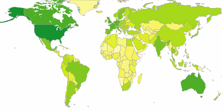
Another indicator is the science communication training that we have conducted around the world. For example, when we were in Thailand, we had students from all of southern and eastern Asia countries attending the course. We have also conducted training sessions in Europe and throughout North America. In addition to science communication training, we have conducted various environmental report cards and national assessments, where we embed our science communications skills in those other locations.
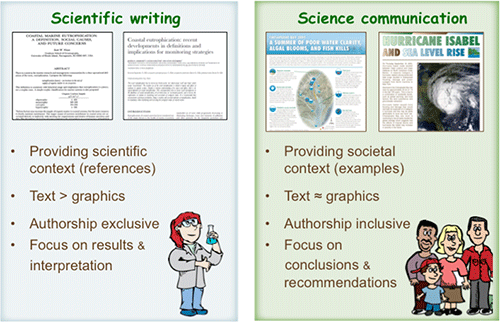
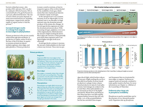
So what is science communication? We define science communication as successful dissemination of knowledge with a wide range of audiences including non-scientists. To provide a contrast between science writing and science communication, there are several comparisons. Science writing for scientific papers and journals provide scientific context with lots of references--fifty or more references—and the text is the major driver. There are some graphics, usually black and white, used to support the text in science writing. In science writing, authorship is something that you care deeply about--who's first author, who's included, who's in the acknowledgments. The focus in science writing is on the results and interpretation of those results. In contrast, science communication is targeted for a much broader audience and rather than providing scientific context, science communication focuses on societal context. For example, science communication answers the questions; what does this mean?, and how is it relevant? The text and the graphics are roughly equally weighted--about 50% text and 50% graphics, using full color. Authorship in science communication is inclusive, rather than exclusive and co-authorship is the rule. In the science communication book, Shifting Sands, there were 80 authors and editors. In science communication, the focus isn't on the results and the interpretation of those results, but on the conclusions and recommendations—the questions addressed are the following: what you do with that knowledge?, and how do you apply that knowledge? Science writing and science communication are very different styles and different training is needed for each style.
When we started teaching science communication, we realized that there are some basic principles that transcend the medium that is used (e.g., Powerpoint, web, newsletters, books, etc.). These basic principles also transcend the particular audience being addressed. Once establishing these basic principles, there are best practices for each medium and for different audiences which are more specific. For training, we focus more on basic principles than specific applications, as well as demonstrate the use of group critiques for constructive feedback. These skills can then be applied to various science communication challenges. In our experience in developing hundreds of science communication applications, we are convinced that by following four basic principles, you can teach anything to anybody.
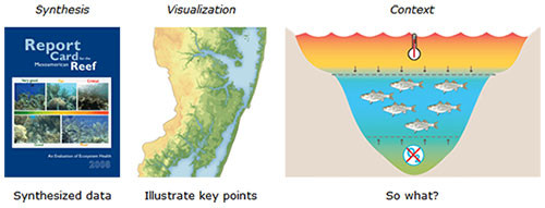
The first basic principle of science communication is to provide synthesis, visualization and context. Synthesis refers to the importance of providing interpreted, analyzed and synthesized data. Visualization refers to showing the audience the 'who', 'what', and 'where' so that you can tell them the 'why'. Context is the important component that relates the scientific finding to the audience, by answering the questions 'why should I care?' and 'so what?'. When these three components of science communication are achieved, complex science can be effectively communicated to virtually anyone.
The second basic principle of science communication is to respect your audience. This means relating to them on their level; using terms and examples that resonate with their life experiences. It also means simplifying the terms, but not the content. Rather than 'dumb it down', our approach is to 'raise the bar'. The most complex concepts can be communicated by using good science communication applications. Inviting and preparing for questions also shows respect for your audience and the Q & A sessions are important learning opportunities.
The third basic principle of science communication is to not be a 'geek'. Using jargon is a useful shortcut with close colleagues, but serves to distance you from the audience and obfuscate meaning. Defining all of the scientific terms used is also important, especially with the specialized terminology used in science. The shortcut of using acronyms can also distance you from the audience.
The fourth basic principle of science communication is to make your products look good. The assembly of various self-contained visual elements (e.g., maps, photos, conceptual diagrams, figures, tables) in an attractive manner is key. Providing a consistency in style and format, while varying content helps bring the focus on the scientific content. The use of color helps provide an additional dimension to the science communication product, but color needs to be applied carefully and judiciously.
Good science communication requires enthusiasm, quality time, feedback and revision. The science communicator needs to get excited about the subject, so that this enthusiasm becomes contagious. If the author or presenter is not excited about a topic, the reader or viewer will not become engaged. It takes quality time to make a good science communication product, and the time that it takes to produce a high quality map, diagram, or presentation should be viewed as an investment. This investment can pay off in the future, as good science communication products can be repurposed multiple times. It is important to obtain feedback using focus groups, colleagues, even family and friends, in order to find out what works and what doesn't work. This feedback can allow for revisions that improve the final product. Employing a group critique, as explained in a previous blog post, can be useful in this context.
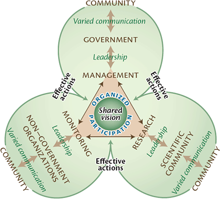
Good science communication ends up as part of a public discourse, which can lead to social change. When approaching environmental problems, a shared vision and organized participation among management, research and monitoring activities all require good communication to government, to scientists, and to non-governmental organizations. Ultimately, the entire community is provided with the basic scientific underpinnings to an environmental campaign, which necessitates good science communication. Different tools and techniques can be used for communicating science, for example, books like "Shifting Sands: Environmental and cultural change in Maryland Coastal Bays" can summarize research findings and environmental report cards like the "Chesapeake Bay Report Card" can summarize monitoring data. Regardless of the science communication medium or technique, the key attribute is conveying science information to promote informed decisions and focus efforts into effective actions.
Good science communication uses a variety of supporting visual elements: conceptual diagrams, maps, photos, video clips, tables, and figures. All of these visual elements can be used in different media, apart from video clips not working in print media. Conceptual diagrams can provide context and facilitate synthesis, information-rich maps provide geographical context, photographs describe methods, support scientific results and provide insight into processes, and tables and figures provide scientific data.
A science communication advocate named Edward Tufte publishes books and gives one-day seminars using examples of bad science communication. Two examples of horrific results from bad science communication that Tufte uses are the Challenger and Columbia space shuttle disasters. In both cases, the engineers and the technicians knew prior to the disaster that something bad was likely to happen. The technical experts ineffectively communicated their concerns to the decision-makers and wrong decisions were made—and tragedy resulted. So the point from these Tufte examples is that good science communication can really make a difference. A term that Tufte coined for ancillary lines, labels and tick-marks on graphs is 'chart junk'; obfuscating good data with meaningless information. Tufte also gives examples of good science communication, in particular, the chart of Napoleon's disastrous march to Moscow in which the size of Napoleon's army is depicted geographically, accompanied by the falling winter temperature graph.
Good science communication can actually make you a better scientist for the following reasons: 1) By envisioning the complete story; you can pick up missing elements. An example is putting together a conceptual diagram relating to the causes of a harmful algal bloom (Lyngbya), where the diagram was used to assemble a comprehensive research program. 2) The context of identifying ecological linkages and developing comparisons can provide important insights. An example is a conceptual diagram focusing on the green, brown, and blue waters, providing a focus on the different processes in the different zones. 3) Visualizations which are created by putting together a combination of different elements can lead to 'Eureka' moments when a new connection is made. 4) The synthesis that comes from combining and comparing different data or approaches can often lead to insights. An example from the draft Great Barrier Reef report card was when different regions were compared and an overall pattern emerged and provided new insights.
Great scientists are great scientists because of their communication skills. For example, Charles Darwin was not the only person to come up with the theory of natural selection, Alfred Wallace developed the same theory and even Charles Darwin's grandfather, Eramus Darwin, wrote about evolution in the form of poetry decades before Chas. Darwin's famous book "On the Origin of Species". But what Charles Darwin did was communicate effectively, using numerous examples and carefully worded text. Albert Einstein was also a prolific author and prolific communicator, with a good quote, "Make everything as simple as possible, but not simpler."

There are numerous examples of communicating science to effect social change that have transformed the world. From the Copernican Revolution to the Laws of Thermodynamics to the Laws of Relatively, communicating science has historically and will continue to change the world. So learning how to communicate science is probably as important a skill as learning how to do science. It is one thing to learn how to collect and analyze data--it's a whole other thing to learn how to effectively communicate science.
About the author
Bill Dennison

Dr. Bill Dennison is a Professor of Marine Science and Vice President for Science Application at the University of Maryland Center for Environmental Science.
