Data Visualization 101: Simple changes can make a world of difference
Holly Padgett · | Science Communication | 5 commentsHolly Padgett
Imagine this scenario: you check your email and see an announcement for an upcoming presentation about elk migration in the Pacific Northwest. Excitedly, you register for the event and mark it on your calendar (because who doesn’t love elk?!). On the day of the event, you show up early to get a good seat, the lights dim, the presenter starts to talk, and the next thing you know you are sitting through slide after slide of complicated scientific charts and graphs with text and titles that seem to be in a foreign language...we’ve all been there, right? It’s terrible! And if you have your own data and information to share, you probably also don’t want to be that presenter who leaves the audience dazed and confused.

Of course, there are very important times and places for the more technical scientific data graphs. But fortunately, for the other times in life, when you need to convey information in a compelling manner to an audience that may not be experts in your field, there are better ways. And it just conveniently happens to be the topic of this week’s class in the Science Visualization Course offered through IAN. Without further ado, welcome to data visualization!
As described by Jane Thomas, Senior Science Communicator for IAN, data visualization is a method for making “complex data more accessible, understandable, and usable”. “Effective visualization helps uncover trends, realize insights, explore sources, and tell stories.” Basically, it's a way to make your data more visually appealing and easier to understand, efficiently convey concepts and stories, and connect with your audience in an impactful manner.

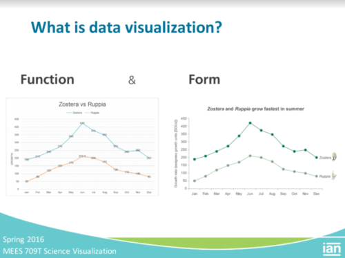
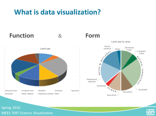
There are many different techniques and components to data visualization. And it doesn’t necessarily need to be a difficult or time consuming process. Small changes (like shown in the slide above) can make a big difference in the effectiveness of your graph. The website InformationisBeautiful.net is a great source for tips and inspiration. Edward Tufte has also put out several books devoted to the art of visualizing and communicating data and information. I’ve also put together a list of several helpful suggestions based on our class discussion that you can find below. Depending on your audience, some techniques may be more important than others. Let your content and goals guide your design!
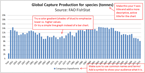
- Make sure your graph/chart title, axis titles, legends, and other text are easy to understand (not too technical or “jargon-y”) and compelling. Try making your main title active to state the main point of your chart or graph (e.g. “Zostera and Ruppia grow fastest in summer” rather than “Zostera vs. Ruppia”, in the slide shown above). Change scientific names to common names. Make sure your axis titles are clear and descriptive.
And don’t forget about your font! Make sure your font size is large enough for the audience to easily read (online or offline, up close or at a distance). Be cautious when using all capital letters – it can come off as overbearing (like you’re SHOUTING!).

- Use colors and symbols to emphasize important elements and help tell your story. If using a bar graph, try using a gradient of 1 color or multiple colors instead of making all the bars uniform. The stoplight colors - red, yellow, and green - can be used together to signify bad, neutral, or good conditions (though be careful when using this combination – make sure it actually conveys the relationship you want to communicate!).
Symbols, like the ones found in the IAN symbol library, can be used as visual aids to directly show your audience what you are talking about, rather than depending on text alone. (Would I know that Zostera and Ruppia were seagrasses without seeing the seagrass symbols in the first slide above? Definitely not.)

- Be sure to design your data graph, chart, or table in a way that best conveys your specific story or message. Make sure the most important element/message of your data is the most prominent element. If you’re working with a horizontal bar chart to show the average high temperatures for California counties in 2015, make sure the counties at the top of the chart (top left of the visual) are the ones you want to emphasize and have the reader to see first. Order your counties from highest (at the top) to lowest, rather than in random or alphabetized order. Moreover, if the geographic location of the counties is important, try utilizing a map for your visualization, rather than a traditional chart.
In general, don’t overcomplicate your data visualization. Make sure when all is said and done that your story/message hasn’t gotten lost in the details!
Most importantly, have fun and don’t forget about that elk migration presentation. You probably don’t want to be in that audience, and, more importantly, you probably don’t want to be that presenter!
Next Post > Combating climate change in the floating city
Comments
-
Jen Shanahan 10 years ago
Great job Holly, very enjoyable and easy to read. This lesson prompts a thought/question to mind, namely that scientists' general approach is to present data without bias. In other words we are trained be cognizant of the fine line between interpreting but not "spinning" the results. Some elements of what we are learning approach this fine line (like writing the conclusion in the title).
But to contrast this I agree that scientists present data all the time without communicating the take home points effectively to their audiences. This is because either don't walk the audience through the basics of their graphs or the graphs inherently take a lot of time and effort to digest because of poor formatting and types of details we are learning here.
So, I think its important to really think through who your audience is and to balance formatting, communication and interpretation.
-
Liz Myers 10 years ago
Holly, your post nicely captures three key filters to keep in mind when analyzing and improving data visualizations. As I read your description of presentations that leave the audience dazed and confused, I realize how influential MS Excel is as a tool. The program is widely used and tends to make many design choices for us, but Excel's default options often contradict minimalist design principles (so many colors, backgrounds, tick marks, and compartmentalized legends). Two of the most helpful suggestions from our class and your post were (1) to make the title active so that it reiterates the main message of the graph, and (2) to review the design so that the most important elements are most prominent, which prompts us to pare down and avoid unnecessary "flare" that might skew the audience's perception of information (3D pie charts).
-
Katie Goerger 10 years ago
My most important takeaway from all of this is what you mentioned towards the end "don’t overcomplicate your data visualization".
We all want to tell a story and these stories often have a lot of nuance. But we don't neccesarily need to overwhelm our graphs trying to explain that nuance. We don't want to lose our audience. Instead, we want to offer a clean, simple visual cue to the story we're trying to explain.
Referencing back to previous weeks, I can see how, when used in conjunction with text content (particularly in an ABT format), a well-designed graph can help a reader can get a more comprehensive understanding of a topic. The ABT content tells the story, and the graph backs that story up with hard data - data that once properly visualized - is now easy and perhaps fun to explore!
-
Melissa Merritt 10 years ago
I like that you reiterated information about the form and function. I also like your numbered bullets. Those bullets provided more info and structure to your blog post than what I did with mine. It allowed for a very thorough recap. You can tell you have an attention to detail. Nice work!
The only other thing, and I might have missed it, but I didn't see any info on who Edward Tufte was. I clicked on his name to find out, but I figure it wouldn't hurt to add "speaker and previous Yale Professor" or something afterward to have the info right there.
That's it! Really informative! -
Michelle Canick 10 years ago
You're right - I've been in those presentations! And probably been that presenter, too. My favorite tip from the class was putting labels next to the graph line rather than in a separate legend. People often don't seem to see legends - I know I've gotten questions about what a line represents and wondered, why don't they just read the legend? But if I want to get my point across, its up to me to make the visualization as easy to digest as possible.