Finding The ‘Sugar, Sugar’ Sweet Spot For Conceptual Diagrams
Nicole Basenback · | Science Communication | 9 commentsClass this week was exciting - we saw hand-drawn sketches of conceptual diagrams from the week prior transform into computer generated versions that rocked! Using Adobe Illustrator and the IAN Symbol Library, we were no longer limited by the number of colored pencils we had. This meant there were endless possibilities, but also some challenges when trying to find the ‘sweet spot’ for each of our conceptual diagrams. A common theme we have revisited is the question of complexity vs. simplicity in our work, and how to find that ideal balance. How do you include enough information so that your diagram accurately conveys what you want without the clutter of extra information?

General Guidelines for Getting Conceptual Diagrams Just Right
Include a comprehensive legend. Legends are extremely valuable when accompanying your diagram. This is because viewers don’t need to read a long description or have you present to explain it to them. There are several different types of legends: the traditional ‘map’ style legend, embedded legend, or a combination of both. Be sure to identify all symbols used that support processes and outcomes. Common symbols or images used to portray the setting of your diagram do not need to be specifically identified.
Know your audience. When trying to find balance between adding more details and retaining the simplest diagram possible, the common answer is, “it depends.” Each of our diagrams applies to a unique research project and audience. Understanding your audiences’ perspective and the medium your diagram will be published in can help guide you in developing your diagram. (Note – Square diagrams are more flexible for multiple publishing uses).
Provide context for your diagram. Use commonly understood images and symbols to provide the setting of your diagram. This reduces the amount of text needed to explain the diagram because it can be inferred visually. Including a title can also be helpful in providing context. Having a realistic setting is also important or simple details can cause unwanted distraction (i.e. boat out of water, lack of texture on natural materials, inconsistent background colors).
Be consistent with symbols, colors, and size. Changes in these elements convey that something is happening in your diagram! Use bright colors to draw attention, and muted colors to blend in or provide context. As a rule of thumb, do not use more than thirty symbols in one diagram. If this unavoidable, consider using blowouts, or sectioned diagrams, to simplify. Be careful with symbol placement. Symbols in the center of diagram naturally draw reader attention.
Don’t expect to get it perfect on the first try. Ask for feedback on your draft diagram from peers, lab members, and others outside of your project. This is a great way to discover any gaps, inconsistencies, or potential misunderstandings. Practice, practice, practice! The guidelines for creating effective conceptual diagrams appear to be simple, but are also be easy pitfalls. Practicing science visualization techniques is important to becoming proficient communicators of our work.
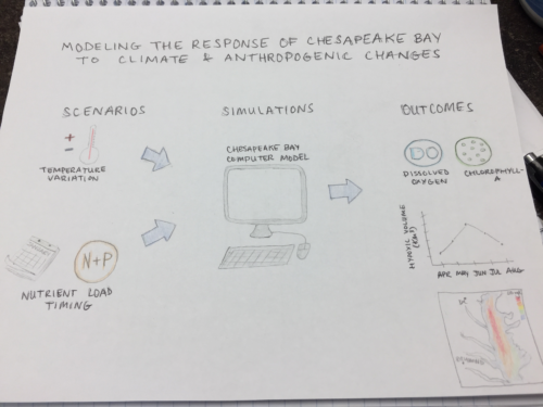
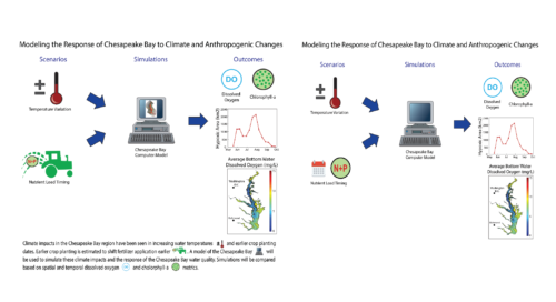
Last week, my hand-drawn diagram was just a basic sketch. There was a bit of a learning curve in using the Adobe Illustrator program, but it was fun to use the multitude of tools to produce a more publication worthy version. In the first version of my computer generated diagram, I had no legend at all – ouch! In my revised version I used an embedded legend, which simultaneously provides a brief description of my research project and identifies the symbols used.


Using the above guidelines for conceptual diagrams and our new found Adobe Illustrator skills, we can all practice and strive to students confident that our poster presentations will be successful at standing alone. We’ve included a stellar conceptual diagram of our project, so even if we take a bathroom break during the poster session, others attending will be able to get a thorough and concise understanding of our work at a glance.
1“Scales of Justice” by Chris Potter, licensed under CC by 2.0
Next Post > To Move or Not to Move: Relocating The Chesapeake Bay Program
Comments
-
Tom Butler 8 years ago
I agree with Lexy's comment on the casual feel of the blog which made it very easy to read. Maybe I was reading to deep but, I enjoyed your goldilocks reference with having the balance just right. It was very brave for you to put your own hand drawing up here, kudos to you for that.
In response to Natalie's comment's about numbering I think it might be best to keep things as you have them. I understand that numbered lists are appealing to some people however, by numbering you might encounter issues where you are ranking the guidelines. I don't know the state of the research into this field so maybe they have already been ranked by order of importance?
-
Alyssa Wellman Houde 8 years ago
"Be consistent with symbols, colors, and size." - I thought this whole paragraph touched on something that may seem like common sense but is incredibly important. Thank you for including it. It would have been interesting to expand just a little more on it (ie: the importance of not just staying consistent but being mindful of the implications of some of your color choices (ex: red has an inherent negative connotation)).
Overall, I thought it was a very solid blog post! And I love the song Bill!
-
Erin Reilly 8 years ago
My favorite part of the whole blog is this sentence:
"We’ve included a stellar conceptual diagram of our project, so even if we take a bathroom break during the poster session, others attending will be able to get a thorough and concise understanding of our work at a glance."
It's so important that the images are able to stand alone and not require explanations!
Great job pulling out the important points, but I think the story would have been better if you related the comments to the journey that your conceptual diagram made or to specific conceptual diagrams from others in the class. You did this with the legend point, but I think it would have been great to use examples for the other points as well. Mine for example, would have been a great example of using color to highlight the wrong things!
-
Natalie Peyronnin 8 years ago
Very informative blog! One thing that I have been told before is readers like numbered lists, so I would suggest adding numbers to key points and drawing the reader in with "5 guidelines..." It would have also been helpful to provide a few more graphics - such as when you discuss legends, providing some examples.
It also is a bit confusing that your original conceptual diagram is on the right instead of the left. I think most readers would assume the diagram on the left is the first iteration and then it was finalized on the right. I also think you Note: about the size would fit better under your #4 (as well as the inconsistent background color). Just small stuff.
AND BILL! NICE SONG!!!
-
Lexy McCarty 8 years ago
I like the tone of your blog - it has a more casual feel and shows a lot of personality. I really enjoy how you included your own example, Rebecca did this as well and I think it really helps exemplify what we did in class. Especially for this past week when we went from a hand drawn image to an Adobe masterpiece.
I think it would have been cool if you included multiple examples from the class and highlighted the before, the critiques and comments, and then the after. This would have given a visual for the guidelines you included in the blog (similar to what Erin mentioned).
-
Bill Dennison 8 years ago
Nicole’s blog focuses on finding the sweet spot, balancing complexity and simplicity. Her evocative title “Sugar, Sugar” brought to mind the Archies hit song from 1969, “Sugar, Sugar”. This prompted these revised lyrics:
Sugar, Sugar
21 Feb 2018
William C. DennisonSugar, ah conceptual diagram
You are my sweet spot
And you got me wanting you
Honey, ah conceptual diagram
You are my sweet spot
And you've got me understanding youI just can't believe the loveliness of your symbols
(I just can't believe it's true)
I just can't believe it’s art and science too
(I just can't believe it's true)Ah sugar, ah conceptual diagram
You are my sweet spot
And you've got me wanting you
Ah honey, ah conceptual diagram
You are my sweet spot
And you've got me understanding youWhen I viewed you, diagram, I knew how sweet a concept could be
(I know how sweet a concept can be)
Like the science insight pour your knowledge over me
(Pour your knowledge over me)Oh sugar, pour a little graphics on it honey
Pour a little sugar on it baby
I'm gonna make your science so sweet, yeah yeah yeah
Pour a little graphics on it oh yeah
Pour a little graphics on it honey
Pour a little graphics on it baby
I'm gonna make your science so sweet, yeah yeah yeah
Pour a little graphics on it honey
Ah sugar, ah honey honey
You are my sweet spot
And you've got me wanting you
Oh honey, honey, sugar sugar
(Honey, honey, sugar sugar)
You are my sweet spot. -
Rebecca Wenker 8 years ago
Good job filtering down all of the discussion topics and comments made in class into an easily read and understood list! These are all helpful and important tips, and a nice continuation from our class last week. I also really like how you mention the idea of "it depends" when creating your diagrams, because it brings us back to always thinking about "Why" and the audience first.
As others have mentioned, I think a few more examples would have been nice to include, especially the many different legend types because we talked about them so much! I like Lexy's idea of the before, during, after structure too. Just a thought for next time, good job overall!
-
Chelsea Wegner 8 years ago
I think your blog was very easy to digest and I think will be great to reference in the future. Like Jessie said, I think it was great that you showed the progress from one class to the next to really drive home the process and what the final product can look like.
-
Jessie Todd 8 years ago
I really enjoyed the variability of this blog and the flow from beginning to end. The transition from intro, to conceptual guidelines and finishing with your own example really brought it together. Your catchy title definitely made me want to read this blog and see what it was all about. It went well with last weeks blog, if outside readers keep up with our week to week blogs; it really shows our two part lesson.