

Get Your Science Out There!
Lauren Jonas ·If you want to communicate your science well, you need to people to see it! A good way of getting your research into people's minds is getting into their hands in the form of pamphlets, one-page handouts, or newsletters.
This week in our Data Visualization course, we took our first steps in creating a communication piece and received feedback from Nathan Miller, a science communicator at the Integration & Application Network (IAN).
The two biggest takeaways from Miller were: #1 Make sure your take-away message is up-front and clear and #2 guide the reader's eye using design elements. But before you are able to create a beautiful communication piece using software like Adobe's InDesign or marketing services like Mailchimp, you need to create a storyboard.1, 2
What is a storyboard?
A storyboard is simply a sketch. For some it is a rough sketch, using pen and paper. Others in our class used colored pencils, markers, or Abode Illustrator. A storyboard is a visualization of how you want your communication piece to look. It includes the ideas you want to convey and the visual components you will use. For example, check out Isabel Sánchez-Viruet's storyboard of a pamphlet she plans to create for the general public:
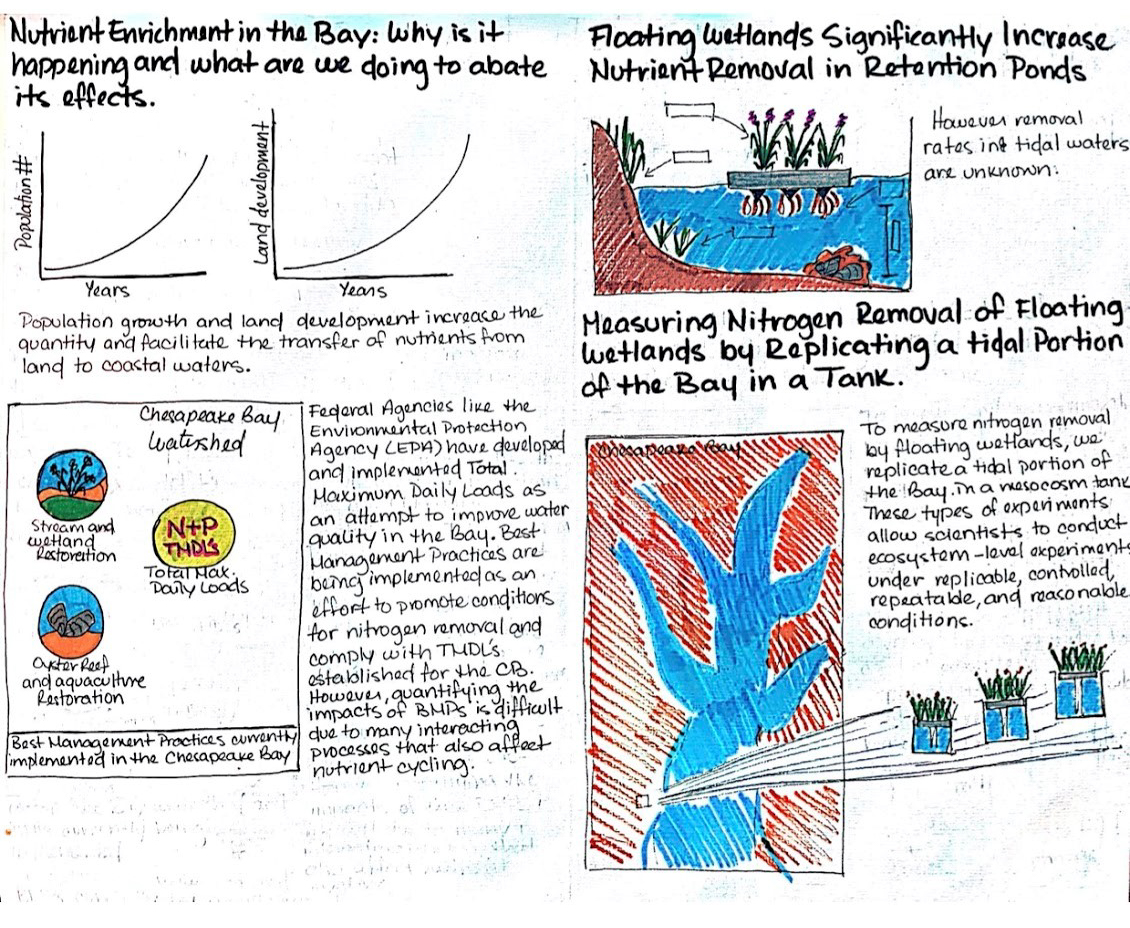
There are many great elements to this storyboard, the first being how much detail there is. From just a pen and paper sketch, Isabel now knows: 1. What visuals she will use, 2. How she wants these images spaced, 3. What color-scheme she wants to use, and 4. What text she thinks is most important.
According to Nathan Miller, the more work you put in during the preparation of your communication piece, the less of an editorial hassle there will be on the back end. Isabel's level of detail in her storyboard should help her this week while working on our class assignment to turn our rough sketches into polished communication pieces.
Want to make your own storyboard? All it takes is a blank sheet of paper and some pens (colored markers can be really helpful!). Close your eyes, and ask yourself the following questions:
1. What is my take-away message? What do I need my reader to learn from this? Pinpoint that message, and put your conclusion first.
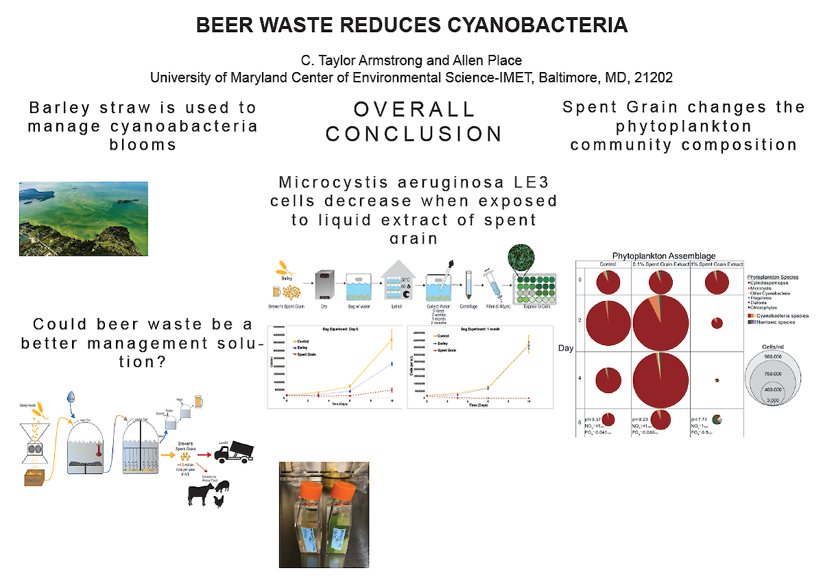
Professor Bill Dennison made a great point about putting your take-away message in "prime real-estate." Prime real-estate in a pamphlet might be its front and back covers. For a one-page document, the prime real-estate is right at the top of the page. Don't bury your conclusion at the end of the document, highlight it early! Taylor Armstrong had a catchy take-away message in all caps and bolded in the storyboard of a poster:
2. Next you need to think about the flow of your storyboard. How should it look? You will need visual components to break up the text and create an aesthetic document. You can use photos, graphs, diagrams, and cartoons!
Nathan Miller had many wise words in this department. He taught us how to direct the eyes of the reader:
To get information to stick out, choose different colors,
font sizes, font effects, and spacing!
In Western languages, we read and perceive information left to right, and top to bottom.3 Remember this when creating the flow of your storyboard! Mariah Kachmar chose a great flow-scheme based on left/right, top/bottom information processing:
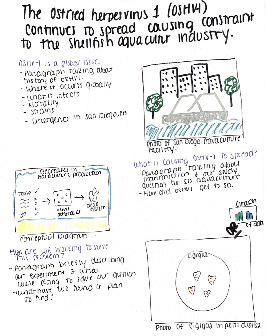
Mariah's piece uses white space, appropriate text and photo alignment, and left-to-right design to guide the eyes of her reader.
As we move toward creating a polished communication piece, our class will be putting our sketched ideas into Adobe Illustrator after watching tutorials from Alex Fries (Integration & Application Network) and RocketJump Film School. We will take Nathan's advice and turn our ideas into pieces that are concise, visually appealing, and have artistic elements that create an effective flow.
Tune into next week's blog by Anna Windle to get a glimpse of our final products!
References:
1/blog/storyboarding-to-generate-a-science-newsletter/ ian storyboarding
2 https://www.fastcompany.com/1672917/the-8-steps-to-creating-a-great-storyboard