She blinded me with science! But data visualization is here to help
Chelsea Wegner · | Science Communication | 11 commentsData is powerful. Data is beautiful. Science can be… complicated. So how do we prevent scaring, confusing or boring people with our results? How do we convey complex processes in a way that is easy to digest? How do we make our science aesthetically pleasing? There are a variety of tools available that can really help to show our results in captivating ways.
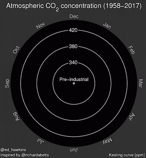
Reaching a wide general audience and accurately conveying your message is the pinnacle of data visualization and science communication. The general public may not always be your target, though. Knowing your audience is always key to effectively communicating your work. The graphic below was created by Ed Hawkins, who also created a climate spiral data graphic that went viral in 2016 and was even used at the 2016 Rio Summer Olympics opening ceremony. This is another dataset that he presented in a similar way. It shows how atmospheric CO2 has been increasing since measurements began in 1958, better known as the Keeling Curve. It leaves any viewer with a clear message – atmospheric CO2 is on the rise. It is also a really compelling image that sticks with you.

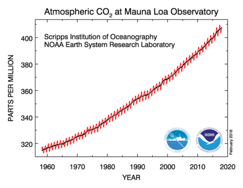
Not all data visualization needs to be presented in a super catchy GIF. The image below presents the same data in a static format but still clearly conveys the same message.

This week’s class took on our “before” figures from last week, generally created in programs such as Excel, Matlab, or R, and used Adobe Illustrator to develop our “after” figures following the feedback from our classmates and tips outlined in the previous blog. The outcome from this process was truly impressive. We saw each student transform their data into clean, less ambiguous, and effective messaging.
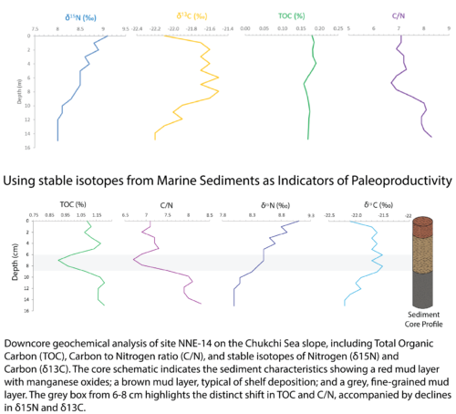
Here is my before and after example from class. This is data from my research where I have analyzed stable isotopes of carbon and nitrogen (δ13C and δ15N), total organic carbon (TOC) and carbon to nitrogen ratios (C/N) from a sediment core that was collected in the Chukchi Sea. This information helps to inform sources of carbon (terrestrial versus marine), paleoproductivity, organic matter diagenesis, and nitrogen utilization. Further data analysis is required to address this, but my goal was to highlight the variability over time and distinguish possible environmental shifts, also to generally clean the figure up for clarity. To do this, I incorporated changes to the x-axis scales to emphasize variability, highlighted the shifts in the TOC and C/N with a shaded box, added a title, adjusted colors, and rearranged my combined datasets. I also added a small conceptual diagram to help visualize these measurements within the context of the sediment core.

As with each of our products in class thus far, there is always room for improvement and you should continue to refine your work. I certainly have more work to do but I feel confident our process is moving things in the right direction. It helps to continuously share your data visuals with others, get feedback and adjust accordingly.
There were a few recurring themes that we identified as areas for further improvements:
- Active titles – these are extremely helpful in guiding the viewer to understand what they are looking at. What is the relationship? Just tell us. Context is important and an active title may not be as important in a publication. However, it is a good idea to have one available and make this an adaptable graphic to include in presentations, posters or as a standalone figure. This may also help you better define your message.
- Defining the key message – Make sure you give this some thought. What story do you want to tell? Does your data visual do this on its own? There may be opportunities to better frame your data by pairing them with maps or images. More to come in future classes! So check back.
- Signal to noise ratio – Look for patterns in your data that might be overshadowed by noise. Use colors, shaded boxes, or some other means to draw the viewer’s eye to these patterns. However, make sure you have the statistics to support it!
- Colors – This can be a really strong tool for conveying your message, and could even convey a misleading message. Remember how powerful red is? We discussed considering color density or shades if the variables are the same but consist of different concentrations, abundances, etc.
- Font size – Don’t make your readers squint! A good rule of thumb is to drop your graphic in powerpoint to see how it translates. Better yet, print it out and you should be able to read the smallest text while holding at arm’s length.
- Acronyms – This is really important and a common mistake. You should never assume everyone knows what your acronym means, even if it is glarlingly obvious to you or those in your field. You may be excluding some of your audience. We discussed the use of “DON” in class. DON may mean Dissolved Organic Nitrogen to the environmental world, but a hodgepodge of other things to everyone else (Double or Nothing?). Don’t forget to define those acronyms.
- Legends and labeling – We reviewed a variety of options to display legends and label our axes to improve the overall look and feel of the data visual. There isn’t one way to do this. Perhaps you could use a symbol or maybe no legend at all is needed. Play around with your options but don’t leave your viewer guessing what something represents.
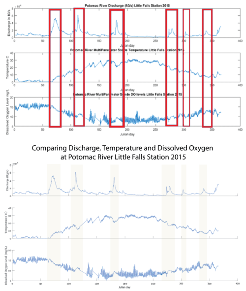
Here is another great example from class where some of these suggestions were applied. This student was able to effectively highlight trends, improve the use of colors and define his key message with an active title.

Keep at it and remember, information is beautiful!
Picture Citations:
Next Post > Scientific synthesis paper shows Chesapeake Bay nutrient diet is working
Comments
-
Katie Fitzenreiter 8 years ago
Great job, Chelsea! You started off strong with a catchy title and the eye-catching GIF, and kept my attention throughout the entire post. I liked the "before" and "after" figures, and your explanations of the changes that were made to improve them. It makes me think about how I can further improve my own graphs.
-
Jamie Currie 8 years ago
Nice work! I agree the song was an intuitive choice. I particularly liked how you showed that CO2 spiral graphic -- turning a graphic into a GIF is not an intuitive choice, but is definitely something that we could use more of. Moving it to the top of the blog was a great way of drawing the reader in. You also did a nice job of integrating some of the best examples of our class figures.
-
Annie Carew 8 years ago
This is really well-written, Chelsea. I like the use of specific student examples, and your list of tips was concise and easy to follow. Linking us to previous blogs about conceptual diagrams and data visualization was a great touch. Like Tom, I was mesmerized by the opening figure/gif. It's such a compelling visual and really draws the reader in. Well done!
-
Nicole Basenback 8 years ago
I love the title! It's so catchy and it makes you want to read the rest. You definitely captured the main talking points from class.
-
Rebecca Wenker 8 years ago
Great blog Chelsea, you're a talented writer! This blog was very engaging, and I thought your use of images was excellent. I think the message of this blog is beneficial for people from a wide range of backgrounds, academic fields, and education levels.
-
Lexy McCarty 8 years ago
Nice job! The first paragraph did a great job grabbing my attention and making me interested. I found it really easy to follow your blog, largely due to all the graphics you used. They did a great job providing visuals for your text.
-
Jessie Todd 8 years ago
The GIF really made your article relatable! I liked that I was able to click the links embedded and go beyond the blog. The blog flowed really well. Overall nice read.
-
Erin 8 years ago
Good Title Chelsea! Not only did it give Bill an easy song, but addressed one of the key issues that we have with data visualization. I thought you did a really good job of integrating the images into the blog. They weren't just there to have images, but you discussed them in a way that I found helpful!
-
Tom Butler 8 years ago
I was drawn into this blog by the animation of CO2 levels at the beginning, great hook. I was also impressed by the number of hyperlinks you used, as I still have to learn this process myself. That was a brilliant move to link your name to the UMCES profile. I think your highlighting of concepts from class really helped me solidify my understanding of text fonts and sizes.
-
Natalie Peyronnin 8 years ago
Great post! I like the use of external links for fun stuff and the writing style was easy to read and engaging.
-
Bill Dennison 8 years ago
This blog is one of the ones that the Science Visualization students have been producing every week this semester. I have been commenting on these excellent blogs with the lyrics of a song that I have adapted. The students have caught onto this trend and now they are feeding me blog titles that immediately lend themselves to adapted songs. Chelsea Wagner’s wonderful blog about data visualization is in keeping with this new tradition, using as part of the title “She blinded me with science”. Too easy. I adapted the 1982 hit song “She Blinded Me With Science” by Thomas Daley:
I Blinded You With Science
7 March 2018
William C. DennisonScience. It’s poetry in motion
I turned my tender eyes to see
Data deep as any ocean
As sweet as any harmonyMmm, but I blinded you with science
I blinded you with science
And failed you in comprehension
When I'm giving you ideas to share
I’m blinding you with science, scienceI can smell the chemicals
Blinding me with science, science
Science, science
Mmm, but it's poetry in motion
And when I turn my eyes to see
Data deep as any ocean
As sweet as any harmonyMmm, but I blinded you with science
And failed to get your attention
When I’m giving you ideas to share
Blinding you with science, science
Science, I can hear the tension
Blinding you with science, science
ScienceIt's poetry in motion
And now we’re using visualization
To improve your retention
With graphics in harmony
No more blinding you with science
Blinding you with science
And hitting you with technology
Good heavens, data graphics
They’re beautiful,
I-I don't believe it
There we go again
Data’s tidied up,
And I can see everything
All my graphs and figures
And careful notes
And antiquated notions
But, it's poetry in motion
And when I turned my eyes to see
Data deep as any ocean
As sweet as any harmonyMmm, but I blinded you with science
I blinded you with, with science
I blinded you with science.