Ten classic conceptual diagrams: Powerful examples of communicating knowledge
Bill Dennison · | Science Communication | 1 commentsClassic conceptual diagrams are those 'thought drawings' that have been judged over time to be effective ways to communicate knowledge. Classic diagrams are emulated repeatedly and appear in text books and in popular media. In order to select a diverse top ten list from many worthy candidates, I selected a representative diagram from different fields of study. The list is presented in chronological order, with the first conceptual diagrams at the beginning of the list.
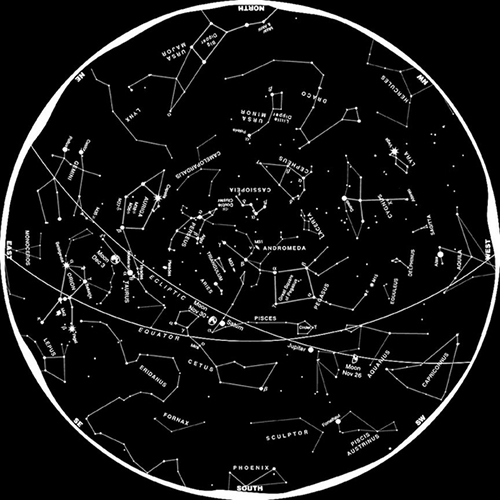
1. Astronomy: Constellations. The arrangement of stars in the night sky has preoccupied people since the dawn of time. Stars have different brightness, color and relative positions that are relatively static during the span of a human lifetime. People have long been grouping stars into forms, or constellations, that help them navigate the myriad visible stars. Different cultures create different constellations, based on forms familiar to them. The most common Northern Hemisphere constellations are various animals and mythical creatures that Greek and Roman observers named. The most common Southern Hemisphere constellations are aspects of sailing ships that the European sailors named.
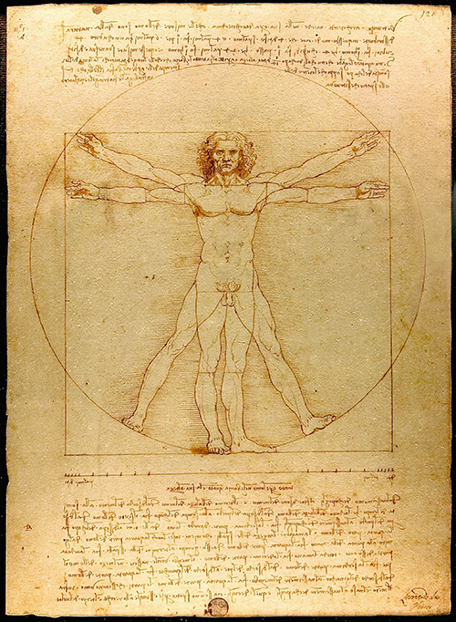
2. Human anatomy: Vitruvian Man. This diagram was created by Leonardo da Vinci in the late 15th century. It depicts a human body in two positions within a circle and within a square. The propositions of the idealized human figure are accurately portrayed, thus the diagram is often called 'The Proportions of Man'. It is based on measurements that a Roman architect named Vitruvius made of human anatomy. I especially like the way da Vinci blends art and science in the Vitruvian Man. It emphasizes the symmetry of the human body and the different positions of the arms and legs implies motion. It has been reproduced globally and is instantly recognizable.
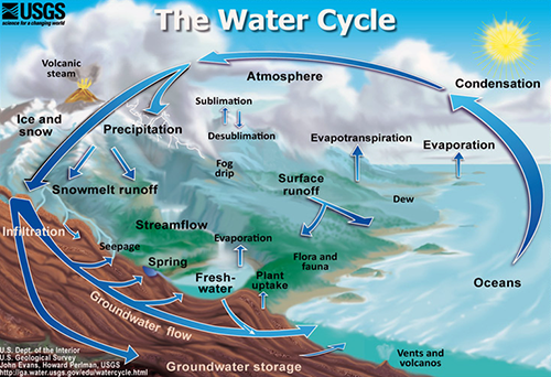
3. Physics: Water cycle. Our understanding of the water cycle began with the Greek philosophers. The Romans applied that knowledge with their various water structures including their famed aqueducts. In the late seventeen century, French scientists linked precipitation to stream flow and the term 'hydrology' came into use during the eighteen century. The now well known connection between precipitation, evaporation, condensation, runoff, etc. is commonly depicted in a diagram that uses arrows to indicate the various transformations and transport mechanisms involved in the water cycle. Of the many water cycle diagrams available, I selected the USGS diagram for illustration.
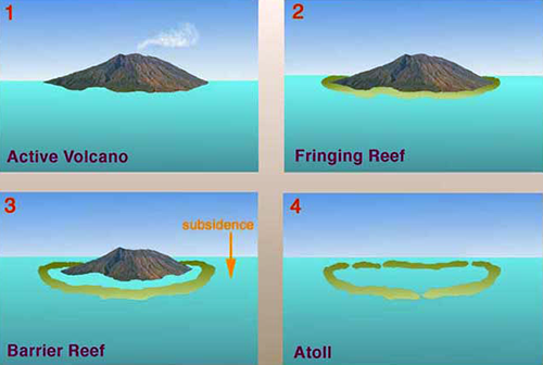
4. Geology: Coral reef formation. The coral reef formation conceptual diagram was created by Charles Darwin for his 1842 book 'The structure and distribution of coral reefs'. Darwin drew a series of diagrams to illustrate his hypothesis for the formation of fringing reefs, barrier reefs and coral atolls. He used woodcut diagrams to incorporate into his book with fine details like stylized sailing ships anchored in the lagoon for scale. Darwin's hypothesis was not rigorously tested for over a hundred years until results from a drilling program associated with nuclear testing on Bikini atoll in the Pacific Ocean supported Darwin's theory.
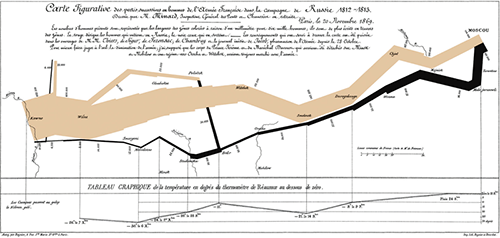
5. History: Napoleon's March. This diagram was created by Charles Joseph Minard in 1869 to depict the march of Napoleon's army from Paris to Moscow and back during the 1812-3 campaign. Edward Tufte, a science communication expert, asserts that this Minard statistical graph is perhaps the best ever created. The size of Napoleon's army is reflected in the thickness of the lines that describe the travel path of the army. The most striking feature of the map is that the line gets thinner and thinner as the army progressed toward Moscow and even thinner as it returned to Paris. A key bit of data is also included along the bottom of the graphic; the temperature during the return march, which reaches -26 degrees Celsius and contributed to the massive loss of life in Napoleon's army. This simple diagram which combines geography, army population size and temperature effectively communicates the devastating impact of the Russian invasion on the French army. In contrast, the classic book War and Peace by Tolstoy, which describes this war from a Russian perspective, is one of the longest novels written.
6. Chemistry: Periodic table. The organization of various elements by atomic number and electrons in the outer shell has become one of the most widely used conceptual frameworks in all of science. The periodic table is credited to a Russian scientist, Dmitri Mendeleev, who published it in 1869. While this is a broad interpretation of what constitutes a conceptual diagram, I contend that Mendeleev came up with this table based on a conceptual understanding of the relationship of different elements to one another and this tabular format is a type of diagram. In fact, the early periodic tables were missing various elements that had yet to be discovered, but were predicted by this conceptual framework. Additional elements have been man-made and added to the table, one even named after Mendeleev (Mendelevium).

7. Biology: Z scheme of photosynthesis. One of my favorite conceptual diagrams is the 'Z-scheme', which describes the flow of electrons in the light reactions of photosynthesis. The conceptual framework for the two light absorbing reaction centers, linked by an electron transport chain involving cytochrome and producing ATP and NADPH. The conceptual underpinning of the Z-scheme was published in a 1960 Nature paper by Robin Hill and Fay Bendall (Nature 186: 136-7). An early version of the Z-scheme by Govindjee and Govindjee (1975) depicts the electron energy gradient from left to right, rather than bottom to top, so the electron flow path traces the letter 'Z'. The most common depiction now has the electron energy gradient flipped from bottom to top, so it looks more like the letter 'N'. This modern version lends itself to our current understanding of the placement of the photosystems within thylakoid membranes. The Z-scheme combines an understanding of light to chemical energy transformation, biochemistry, and electron flow.

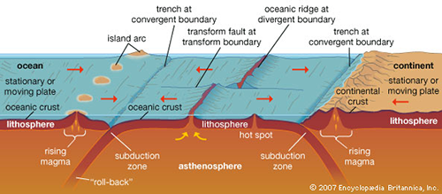
8. Geology: Plate tectonics. The movement of the earth's crust, depicted as a cross section of tectonic plates being formed at spreading centers and colliding to form earthquake zones, volcanos and mountain ranges at the juncture of tectonic plates is a commonly used conceptual diagram. The conceptual underpinning of plate tectonics began in the early twentieth century with Alfred Wegener's theory of continental drift. It was ocean bathymetry and magnetic field reversal data in rocks that provided evidence of sea floor spreading in the 1950s and 1960s that led to the theory of plate tectonics, developed in the mid-1960s. These diagrams are often used in the media following major earthquakes, volcanos or tsunamis to explain the underlying processes.
9. Evolution: March of progress. The drawing of 25 apes, early hominids to modern humans in a marching line of silhouette figures depicts 25 years of evolution in a single diagram. It was first used in 1965 in a Time-Life book, authored by F. Clark Howell and illustrated by Rudolph Zallinger. It has been reproduced frequently and often parodied. It has been criticized as being a too linear version of evolution and is controversial to creationists. But its power is the condensed version of evolution and the clarity of lineage between various extinct and extant animals.

10. Health: Food pyramid. The food pyramid was first developed in Sweden in the early 1970s by a consumer cooperative. It was adapted by various other countries and the United States adopted a food pyramid in 1992. The base of the pyramid is for 'basic foods' like diary, cereals and potatoes, and the higher levels are for 'supplementary foods' like vegetables and fruit with the higher level for meat, fish and eggs. Ecologists have used tropic structure pyramids with primary producers at the base and consumers at successive higher levels that are conceptually similar to the food pyramid. Most depictions of food pyramids use photos or drawings of various foods for illustration.

These ten examples, spanning a broad time scale and from various disciplines and created by people from different cultures serve to illustrate the universality of good conceptual diagrams. A solid scientific underpinning is necessary and a good artistic representation is helpful. Our challenge is to develop and modify conceptual diagrams that can, like these classic diagrams do so well, effectively communicate scientific concepts to a broad audience.
About the author
Bill Dennison

Dr. Bill Dennison is a Professor of Marine Science and Vice President for Science Application at the University of Maryland Center for Environmental Science.
Next Post > Presentation dialog
Comments
-
Bill Nuttle 12 years ago
On diagram 9. - Evolution in 25 years. I am thinking that's kindergarten to PhD in 25 years. The time span ape to human exceeds even the nether reaches of Emeritus Professor status.