Viewing data on a VisWall and in an immersive dome in Fort Collins, Colorado
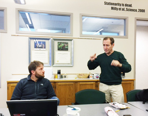
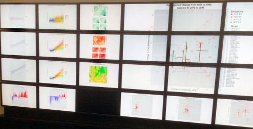
Bill Dennison · | Science Communication | Applying Science | Learning Science | 2 commentsJeff Morisette, Director of the North Central Climate Science Center, provided us with two amazing opportunities following our workshop on climate issues in the North Central region of the United States. First, we were treated to demonstrations of the VisWall, a bank of 24 computer monitors run by a series of networked computers. The VisWall facility was in the USGS Fort Collins Science Center adjacent to the Colorado State University campus. Colin and Marian Talbert provided a demonstration of VisWall in the Resource for Advanced Modeling (RAM) facility. This facility is staffed by computer specialists who had backgrounds in ecology and statistics with additional skills in data analysis and visualization. One of the key features of the RAM was the opportunity for group learning. The ability to view and interact with the data with a group of scientists or stakeholders provides a unique opportunity to learn from each other and interrogate data in novel ways.

One of the example data visualizations was a climate data set for a section of the Great Plains. Various meteorological data were presented as a regional map with the area polygon of interest highlighted (providing spatial context) and as a linear time course of drought intensity (providing temporal context). In addition, some annual temperature and precipitation plots highlighted the year of interest compared with the entire data set. A slider bar function allowed the viewers to track through time to see how things changed both spatially and temporally. Another function of the VisWall was to provide a series of individual graphics that can be viewed simultaneously, allowing for pattern recognition and facilitating the ability to discern relationships. We discussed the hardware and software needed for this facility and various potential applications.
The VisWall group learning approach reminded me of a very successful program of stakeholder engagement that Tony McAlister and Rob Vertessy ran associated with Phase 3 of the Healthy Waterways program. The modeling team would bring stakeholders to a computer lab at one of the universities and would conduct interactive workshops using the water quality models developed to understand land-sea interactions in Southeast Queensland, Australia. This approach is summarized in a book chapter of Healthy Waterways, Healthy Catchments: Making the connection in South East Queensland, available for free download on IAN Press. Developing a similar program of stakeholder engagement using the VisWall, after more scientific content and synthesis is developed, would seem a logical application.

I was excited about the potential of having the VisWall team incorporate the IAN symbol libraries for data visualization. Simply replacing the words describing various data layers with an IAN symbol would help with science communication. A more involved application would be to use an IAN conceptual diagram that could be animated by the VisWall models for a data visualization that provided immediate recognition. For example, the model output of drought intensity could be visualized by having prairie potholes drying up, supporting less wetland vegetation and fewer migratory birds.
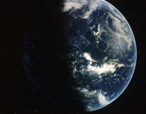
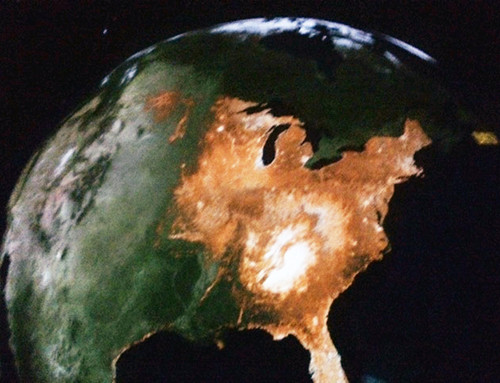
Our second demonstration of science visualization was an immersive digital dome theater. We visited the Fort Collins Museum of Discovery for a demonstration of their immersive dome, associated with a nice reception in the museum that Jeff had organized. The closest thing to the dome that I had seen before was a planetarium. But there were key differences with the immersive dome. First, it was not a complete sphere, rather a wrap around screen that displayed a variety of images from different perspectives; e.g., looking at the sky, looking back on earth as well as looking at areas on the earth's surface. There was a local operator (akin to Star Trek's Sulu) but the narration was provided via Skype by Ned Gardiner, a NOAA data visualization contractor based in Asheville, North Carolina. Ned was an "Earth Whisperer" with his soft voice delivering powerful unscripted descriptions of what we were seeing. Second, the dome provided a canvas to tell compelling stories like the disappearance of sea ice, oceanic productivity and bird migrations. The demonstration was mesmerizing. To view the earth system as a whole intact system struck a deep human emotion about our connectedness and our vulnerability. Third, the focus on this use of the immersive dome was on Planet Earth, rather than the solar system ("Putting the planet back into Planetarium"). It was operated by talented science communicators focused on telling compelling stories.

The dome surface is an aluminium surface suspended from the roof. Five synchronized data projectors connect to five servers, work in sync to provide visualizations of immense amounts of data. The sound system was fantastic, and the voice of our guide Ned Gardiner was Skyped in from North Carolina which sounded like the voice of God explaining His creation to us. It was truly an immersive experience and I could have stayed in the dome for hours.
One of the most arresting images of the earth I have ever seen was the image of the earth's magnetosphere, depicted as white wisps that seemed to be blown by wind from the sun. The image reminded me of a beautiful ctenophore (comb jelly) floating in the ocean. I loved the visualization of all of the satellite tracks on their various trajectories around the earth. The hole in satellite trajectories directly over the North Pole explained a data gap in that region of the sea ice maps that powerfully demonstrated the decline in Arctic sea ice sue to climate change. I loved when they cruised over the ocean to view maps of oceanic productivity. Hot spots due to upwelling areas and river plumes were clearly evident. North American bird migrations were effectively visualized using citizen science eBird data. Simply viewing the land surface with the dome was amazing because you could look out to the surrounding sky and recognize constellations, view forest fire smoke trails, snow-covered mountain peaks in the distance and have a sense of where on the planet you were viewing.

The dome experience was amazingly emotional as well as intellectual, quite different from the entirely intellectual response elicited using a standard PowerPoint science presentation projected onto a screen. This emotional connection that the dome experience provides is what Randy Olson call for in his book "Stop Being Such a Scientist!". Speaking with Dennis Ojima after the demonstration about the visceral response that was evoked, his thought was that viewing the earth as a whole, with all the interconnected features, strikes a deeply human response. I am convinced that these immersive domes are incredibly powerful tools for science communication and I look forward to developing opportunities to utilize this technology in the future.
About the author
Bill Dennison

Dr. Bill Dennison is a Professor of Marine Science and Vice President for Science Application at the University of Maryland Center for Environmental Science.
Next Post > Know the connection, know your coast: Coastal Georgia's first ecosystem report card
Comments
-
Ben Gondrez 10 years ago
This is the Dome Coordinator here, aka Sulu. Just wanted to say thank you for posting this great article! I'm so glad you were able to experience our dome and hope that others had similar experiences to yours!
-
Amelie 10 years ago
Everything is very open with a precise clarification of
the issues. It was really informative. Your
website is very helpful. Many thanks for sharing!