Who tells your story?
Jamie Currie · | Science Communication | 7 comments
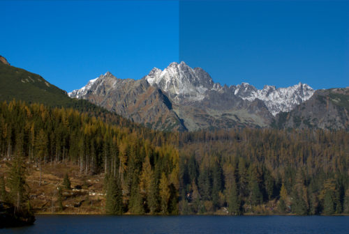
Who tells your story? And how do they tell it? Well, that's going to depend on your story's images. Our most recent class covered the second half of the photography and video unit. During our analysis of each others' work, we discussed a variety of visual elements that we could use to re-tool our images. The bulk of our attention, however, was not focused on the composition, white balance, highlights and contrast, framing, steadiness, or effects. Despite these elements' obvious importance, our focus was actually on refining the stories that we wanted to tell, and discovering a way to tweak our images to more compellingly convey that information. To me, this class was all about people beginning to discover the powerful storytelling tools that are at their disposal. Some of the adjustments we made to our photographs and videos were small, but to echo the apt statement of E. Guy Stephens, our photography professor, "simple changes can make big differences."

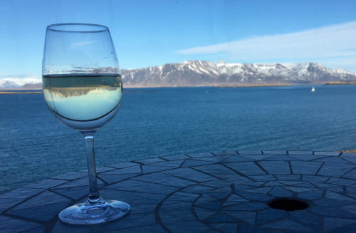
Although we talked about a wide variety of image elements on Friday, there were a number of standout components that changed an image from a snapshot of the world to an entire story told in a second of frozen time. One of these elements was the rule of thirds. The rule of thirds is a photo/video technique that breaks down a frame into 9 equal sections. Which of these sections your subject appears in can drastically alter the audience's perception of the image. An object placed in the left third of an image can work to draw the eye first, and then push the focus onto the other contents of the frame, suggesting that your object has a direct effect on the objects in your image. Conversely, if you place an object in the right third of your frame, the audience's eyes are first drawn to the other contents of the image and then eventually land on the object of focus. This effect causes the audience to instinctively assume that the objects in the left two-thirds of the frame lead into, or directly impact, the object of focus.

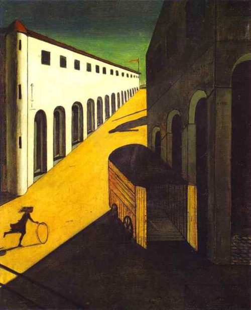
Another set of visual elements we discussed was color. The way you use color in an image can drastically alter it. Warmer versus cooler tones can significantly change the mood and feel of the scene. Warmer tones can increase the ambient energy of the image, with a variety of results. And in some cases, no color at all is better. Guy made a very good point when he stated that it only takes the removal of color to make an image into an expressive story.

There's an old saying that 'a picture is worth a thousand words.' In many instances this is true - however, one thing that we discovered in class is that capturing a picture worth a thousand words can be a very difficult task. One of the key takeaway messages was that cropping can make a world of difference to the image. Cropping can serve a number of purposes: It can help to declutter images, it can allow you to work more powerfully with the rule of thirds, and by doing so, to subtly shift the focus of the image to your subject. Before doing so, however, it is important to think about the purpose of your photo. What is the story you want to tell? What sort of emotional journey do you want to take the audience on though your image?
When discussing the video unit, the class brought a variety of videos to the table. Arguably the most important lesson that we covered was how to tie a series of images together to make a compelling story. Because when watching a video the audience assumes that each image is related to the next, choosing the correct order of images can often make the story far more compelling and easy to follow. I think one of the standout examples of this strategy is Erin Reilly's video. Her order displayed how erosive forces can influence shorelines, but these forces can be reduced with carefully placed barriers.
Another important pointer in crafting a compelling video story is the use of sound. We only briefly touched on sound on Friday, but I think some of the examples used were truly excellent. Lexy McCarty chose to use voiceover to tell her story, while Chelsea Wegner chose music to help tell hers. I think it's important to remember when you're trying to tell a story using video that an audience can be just as powerfully affected by what they hear as they see. In some formats, using music can tell a story even more profoundly than with visuals -- if I were making a story about a historical figure, for instance (and did not have good visuals), perhaps I would write a song about them instead. Who knows, it might even be successful.
Overall, there was a wide variety of excellent visual storytelling presented during the last class. Many of these visual elements will be useful in our final presentations. Now that we know the fundamentals of editing pictures and video, I also think the coming class on storyboarding will be highly useful in making us take a step back and think carefully about the story that we want to tell. There are so many ways that images can be combined to become powerful science communication tools, and as the class continues to refine their images, I look forward to seeing some of the stories that they choose to tell.
Next Post > Training local teams in report card creation
Comments
-
Lexy McCarty 8 years ago
Nice blog! I really like how you highlighted some of the main points from class using photos to provide an example. Photos always help me with understanding. I also really enjoyed the flow of your blog. You started with "what makes a good photo" and then transitioned into "how to edit a photo to make it better". I think your reader will take a lot away from your blog due to its clarity and flow.
-
Tom Butler 8 years ago
Jamie, nice blog, I liked the use of a photo with one side edited as the lead in. I think that you cover really good points about various rules, thirds, color, etc. It might have been nice to see a little more content in the blog from your lectures about story telling. You have several mentions about it around the image depicting color and right before the video but you could have really hit it out of the park if you went back to it in more detail. I think you had great choices about the the main topics covered and used images to back them up but would have loved the incorporation of more of your specific knowledge. This aside I think you did a good job.
-
Chelsea Wegner 8 years ago
Nice blog, Jamie! I liked how you reference and incorporate elements from multiple student's work. I definitely have been thinking differently about how I am taking photos with my phone now and seeing other's examples of videos has given me inspiration for further developing my own.
-
Bill Dennison 8 years ago
Jamie Currie’s insightful blog on the use of images and videos in science visualization is titled “Who tells your story?”, which is the also the title of Lin-Manuel Miranda’s song from the musical “Hamilton”. Hamilton is one of my favorite musicals and my version of “Who tells your story?” is the following:
Who Tells Your Story?
11 Apr 2018
William C. DennisonLet me tell you what I wish I’d known
When I was young and dreamed of glory
You have some controlWhy know
What is
Who tells your story?With information, you can tell a good story
Leaving us with a good understanding
Focusing on essential elementsWhy know
What is
Who tells your story?You can use an image to replace a thousand words, and if you didn’t
Does that make you foolish
Or lazy?Why know
What is
Who tells your story?Every science paradigm story gets told
Every science paradigm story gets to grow old
And when you’re gone, who remembers your name?
Who keeps your flame?Who tells your story?
Who tells your story?You put yourself back in the narrative
You stop wasting time on fears
You communicate for many years
It’s never enoughYou create powerful images and use them wisely
You try to make sense of the mysteries of nature
You really do write like you’re running out of timeYou rely on
Strong data
To tell your storyEvery day is new
You ask yourself “What would I do if I had more time?
Science, in its wisdom
Gives us what we always wanted
It gives us more time.And you ask yourself, “Have I done enough?”
How will I tell my story? -
Rebecca Wenker 8 years ago
Good blog, Jamie! I think the biggest take-away from last week's class, and your blog, is Bill's favorite quote, "Simple changes can make big differences." Whether it's a crop, slight shift in color balance, or addition of the perfect sounds/music to a video, simple changes can really reshape the story and message you are portraying with your visualizations. Like Tom said, I would have appreciated a little more discussion on the use of videography and storytelling, because your lectures covered that so well! Overall though I thought you did a great job!
-
Natalie Peyronnin 8 years ago
Great job Jamie! I really enjoyed this blog as it was engaging and informative. I like your use of questions to engage the audience.
And I also really enjoyed your references to Hamilton in the title and last paragraph.
-
Nicole Basenback 8 years ago
Nice work Jamie! This was a really interesting class seeing how everyone photos changed after edits.
I like your quote of "a picture is worth a thousand words", and emphasis on how this isn't always true. I am now challenged, before and after taking a photo, to consider if it is a quality photo that can appropriately represent the story I'm trying to tell.
I think it is interesting how some of the same principles used in photography are consistent across other communication mediums we have discussed - importance of color, reducing clutter, focusing on your message. It's like we use the same tools, and just repackage it.