Blog posts for the Science Visualization course
A photo of a Dungeoness Crab rather than a Blue Crab would drastically decrease the credibility of a report on the Chesapeake Bay. Photo retrieved from Flickr Creative Commons user Max Wheeler.

A great pot does not necessarily make a great dinner: photography techniques to take your science communication to the next level.

Dylan Taillie ·
30 March 2016
Science Communication | Applying Science |     9 comments

Dylan Taillie … “Wow, what an awesome photo, did you take that on a Nikon D7000? Something better?” … “Wow, what a horrible photo, did you take that with your iPhone or a potato?” … These two fictional statements allude to the crux of a lengthy discussion that occurred during this week’s science visualization course. The thought that a high quality photo must be taken with a high quality camera and by an experienced photographer is a common misconception.

Read more

Figure 1. Example of spatial data displayed on a map, courtesy of Ben Wahle.

Maps: The Promise of Exploration

Juliet Nagel ·
23 March 2016
Science Communication | Applying Science | Learning Science |     6 comments

Juliet Nagel … I’ve always loved maps. As a child, I would follow along on the road map as we took family trips across my home state of Wisconsin, tracing the routes and watching for town names as we passed through them, strange-sounding places like Weyauwega and Oconomowoc. I would wonder, is Greenville greener than other towns? Where is the spring located in Spring Valley, or was it named after the season?

Read more

Example of map with all required elements (title, legend, scale bar, north arrow), intuitive color schemes, and simplistic features. Credit: Dylan Tallie

Maps should tell a story

Ben Wahle ·
8 March 2016
Science Communication | Applying Science | Learning Science |     8 comments

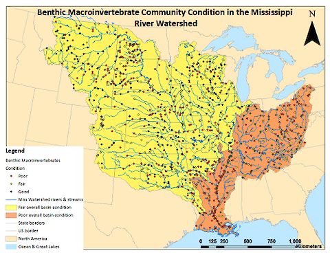
Ben Wahle … The summer before I started fifth grade, my family took a road trip from Washington DC to Nova Scotia, Canada. A few days before we loaded our luggage and our dog, Chloe, into the car and headed off, my mom picked up some maps from the local AAA office. That night, she and my dad poured over them, highlighting our route and circling places to stop.

Read more

Definition of Feng Shui. Credit: Google

Data visualization: Feng shui for your charts, graphs, and plots

Noelle Olsen ·
1 March 2016
Science Communication |     6 comments

Noelle Olsen … The past two weeks of class have been dedicated to fine tuning our data visualization techniques. The first part consisted of bringing in a chart or graph from our research and presenting our data in a whole new way. Wilmelie Cruz Marrero reported on what we learned during that week in a previous blog post, and I will reference some of her examples used later in this post. Rather than focusing on the analytical tools used, we discussed the aesthetic elements.

Read more

Imagen 1. Mi gráfica: ¿Systematic sampling used to determine sampling rat? ¿Pueden identificar alguno de los errores que cometí en mi gráfica?

Nadie lo hace correcto la primera vez (Nobody gets it right the first time)

Wilmelie Cruz Marrero ·
23 February 2016
Science Communication | Learning Science |     1 comments

Wilmelie Cruz Marrero … This is the Spanish version of the blog "Nobody gets it right the first time" Como científicos nosotros parte de nuestro trabajo es investigar y luego analizar nuestra data para validar nuestro trabajo, pero ¿hacemos un buen trabajo demostrando nuestros hallazgos a otras personas que a nosotros mismos? ¿Qué tal si representamos nuestra data visualmente?

Read more

Image 1. My graph: Systematic sampling used to determine sampling rat? Can you identify some of the mistakes I made?

Nobody gets it right the first time

Wilmelie Cruz Marrero ·
23 February 2016
Science Communication | Learning Science |     6 comments

Wilmelie Cruz Marrero … * A Spanish version (Nadie lo hace correcto la primera vez ) is also available* … As scientists, we conduct research and spend a lot of time analyzing our data to validate our work, but do we do a good job at showing our findings to other people than ourselves? What about using visual representation of our findings - we know the saying that pictures are worth a thousand words… I am pretty sure they are probably taking about graphs. How can we improve our GRAPHS?

Read more

TAKE-AWAY: Getting to “just right” here relies on use of classic color + simple shape in an easy-to-read orientation WITH sufficient, deliberate graphic detail to communicate a natural species, with markers of sex and maturity.

Just Right: Goldilocks and conceptual diagrams

Marybeth Shea ·
17 February 2016
Science Communication | Applying Science |     6 comments

Marybeth Shea … During our class I kept thinking about revision and the Goldilocks problem: Getting things “just right” is a challenge for conceptual diagram design. I could see in the analysis of what worked in our diagrams -- and what did not work -- applications of “just right.” How do we get there? IAN offers principles that guide this getting-to-just-right revision of conceptual diagrams:

Read more

An example diagram from our quick game of “conceptionary”. Sentences and words that were given to produce this diagram: Increased nutrients from farming limit the light that can penetrate the water, limiting growth of seagrass beds. Credit: Christina Goethel

A picture is worth a thousand words… but what about a conceptual diagram?

Christina Goethel ·
10 February 2016
Science Communication | Learning Science |     4 comments

Christina Goethel … Often times dissecting and reading a description of a scientific process can be time-consuming, tedious, and frustrating. As visual creatures, paragraphs and paragraphs of words on a page may elude us. To remedy this, we can turn scientific concepts and ideas into different forms of visualizations, diagrams, and pictures. One such visualization tool is the conceptual diagram, so what is that? There is no better way to understand a new tool than to jump right in.

Read more