Drawing sketches and creating conceptual diagrams to communicate science
Bill Dennison · | Science Communication |Often the focus on science communication is the data visualization or the words or phrases chosen about a topic. But another important aspect of communicating science, both informally and formally is the use of hand drawn sketches. These sketches can be very simple black and white lines to complex color drawings. These sketches can be created using a stick to draw something in the dirt or sand, or chalkboards and whiteboards, or modern tablets and computers that have drawing applications. One of the things that the To provide a demonstration of the evolution of hand sketches, I have selected some drawings that I produced in my research career beginning with my Master's thesis. Upon reflection, I had the good fortune to have had thesis advisors and colleagues who looked at my sketches and strongly encouraged me to use them in my thesis or other publication. I had drawn the sketches as an attempt to communicate in a one-on-one setting with no intention of using them in a publication. But beginning with Peter McRoy, my Master's advisor, and Randy Alberte, my PhD advisor, it was clear that what worked on a one-on-one setting translated to a broader audience.
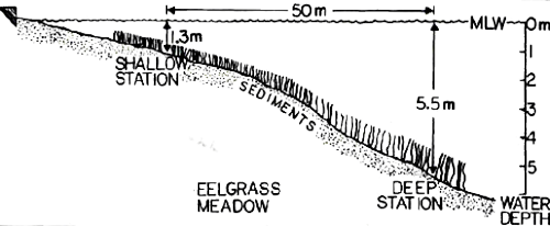
The first hand sketches that I published were in my Master's thesis, and my favorite was a sketch of the sun reflectors and floating shade screens that I used to increase and decrease light availability to seagrasses in Izembek Lagoon, Alaska. During my PhD research, I drew the seagrass depth transect from Great Harbor in Woods Hole, Massachusetts that was my research site. In both these efforts, I learned to use a drawing pen called a rapidograph, rub-off letters, protractors, French curves, tracing paper, white out and erasers. Creating these drawings was a tedious process, restricted to black and white and difficult to edit and share. But there was a serenity associated with the careful and meticulous process of creating these drawings and I used the activity as a break from field work, lab work, data analysis or writing tasks.

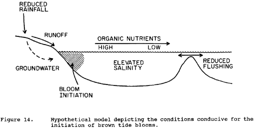
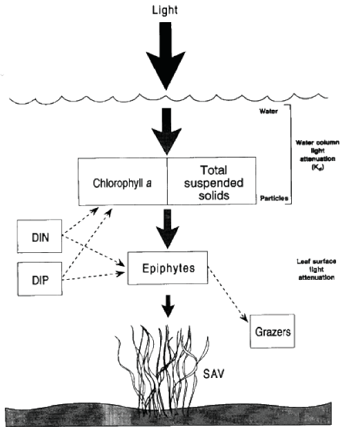
During my postdoc at Stony Brook, I became involved in a research program to understand the causes and impacts of a 'brown tide' harmful algal bloom in coastal waters of the mid-Atlantic Ocean, hence the diagram of potential causal agents. And then as a junior faculty at Horn Point Laboratory, I was part of a group of scientists and resource managers who developed habitat requirements for Chesapeake Bay submerged aquatic vegetation. I drew a box and arrow diagram to depict the light attenuating processes.


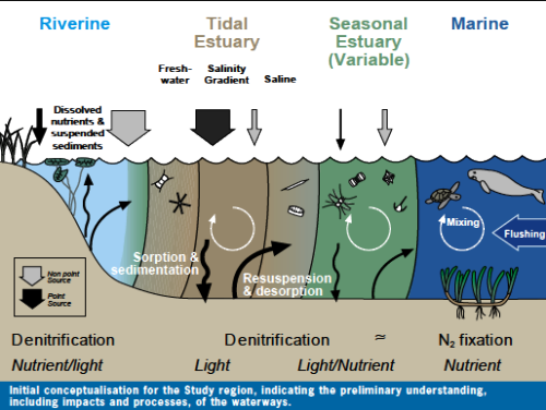
While at the University of Queensland, I began using computer-aided diagrams with color to describe Moreton Bay. The early computer-aided diagrams still used a lot of words and were fairly simplistic depictions, but we quickly evolved to using more symbols and less words. The computer drawing programs allowed the symbols to become more realistic and they were reproducible.
Over the course of the evolution of these conceptual diagrams from hand drawn, black and white diagrams to computer-aided full color diagrams there are some key differences. One difference is that the computer-aided diagrams are infinitely editable, and they can be used to depict dynamic processes as well as static conditions. I have also expanded my use of conceptual diagrams to increasingly broader audiences, well beyond the peer scientific audience, and the computer-aided, full color diagrams definitely helped address the broader audiences. We created the IAN symbol and image libraries in order to provide a broader availability to fellow scientists.

There are many similarities that all diagrams share regardless of the sophistication level of their production technique. One similarity is that creating a good, unambiguous and information-rich diagrams requires time and imagination. There are a variety of types of diagrams, e.g., two-dimensional, three-dimensional, mirrored, panels, insets, etc. but the key is the ability of the diagram to effectively communicate scientific meaning.
About the author
Bill Dennison

Dr. Bill Dennison is a Professor of Marine Science and Vice President for Science Application at the University of Maryland Center for Environmental Science.