It’s the Circle of Science: How to Move Your Audience
Natalie Peyronnin · | Science Communication | 8 commentsNatalie Peyronnin
Now that we know all about how to communicate science through crafting the message, conceptual diagrams, data visualization, maps, photography and videography, it’s time to bring all those pieces together to present a complete story. There are many different platforms that can be used to tell the story of your research, including presentations, posters, reports, videos and websites. To determine which platform is best, you should first evaluate who the intended audience is, how best can you reach your audience and how much time and resources are available to produce the material.

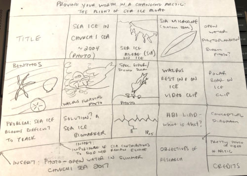
Once you have selected the appropriate platform, it is time to write the story. Storyboarding or sketching out the product will provide the outline for the work. It is important to define your key message and 3 to 5 main points that support the message to develop a clear story. Also keep in mind the level of knowledge of your audience so you avoid explaining concepts or terms that are too simple or too complex, therefore detracting from the audience’s ability to connect with your story.

The best method for ensuing your audience hears your key message is to take them on the full circle. This means reiterating this key message at least 3 times. In a presentation or video, for instance, you can tell them what are going to tell them, tell them, and then tell them what you just told them. This ensures that if the audience only remembers one thing about your story, it will be your main message. It is also helpful to think – What are the implications of my story? Why does my audience care? Then tell them that right up front.
As you work on the storyboard for your product, there are some good tips to keep in mind on the layout design. Object placements is an important factors to the overall appearance of the product and whether it is pleasing to the audience. When placing graphics, photographs or text, you want to ensure that the layout has a balanced appearance and is not asymmetrical. The proximity of objects to each other can also be meaningful, such as the placement of data graphs that relate to each other.
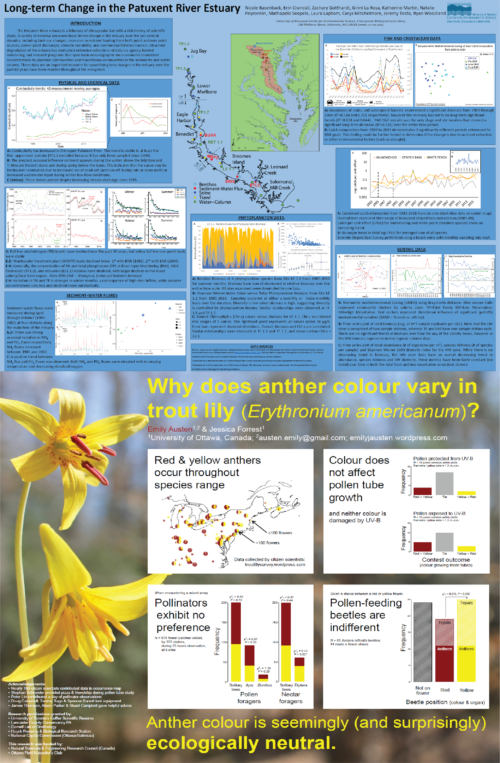
White space is not the enemy. Many of us, including me, have tried to cram too much information into a small space, taking up all the “real estate” available. This drastically effects the readability of the product and damages your ability to connect your message to your audience. Keeping a balance of white space is important to the audience. If you are running out of space, you will have to evaluate if the space can be expanded (i.e., a larger poster or adding a slide to the presentation) or whether you need to cut some of the material.

We have learned how important active titles are for your product, however keep in mind that active titles can be used on each subsection of a poster or report, or each slide of a presentation. We may have to use the generic “Introduction, Methods, Results, Conclusions” subtitles for peer-reviewed literature, but in our science communication products, using active titles can pique the interest of the audience.
If you are doing a presentation or video, be cognizant of the time available and how much time is needed per slide/video clip to effectively communicate the concept. Plan ahead so you know how much time is needed for each slide/video clip. Ever been to a 15-minute presentation where the speaker spends the first 12 minutes on background and set-up and then has to rush through the results, which are more interesting and carry the speaker’s key message? It is terrible! It can be helpful to write out your script and practice, practice, practice. And be enthusiastic! There is no better way to grab an audiences’ attention than to be excited about your work.
In conclusion, get creative, but don’t lose sight of the science!
Next Post > Atlantic Estuarine Research Society 70th anniversary conference
Comments
-
Tom Butler 8 years ago
Natalie, nice blog. I feel like you wrapped up the course very nicely. I liked the use of example posters to actually show how white space can be utilized to create a stronger product. I think the only thing I might add is the mention of one big idea per 15 minutes of presentation, however you already covered how to support big ideas with proper timing. Great job. Now if only someone could think of a song to relate too the blog...
-
Chelsea Wegner 8 years ago
Your blog does a really nice job emphasizing the importance of having a clear, concise and simple message - which is not as easy as it sounds! Your example of the posters is great. I think we have all tried cramming a ton of info in one poster or presentation. This has really made me think more about better preparation and practice.
-
Bill Dennison 8 years ago
I love Natalie's blog about coming full circle in the art of science visualization. Her blog title reminded me of Joni Mitchell's "The Circle Game", inspiring me to adapt her lyrics to the following:
The Circle Game
20 April 2018
William C. DennisonYesterday a child came out to wonder
At some science communication
Fearful when the data was full of holes
And joyful at the complete storyThen the child moved ten times round the seasons
Wondered over the clear data display
Words like when you’re older must appease them
And promises of someday make his dreamsAnd the seasons they go round and round
And the data graphs go up and down
We’re captive on the carousel of time
We can’t return we can only look
Behind from where we came
And go round and round and round
In the circle gameTen classes and ten blogs gone now
Science visuals turn to communication products thru the town
And they tell them take your time it won’t be long now
Till you drag your feet to slow the circles downAnd the seasons they go round and round
And the data graphs go up and down
We’re captive on the carousel of time
We can’t return we can only look
Behind from where we came
And go round and round and round
In the circle gameSo the weeks spin by and now the class is nearly over
Though our dreams have lost some grandeur coming true
There'll be new dreams maybe better dreams and plenty
Before the last science visualization is throughAnd the seasons they go round and round
And the data graphs go up and down
We’re captive on the carousel of time
We can’t return we can only look
Behind from where we came
And go round and round and round
In the circle game -
Annie Carew 8 years ago
Great job, Natalie! As everyone else said, you've summarized our class beautifully and incorporated all the topics we've covered. The images you used were good quality and conveyed your message well. And the Lion King was my favorite movie as a kid, so I absolutely love your title!
-
Rebecca Wenker 8 years ago
Great job summarizing and connecting all of our previous classes to this lesson! This advice is especially useful for creating a poster for a large conference, where there are so many posters to look at. Sticking to your simple message and utilizing those preparation/design tips can really make your poster stand out from the crowd.
-
Jessie Todd 8 years ago
I really liked how you linked your introduction back to other blogs written throughout the semester, it helps wrap the entire picture together. It might have been nice to list/bold the few key points about good storyboarding that we focused on in class to highlight what is important to readers (i.e. whitespace, 3-5 main points, object placement, reiterating key messages). It was an overall easy, enjoyable read!
-
Nicole Basenback 8 years ago
Great blog Natalie!
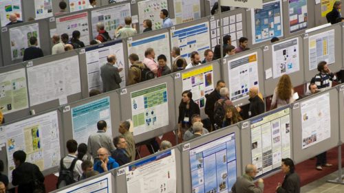
I love the photos to show how overwhelming poster sessions can be at large conferences, and how you really need to employ the points you mentioned (active titles, use white space etc.) to stand out and capture an audience.
I appreciate your parting advice on being creative and having fun. :)
-
Erin 8 years ago
Awesome Job Natalie! I thought you tied all of our previous classes together really well with the messages from the last class about how to present all of the other stuff you are doing!