Going from "Aha!" to "Well, Duh" in the Great Barrier Reef, with beer coasters and Burdekin Gold
Bill Dennison · | Environmental Report Cards | Applying Science | Learning Science |This blog is part of the Basin Report Card Initiative: a partnership between the World Wildlife Fund (WWF) and the University of Maryland Center for Environmental Science (UMCES)
Catherine Blancard, Heath Kelsey, Alex Fries and I held a session to discuss and analyze our Integration and Application Network experience with environmental report cards on 26 January 2016. This activity is part of our World Wildlife Fund--University of Maryland Center for Environmental Science partnership; the Basin Report Card Initiative. We reviewed a variety of our past report card efforts to develop a series of report card stories that provide insight into a) the process of developing report cards and b) the impact of report cards on the various people and stakeholders involved. I have selected one of these stories to relate here.
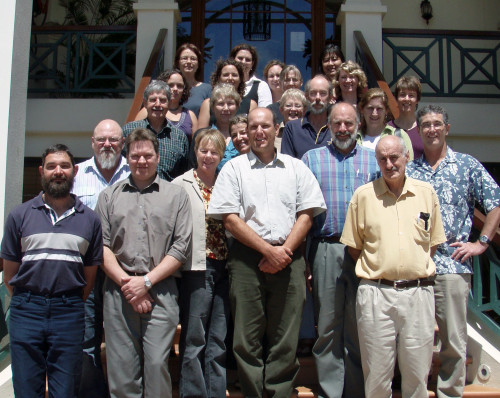
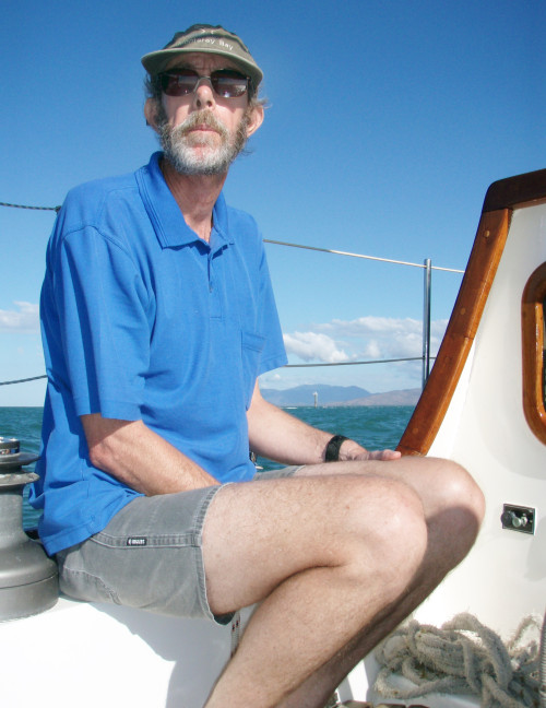
This story is about the initial development of the Great Barrier Reef report card. Ben Longstaff, Jane Thomas and I traveled to Townsville, Australia in September, 2007 to work with former University of Queensland colleagues David Haynes and Joelle Prange, who were working for the Great Barrier Reef Marine Park Authority. We had a wonderful weekend prior to the workshop sailing David's yacht to Magnetic Island and snorkeling on one of the inshore reefs to get us into the mood. We then convened a scientific workshop with water quality experts, ecologists and resource managers to select a suite of indicators, establish thresholds and calculate scores. The Great Barrier Reef was divided into six reporting regions and we selected a variety of independent water quality, coral and seagrass indicators to generate scores for each region.
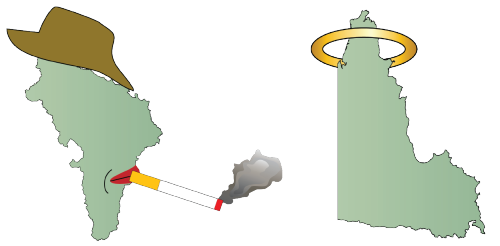
Our "Aha" moment was when we saw that the Burdekin region scored consistently and appreciably lower than any of the other reporting regions. We said "Wow, the Burdekin was so much lower than the other regions, but why is the Burdekin section so degraded?" We went to a 2003 book that Miles Furnas had written titled "Catchments and corals: Terrestrial runoff to the Great Barrier Reef" to answer our question. The data was overwhelming; the large Burdekin River catchment was the most heavily impacted from grazing and agriculture with the highest concentrations of suspended sediments and nutrients in sporadic runoff events. This is what turned our "Aha!" moment into a "Well, Duh" realization. We were somewhat chagrined, in that we should have known this immediately. In fact, when you look at a map of the Great Barrier Reef, you see that the section of the reef offshore the mouth of the Burdekin River is relatively depauperate in reefs compared with the rest of the Great Barrier Reef.

We were, however, able to assuage our guilt at our "Well, Duh" moment at the local Townsville pub which was serving a locally produced beer, appropriately named "Burdekin Gold". Joelle Prange produced a draft report card in a bullseye format which she plasticized so that we could use it as a beer coaster. So with our report card beer coasters supporting our Burdekin Gold, we reflected on how we had collectively spent decades, even centuries, studying various aspects of the Great Barrier Reef aboard ships and at research stations, yet we had not seen this overall pattern of impact of the Burdekin River runoff on the Great Barrier Reef. The report card process provided us with a new insight, which was so obvious once you saw it that we literally couldn't ever look at the Great Barrier Reef map again in the same way. A take home lesson was the value of integrating disparate indicators--the integration provided new insights, even to those of us closest to the process.
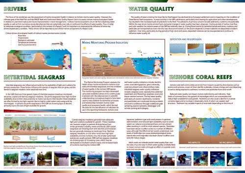
In the end, this workshop did not result in a published report card, but it did lay the groundwater for the 2009 Great Barrier Reef report card. We were not surprised when the Burdekin region scored poorly in the Paddock to Reef program report card. We published an IAN newsletter capturing the conceptual framework of the report card, but the real lesson from this workshop was behind the scenes. It was the "Aha!" moment that changed, forever, the way we viewed the Great Barrier Reef.
About the author
Bill Dennison
Dr. Bill Dennison is a Professor of Marine Science and Vice President for Science Application at the University of Maryland Center for Environmental Science.