Top ten conceptual diagrams: Seagrasses, streams, eco-rhythms
Bill Dennison · | Science Communication |Conceptual diagrams are 'thought drawings' that use symbols to convey meaningful ecological information. The IAN symbol library was created in order that more people would be able to produce conceptual diagrams. Between the Marine Botany Group at the University of Queensland and the IAN team, the Science Communicators have produced over a thousand conceptual diagrams that have been used in scientific papers, books, newsletters, fact sheets, posters, and websites. Choosing the top ten conceptual diagrams was difficult, so the selection was based on the diagrams that were the most meaningful to me personally.
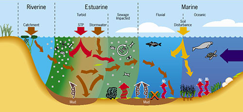
1) The Ecosystem Health Monitoring Program for Moreton Bay created a conceptual diagram to illustrate the indicators used to develop the annual report cards for Moreton Bay. This diagram evolved from the original Moreton Bay diagram which used brown, green and blue water colors--these same colors gave rise to the brown, green and blue Healthy Waterways logo. This diagram was drawn by Diana Kleine and it has been published in the book 'Healthy waterways - Healthy catchments: Making the connection in Southeast Queensland' (2005: Abal, Bunn & Dennison, eds.) as well as in 'Quantifying and evaluating ecosystem health: A case study from Moreton Bay, Australia (2005, Environmental Management, Pantus and Dennison).
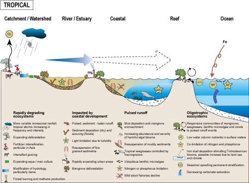
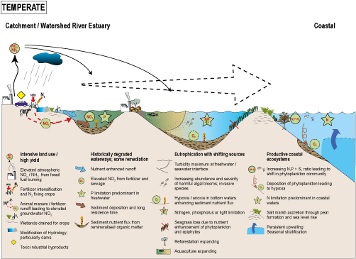
2) A series of tropical, temperate and polar conceptual diagrams was created during my stint on the Scientific Steering Committee of the Land-Ocean Interactions in the Coastal Zone (LOICZ) program, part of the International Geosphere-Biosphere Programme (IGBP). I attended a workshop in 2001 in Lawrence, Kansas with a very knowledgeable group of international scientists and picked their brains about the key features and major threats along their coastlines. These diagrams were used in the LOICZ book 'Coastal Fluxes in the Anthropocene' (Crossland et al., 2005) and adapted in 'Environmental problem solving in coastal ecosystems: A paradigm shift to sustainability' (Dennison, 2008; Estuar Coast Shelf Sci). The original diagrams were produced by Diana Kleine and then adapted by Tracey Saxby.

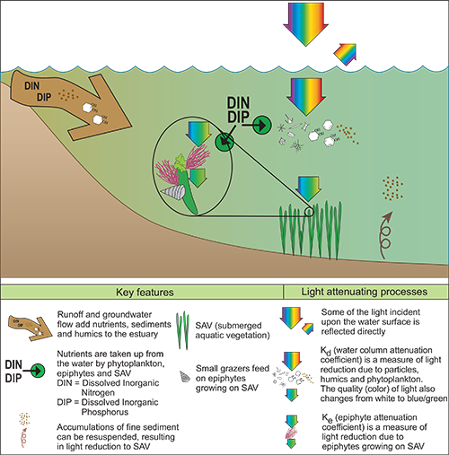
3) The Chesapeake Bay seagrass light attenuation conceptual diagram was developed from a box and arrow model produced as part of the 'Chesapeake Bay Submerged Aquatic Vegetation Habitat Requirements and Restoration Targets: A Technical Synthesis' (Batiuk et al., 1992), which resulted in a Bioscience publication 'Assessing water-quality with submersed aquatic vegetation' (Dennison et al., 2003). The diagram was drawn by Tim Carruthers in 2002 when we were setting up the Integration and Application Network and appears in several IAN publications.
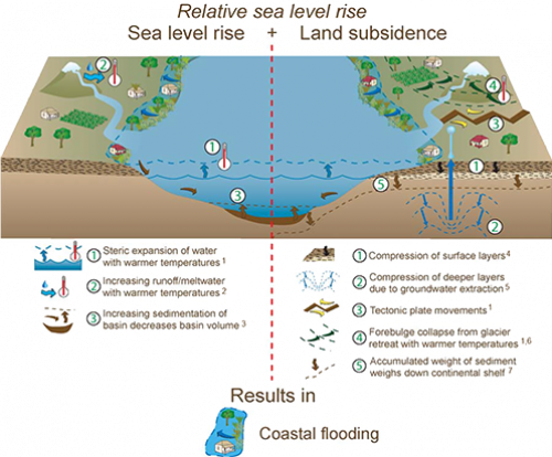
4) A conceptual diagram depicting the causes of relative sea level rise was created in 2003 following the devastating storm surges in Chesapeake Bay associated with Hurricane Isabel. Jane Thomas created this conceptual diagram for a newsletter entitled 'Hurricane Isabel and Sea Level Rise' that we generated two weeks following Hurricane Isabel in order to capitalize on the 'learning moment' that we had regarding the dangers of sea level rise and climate change.
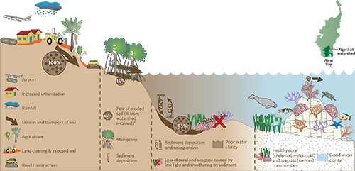
5) The cross section of Babeldaob Island, Palau depicting sediment erosion and impacts on the coastal ecosystem was a conceptual diagram created by Jane Thomas when the IAN team traveled to Palau to work with the Palau Conservation Society. What was fun about developing this diagram was personally viewing each aspect and helping integrate the different observations. This diagram was used in the 'Protecting Palau's natural heritage' IAN newsletter, published in 2007.
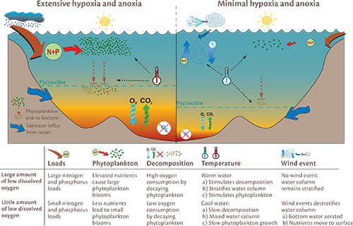
6) Anoxia and hypoxia in bottom waters of Chesapeake Bay are depicted in this comparison diagram contrasting extensive vs. minimal anoxia/hypoxia conditions. I like the side-by-side comparisons and the inclusion of various casual factors. This diagram was produced for the 'Breath of Life: Dissolved oxygen in Chesapeake Bay' IAN newsletter in 2007. This diagram was created by Caroline Wicks.
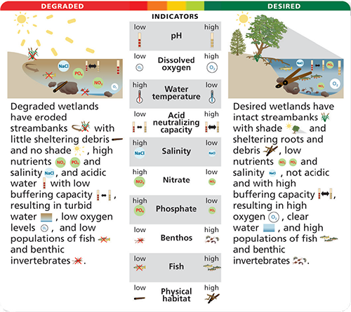
7) The degraded vs. desired conceptual diagram of wetland health, with vital signs and thresholds, is an example of the assessment approach Tim Carruthers developed for IAN and the National Park Service. This particular diagram was used in the Natural Resource Condition Assessments for the three Civil War battlefield parks near Washington, D.C.; Antietam National Battlefield Park, Manassas National Battlefield Park and Monocacy National Battlefield Park. This diagram was created by Jane Thomas.
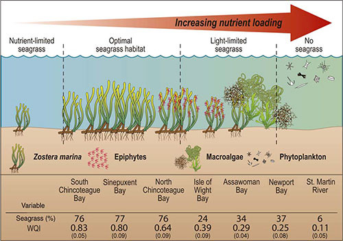
8) The eutrophication gradient for Chincoteague Bay conceptual diagram was developed to explain the ecological transitions occurring over the past decade. This diagram was used in the book 'Shifting Sands: Environmental and cultural change in Maryland's Coastal Bays' published by IAN Press in 2009 and 'Linking water quality to living resources in a mid-Atlantic lagoon system, USA' in 2007 (Wazniak et al. Ecol. Apps.). The diagram was created by Jane Thomas.
9) The Assateague Island cross section conceptual diagram was part of the Natural Resource Condition Assessment for Assateague Island National Seashore produced in 2011 by the IAN team. I like the simplicity of this diagram which illustrates the seven habitats with elevation, major features and human uses. This diagram was created by Jane Hawkey.

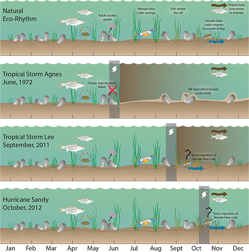
10) The eco-rhythm of Chesapeake Bay, both natural and in response to extreme events, was depicted in this conceptual diagram used in the 'Responding to major storm impacts: Ecological impacts of Hurricane Sandy on Chesapeake and Delmarva Coastal Bays' booklet, produced in 2012. This diagram was created by Brianne Walsh in collaboration with Tracey Saxby.
Reflecting on what makes these particular conceptual diagrams memorable for me, I think that they all represent relatively simple diagrams that I can recall and quickly sketch. Because of this, I often use these diagrams as guideposts when discussing new projects and working in a new region. In addition, these diagrams represent a scientific story that connects science to environmental management. The graphical approach differs, with two dimensional vs. three dimensional diagrams, and they are drawn by different Science Communicators sometimes over a decade and continents apart. Yet, the common use of the IAN symbol library, similar color palettes, and the synthesis of scientific understanding depicted on the diagrams unites them. We often talk of how our symbol libraries are an attempt to create a global symbol language. However, it strikes me that the symbol libraries are growing a global alphabet, and that conceptual diagrams create the global symbol language.
About the author
Bill Dennison

Dr. Bill Dennison is a Professor of Marine Science and Vice President for Science Application at the University of Maryland Center for Environmental Science.