Chelsea Wegner … Data is powerful. Data is beautiful. Science can be… complicated. So how do we prevent scaring, confusing or boring people with our results? How do we convey complex processes in a way that is easy to digest? How do we make our science aesthetically pleasing? There are a variety of tools available that can really help to show our results in captivating ways.
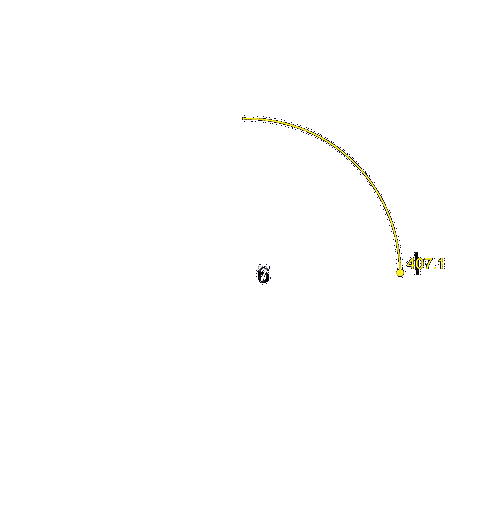
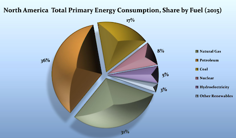
Katie Fitzenreiter … Visualization of North America's Total Primary Energy Consumption in 2015.1 … One of the most effective ways that researchers can communicate their findings is through data visualization. Emily Nastase said it best; she described data visualization as a way to effectively reveal trends, tell a story, and represent things that are not easily observed from words and numbers alone. However, producing a visual representation of data can be quite challenging.
Nicole Basenback … Class this week was exciting - we saw hand-drawn sketches of conceptual diagrams from the week prior transform into computer generated versions that rocked! Using Adobe Illustrator and the IAN Symbol Library, we were no longer limited by the number of colored pencils we had. This meant there were endless possibilities, but also some challenges when trying to find the ‘sweet spot’ for each of our conceptual diagrams.
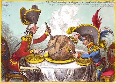
Annie Carew and Lexy McCarty … We’ve all seen political cartoons, whether in an antiquated physical newspaper or somewhere online. What makes political cartoons so compelling? They get their point across, quickly and simply, with an eye-catching visual and brief, clever text. These comics condense often complex sociopolitical issues into a panel or two with devastating effectiveness.
Rebecca Wenker … If you had to group Abraham Lincoln, Charles Darwin, and the writers of South Park together based on a single characteristic, would you be able to do it? True, they are all men and were able to achieve great success in their respective fields, but that's not the answer I'm looking for. Therefore, I'm going to ask that you try again. The correct answer, which I not-so- subtly hinted at in bold, is that they all know the power of the ABT narrative structure.
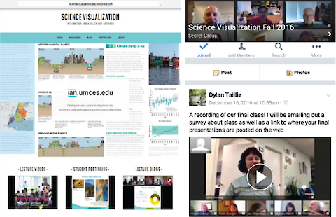
The Science Visualization course in the Fall 2016 semester that wrapped up in December 2016. The first time this course was taught was in Spring 2016, when it was offered for graduate credit with the Marine Environmental and Estuarine Science (MEES) program. In this second round of teaching, it was targeted for people in environmental government agencies and non-government organizations.
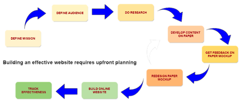
Kristie Gianopulos … Over 40% of the world population has an internet connection (3.42 billion people), and we all recognize the importance of using the internet to find and broadcast information. So if you want to use the web to get your message out, how should you go about it? How do you make your website effective? You may be surprised to learn that building effective websites requires most of your work prior to building the site itself.
Liz Myers … Dancing among disciplines to protect ecosystems … Science communicators pursue an ambitious, worthwhile goal. We integrate knowledge across disciplines and fields of expertise - physical and life sciences, rhetoric, art, psychology, public administration, publishing, and digital technology - each with its own rich history and strikingly different culture.
Laura Wood … Photos are a great way to quickly catch people’s attention and get them interested in a subject matter. In fact, they often provide the first impression for your work, as people take in and react to visual images much more quickly than they do text. So, whether you’re working with data visualization, outreach material, or web design, a good photo can send a message to your audience about the content and quality of the information it represents.
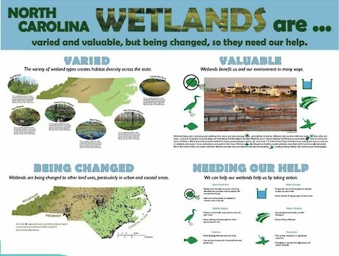
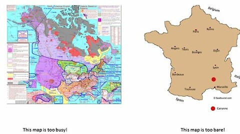
Michelle Canick … OK, not really. But like Goldilocks selecting the bed just right for her nap, we should try to avoid the extremes when designing a map. Don’t make the map too simple or too complex, but provide just the right amount of detail to tell the story. Bad map examples Credit: cartastrophe.wordpress.com … What’s the story? Well, that’s really the first step.